On quantifying passing skill

Quantifying passing skill has been a topic that has gained greater attention over the past 18 months in public analytics circles, with Paul Riley,  StatsBomb and Played off the Park regularly publishing insights from their passing models. I talked a little about my own model last season but only published results on how teams disrupted their opponents passing. I thought delving into the nuts and bolts of the model plus reporting some player-centric results would be a good place to start as I plan to write more on passing over the next few months.

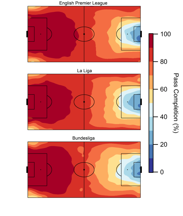
Firstly, the model quantifies the difficulty of an open-play pass based on its start and end location, as well as whether it was with the foot or head. So for example, relatively short backward passes by a centre back to their goalkeeper are completed close to 100% of the time, whereas medium-range forward passes from out-wide into the centre of the penalty area have pass completion rates of around 20%.

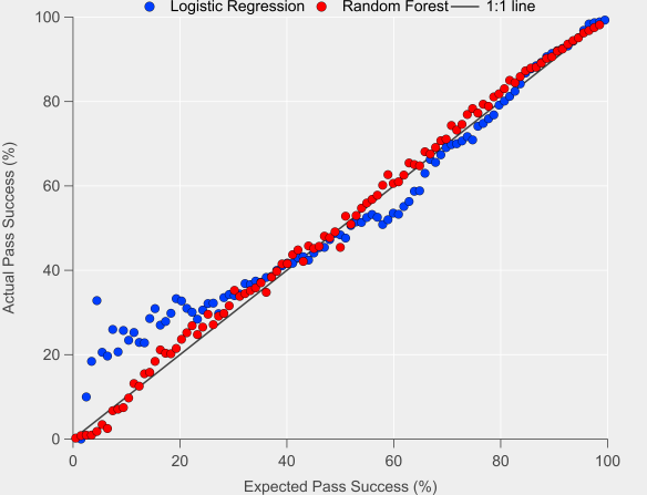
The data used for the model is split into training and testing sets to prevent over-fitting. The Random Forest-based model does a pretty good job of representing the different components that drive pass difficulty, some of which are illustrated in the figure below (also see the appendix here for some further diagnostics).

xP_val

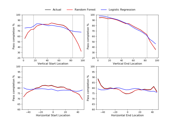
Comparison between expected pass completion rates from two different passing models and actual pass completion rates based on the start and end location of an open-play pass. The horizontal dimension is orientated from left-to-right, with zero designating the centre of the pitch. The dashed lines in the vertical dimension plots show the location of the edge of each penalty area. Data via Opta.

One slight wrinkle with the model is that it has trouble with very short passes of less than approximately 5 yards due to the way the data is collected; if a player attempts a pass and an opponent in his immediate vicinity blocks it, then the pass is unsuccessful and makes it looks like such passes are really hard, even though the player was actually attempting a much longer pass. Neil Charles reported something similar in his OptaPro Forum presentation in 2017. For the rest of the analysis, such passes are excluded.

None shall pass

That gets some of the under-the-hood stuff out of the way, so let’s take a look at ways of quantifying passing ‘skill’.

Similar to the concept of expected goals, the passing model provides a numerical likelihood of a given pass being completed by an average player; deviations from this expectation in reality may point to players with greater or less ‘skill’ at passing. The analogous concept from expected goals would be comparing the number of goals scored versus expectation and interpreting this as ‘finishing skill‘ or lack there of. However, when it comes to goal-scoring, such interpretations tend to be very uncertain due to significant sample size issues because shots and goals are relatively infrequent occurrences. This is less of a concern when it comes to passing though, as many players will often attempt more passes in a season than they would take shots in their entire career.

Another basic output of such models is an indication of how adventurous a player is in their passing – are they playing lots of simple sideways passes or are they regularly attempting defense-splitting passes?

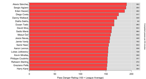
The figure below gives a broad overview of these concepts for out-field players from the top-five leagues (England, France, Germany, Italy and Spain) over the past two seasons. Only passes with the feet are included in the analysis.

dxP_avg_xP_scatter

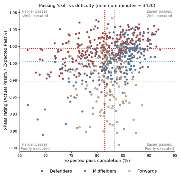
Passing ‘skill’ compared to pass difficulty for outfield players from the past two seasons in the big-five leagues, with each data point representing a player who played more than 3420 minutes (equivalent to 38 matches) over the period. The dashed lines indicate the average values across each position. Foot-passes only. Data from Opta.

One of the things that is clear when examining the data is that pulling things apart by position is important as the model misses some contextual factors and player roles obviously vary a huge amount depending on their position. The points in the figure are coloured according to basic position profiles (I could be more nuanced here but I’ll keep it simpler for now), with the dashed lines showing the averages for each position.

In terms of pass difficulty, midfielders attempt the easiest passes with an average expected completion of 83.2%. Forwards (81.6%) attempt slightly easier passes than defenders (81.4%), which makes sense to me when compared to midfielders, as the former are often going for tough passes in the final third, while the latter are playing more long passes and crosses.

Looking at passing skill is interesting, as it suggest that the average defender is actually more skilled than the average midfielder?!? While the modern game requires defenders to be adept in possession, I’m unconvinced that their passing skills outstrip midfielders. What I suspect is happening is that passes by defenders are being rated as slightly harder than they are in reality due to the model not knowing about defensive pressure, which on average will be less for defenders than midfielders.

Forwards are rated worst in terms of passing skill, which is probably again a function of the lack of defensive pressure included as a variable, as well as other skills being more-valued for forwards than passing e.g. goal-scoring, dribbling, aerial-ability.

Pass muster

Now we’ve got all that out of the way, here are some lists separated by position. I don’t watch anywhere near as much football as I once did, so really can’t comment on quite a few of these and am open to feedback.

Note the differences between the players on these top-ten lists are tiny, so the order is pretty arbitrary and there are lots of other players that the model thinks are great passers who just missed the cut.

First-up, defenders: *shrugs*.

In terms of how I would frame this, I wouldn’t say ‘Faouzi Ghoulam is the best passer out of defenders in the big-five leagues’. Instead I would go for something along the lines of ‘Faouzi Ghoulam’s passing stands out and he is among the best left-backs according to the model’. The latter is more consistent with how football is talked about in a ‘normal’ environment, while also being a more faithful presentation of the model.

Looking at the whole list, there is quite a range of pass difficulty, with full-backs tending to play more difficult passes (passes into the final third, crosses into the penalty area) and the model clearly rates good-crossers like Ghoulam, Baines and Valencia. Obviously that is a very different skill-set to what you would look for in a centre back, so filtering the data more finely is an obvious next step.

Defenders (* denotes harder than average passes)

Name Team xP rating Pass difficulty
Faouzi Ghoulam Napoli 1.06 80.3*
Leighton Baines Everton 1.06 76.5*
Stefan Radu Lazio 1.06 82.1
Thiago Silva PSG 1.06 91.0
Benjamin Hübner Hoffenheim 1.05 84.4
Mats Hummels Bayern Munich 1.05 86.0
Kevin Vogt Hoffenheim 1.05 87.4
César Azpilicueta Chelsea 1.05 83.4
Kalidou Koulibaly Napoli 1.05 87.8
Antonio Valencia Manchester United 1.05 80.0*

On to midfielders: I think this looks pretty reasonable with some well-known gifted passers making up the list, although I’m a little dubious about Dembélé and Fernandinho being quite this high up. Iwobi is an interesting one and will keep James Yorke happy.

Fàbregas stands-out due to his pass difficulty being well-below average without having a cross-heavy profile – nobody gets near him for the volume of difficult passes he completes.

Midfielders (* denotes harder than average passes)

Name Team xP rating Pass difficulty
Cesc Fàbregas Chelsea 1.06 79.8*
Toni Kroos Real Madrid 1.06 88.1
Luka Modric Real Madrid 1.06 85.9
Arjen Robben Bayern Munich 1.05 79.6*
Jorginho Napoli 1.05 86.8
Mousa Dembélé Tottenham Hotspur 1.05 89.9
Fernandinho Manchester City 1.05 87.2
Marco Verratti PSG 1.05 87.3
Alex Iwobi Arsenal 1.05 84.9
Juan Mata Manchester United 1.05 84.5

Finally, forwards AKA ‘phew, it thinks Messi is amazing’.

Özil is the highest-rated player across the dataset, which is driven by his ability to retain possession and create in the final third. Like Fàbregas above, Messi stands out for the difficulty of the passes he attempts and that he is operating in the congested central and half-spaces in the final third, where mere mortals (and the model) tend to struggle.

In terms of surprising names: Alejandro Gomez appears to be very good at crossing, while City’s meep-meep wide forwards being so far up the list makes we wonder about team-effects.

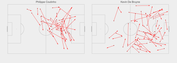
Also, I miss Philippe Coutinho.

Forwards (* denotes harder than average passes)

Name Team xP rating Pass difficulty
Mesut Özil Arsenal 1.07 82.9
Eden Hazard Chelsea 1.05 81.9
Lionel Messi Barcelona 1.05 79.4*
Philippe Coutinho Liverpool 1.04 80.6*
Paulo Dybala Juventus 1.03 84.8
Alejandro Gomez Atalanta 1.03 74.4*
Raheem Sterling Manchester City 1.03 81.6*
Leroy Sané Manchester City 1.03 81.9
Lorenzo Insigne Napoli 1.03 84.3
Diego Perotti Roma 1.02 78.4*

Finally, the answer to what everyone really wants to know is, who is the worst passer? Step-forward Mario Gómez – I guess he made the right call when he pitched his tent in the heart of the penalty area.

Pass it on

While this kind of analysis can’t replace detailed video and live scouting for an individual, I think it can provide a lot of value. Traditional methods can’t watch every pass by every player across a league but data like this can. However, there is certaintly a lot of room for improvement and further analysis.

A few things I particularly want to work on are:

  • Currently there is no information in the model about the type of attacking move that is taking place, which could clearly influence pass difficulty e.g. a pass during a counter-attacking situation or one within a long passing-chain with much slower build-up. Even if you didn’t include such parameters in the model, it would be a nice means of filtering different pass situations.
  • Another element in terms of context is attempting a pass after a dribble, especially given some of the ratings above e.g. Hazard and Dembélé. I can envisage the model somewhat conflates the ability to create space through dribbling and passing skill (although this isn’t necessarily a bad thing depending on what you want to assess).
  • Average difficulty is a bit of a blunt metric and hides a lot of information. Developing this area should be a priority for more detailed analysis as I think building a profile of a player’s passing tendencies would be a powerful tool.
  • You’ll have probably noticed the absence of goalkeepers in the results above. I’ve left them alone for now as the analysis tends to assign very high skill levels to some goalkeepers, especially those attempting lots of long passes. My suspicion is that long balls up-field that are successfully headed by a goalkeeper’s team-mate are receiving a bit too much credit i.e. yes the pass was ‘successful’ but that doesn’t always mean that possession was retained after the initial header. That isn’t necessarily the fault of the goalkeeper, who is generally adhering to the tactics of their team and the match situation but I’m not sure it really reflects what we envisage as passing ‘skill’ when it comes to goalkeepers. Discriminating between passes to feet and aerial balls would be a useful addition to the analysis here.
  • Using minutes as the cut-off for the skill ratings leaves a lot of information on the table. The best and worst passers can be pretty reliably separated after just a few hundred passes e.g. Ruben Loftus-Cheek shows up as an excellent passer after just ~2000 minutes in the Premier League. Being able to quickly assess young players and new signings should be possible. Taking into account the number of passes a player makes should also be used to assess the uncertainty in the ratings.

I’ve gone on enough about this, so I’ll finish by saying that any feedback on the analysis and ratings is welcome. To facilitate that, I’ve built a Tableau dashboard that you can mess around with that is available from here and you can find the raw data here.

Time to pass and move.

Advertisement

What has happened to the Klopp press?

Originally published on StatsBomb.

When asked how his Liverpool team would play by the media horde who greeted his unveiling as manager two years ago, Jürgen Klopp responded:

We will conquer the ball, yeah, each fucking time! We will chase the ball, we will run more, fight more.

The above is a neat synopsis of Klopp’s preferred style of play, which focuses on pressing the opponent after losing the ball and quickly transitioning into attack. It is a tactic that he successfully deployed at Borussia Dortmund and one that he has employed regularly at Liverpool.

However, a noticeable aspect of the new season has been Liverpool seemingly employing a less feverish press. The Anfield Index Under Pressure Podcast led the way with their analysis, which was followed by The Times’ Jonathan Northcroft writing about it here and Sam McGuire for Football Whispers.

Liverpool’s pass disruption map for the past three seasons is shown below. Red signifies more disruption (greater pressure), while blue indicates less disruption (less pressure). In the 2015/16 and 2016/17 seasons, the team pressed effectively high up the pitch but that has slid so far this season to a significant extent. There is some disruption in the midfield zone but at a lower level than previously.

LFC_dxP.png

Liverpool’s zonal pass completion disruption across the past three seasons. Teams are attacking from left-to-right, so defensive zones are to the left of each plot. Data via Opta.

The above numbers are corroborated by the length of Liverpool’s opponent possessions increasing by approximately 10% this season compared to the rest of Klopp’s reign. Their opponents so far this season have an average possession length of 6.5 seconds, which is lower than the league average but contrasts strongly with the previous figures that have been among the shortest in the league.

Examining their pass disruption figures game-by-game reveals further the reduced pressure that Liverpool are putting on their opponents. During 2015/16 and 2016/17, their average disruption value was around -2.5%, which they’ve only surpassed once in Premier League matches this season, with the average standing at -0.66%.

LFC-xP-17-18

Liverpool’s game-by-game pass completion disruption for 2017/18 English Premier League season. Figures are calculated for zones above Opta x-coordinates greater than 40. Data via Opta.

The Leicester match is the major outlier and examining their passing further indicates that the high pass disruption was a consequence of them attempting a lot of failed long passes. This is a common response to Liverpool’s press as teams go long to bypass the pressure.

Liverpool’s diminished press is likely a deliberate tactic that is driven by the added Champions League matches the team has faced so far this season. The slightly worrisome aspect of this tactical shift is that Liverpool’s defensive numbers have taken a hit.

In open-play, Liverpool’s expected goals against figure is 0.81 per game, which is up from 0.62 last season. Furthermore, their expected goals per shot has risen to 0.13 from 0.11 in open-play. To add further defensive misery, Liverpool’s set-piece woes (specifically corners) have actually got worse this season. The team currently sit eleventh in expected goals conceded this season, which is a fall from fifth last year.

This decline in underlying defensive performance has at least been offset by a rise on the attacking side of 0.4 expected goals per game to 1.78 this season. Overall, their expected goal difference of 0.79 this season almost exactly matches the 0.81 of last season.

Liverpool’s major problem last season was their soft under-belly but they were often able to count on their pressing game denying their opponents opportunities to exploit it. What seems to be happening this season is that the deficiencies at the back are being exploited more with the reduced pressure ahead of them.

With the season still being relatively fresh, the alarm bells shouldn’t be ringing too loudly but there is at least cause for concern in the numbers. As ever, the delicate balancing act between maximising the sides attacking output while protecting the defense is the key.

Klopp will be searching for home-grown solutions in the near-term and a return to the familiar pressing game may be one avenue. Given the competition at the top of the table, he’ll need to find a solution sooner rather than later, lest they be left behind.

Under pressure

Originally published on StatsBomb.

Models that attempt to measure passing ability have been around for several years, with Devin Pleuler’s 2012 study being the first that I recall seeing publicly. More models have sprung up in the past year, including efforts by Paul Riley, Neil Charles and StatsBomb Services. These models aim to calculate the probability of a pass being completed using various inputs about the start and end location of the pass, the length of the pass, the angle of it, as well as whether it is played with the head or foot.

Most applications have analysed the outputs from such models from a player passing skill perspective but they can also be applied at the team level to glean insights. Passing is the primary means of constructing attacks, so perhaps examining how a defense disrupts passing could prove enlightening?

In the figure below, I’ve used a pass probability model (see end of post for details and code) to estimate the difficulty in completing a pass and then compared this to the actual passing outcomes at a team-level. This provides a global measure of how much a team disrupts their opponents passing. We see the Premier League’s main pressing teams with the greatest disruption, through to the barely corporeal form represented by Sunderland.

Team_PCDgraph

Pass completion disruption for the 2016/17 English Premier League season. Disruption is defined as actual pass completion percentage minus expected pass completion percentage. Negative values means opponent’s complete fewer passes than expected. Data via Opta.

The next step is to break this down by pitch location, which is shown in the figure below where the pitch has been broken into five bands with pass completion disruption calculated for each. The teams are ordered from most-to-least disruptive.

PressureMap

Zonal pass completion disruption for 2016/17 English Premier League season. Teams are attacking from left-to-right, so defensive zones are to the left of each plot. Data via Opta.

We see Manchester City and Spurs disrupt their opponents passing across the entire pitch, with Spurs’ disruption skewed somewhat higher. Liverpool dominate in the midfield zones but offer little disruption in their deepest-defensive zone, suggesting that once a team breaks through the press, they have time and/or space close to goal; a familiar refrain when discussing Liverpool’s defense.

Chelsea offer an interesting contrast with the high-pressing teams, with their disruption gradually increasing as their opponents inch closer to their goal. What stands out is their defensive zone sees the greatest disruption (-2.8%), which illustrates that they are highly disruptive where it most counts.

The antithesis of Chelsea is Bournemouth who put together an average amount of disruption higher up the pitch but are extremely accommodating in their defensive zones (+4.5% in their deepest-defensive zone). Sunderland place their opponents under limited pressure in all zones aside from their deepest-defensive zone where they are fairly average in terms of disruption.

The above offers a glimpse of the defensive processes and outcomes at the team level, which can be used to improve performance or identify weaknesses to exploit. Folding such approaches into pre-game routines could quickly and easily supplement video scouting.

Appendix: Pass probability model

For this post, I built two different passing models; the first used Logistic Regression and the second used Random Forests. The code for each model is available here and here.

Below is a comparison between the two, which compares expected success rates with actual success rates on out-of-sample test data.

Actual_vs_Expected

Actual versus expected pass success for two different models. Data via Opta.

The Random Forest method performs better than the Logistic Regression model, particularly for low probability passes. This result is confirmed when examining the Receiver Operating Characteristics (ROC) curves in the figure below. The Area Under the Curve (AUC) for the Random Forest model is 87%, while the Logistic Regression AUC is 81%.

xPass_AUC

Receiver Operating Characteristics (ROC) curves for the two different passing models. Data via Opta.

Given the better performance of the Random Forest model, I used this in the analysis in the main article.

On the anatomy of a counter-attack

Originally published on StatsBomb.

One of the most enduring aspects of football is the multitude of tactical and stylistic approaches that can be employed to be successful. Context is king in analytics and football as a whole, so the ability to identify and quantify these approaches is crucial for both opposition scouting and player transfer profiles.

At the OptaPro Forum this year, I looked at data from the past five Premier League seasons and used a sprinkling of maths to categorise shots into different types.

One such style I identified was ‘fast attacks from deep’, which were a distinct class of shots born of fast and direct possessions originating in the defensive zone. While these aren’t entirely synonymous with counter-attacks, there is likely a lot of overlap; the classical counter-attack is likely a subset of the deep fast-attacks identified in the data.

These fast-attacks from deep typically offer good scoring chances, with above average shot conversion (10.7%) due to the better shot locations afforded to them. They made up approximately 23% of the shots in my analysis.

So what do they look like?

To provide an overview of the key features of these attacks, I’ve averaged them together to get a broad picture of their progression up the pitch. I’ve presented this below and included a look at attacks from deep that involve more build-up play for comparison.

Fast-attacks_vs_Build-up

Comparison between fast-attacks from deep and attacks from deep that focus on slower build-up play. Vertical pitch position refers to the progression of an attack towards the opponent’s goal (vertical pitch position equal to 100). Both attack types start and end in similar locations on average but their progress with time is quite different. The shading is the standard deviation to give an idea of the spread inherent in the data. Data via Opta.

Fast-attacks from deep are characterised by an initial speedy progression towards goal within a team’s own half, followed by a steadier advance in the attacking half. This makes sense qualitatively as counter-attacks often see a quick transition in their early stages to properly establish the attacking opportunity. The attack can then be less frenetic as a team seeks to create the best opportunity possible from the situation.

Over the past five seasons, the stand out teams as rated by shot volume and expected goals have been various incarnations of Arsenal, Manchester City, Chelsea and Liverpool.

The architects

Player-level metrics can be used to figure out who the crucial architects of a counter-attacking situation are. One method of examining this is how many yards a player’s passing progressed the ball during deep fast-attacking possessions.

Below I’ve listed the top 10 players from the 2016/17 season by this metric on a per 90 minute basis, alongside some other metrics for your delectation.

BallProgression_SummaryTable

Top players ranked by ball progression per 90 minutes (in yards) during fast-attacks from deep for the 2016/17 Premier League season. xGoals and Goals per 90 are for possessions that a player is involved in (known as xGChain in some parts). Players with more than 1800 minutes only. Data via Opta.

While the focus was often on him kicking people rather than the ball, we see that Granit Xhaka stands alone in terms of ball progression, with Daley Blind a long way behind him in second place. Xhaka’s long-range passing skills are well known, so combining this with the most passes per 90 in such situations propels him to the top of pile.

The graphic below illustrates Xhaka’s passing during deep fast-attacks, with his penchant for long passes spread all over the midfield zone evident. For comparison, I’ve included Eden Hazard’s passing map as someone who played many important passes that were limited in terms of ball progression as they were typically shorter or lateral passes in the final third.

Xhaka_Hazard_PassMaps.png

Passes played by Granit Xhaka and Eden Hazard during fast-attacks from deep during the 2016/17 season. Solid circles denote pass origin, while the arrows indicate the direction and end point of each pass. Data via Opta.

Evidently there is a link between position and ball progression, as players in deeper positions have greater scope to progress the ball as they have more grass in front of them. The likes of Coutinho, Özil and De Bruyne residing so high up the rankings is therefore impressive.

Coutinho_DeBruyne_PassMaps.png

Passes played by Philippe Coutinho and Kevin Dr Bruyne during fast-attacks from deep during the 2016/17 season. Data via Opta.

Coutinho’s passing chalkboard above illustrates his keen eye for a pass from midfield areas through opposition defensive lines, as does De Bruyne’s ability to find teammates inside the penalty area. De Bruyne’s contribution actually ranks highest in terms of xG per 90 for the past season.

The finishers

While ball progression through the defensive and midfield zones is important for these fast-attacks from deep, they still require the finishing touches in the final third. There are fewer more frustrating sights in football than watching a counter-attack be botched in its final moments.

The graphic below summarises the top players in this crucial aspect by examining their expected goal and assist outputs. Unsurprisingly, Kevin De Bruyne leads the way here and is powered by his exceptional creative passing.

xGandxA_DFA

Top-20 players rated by expected goals (xG) plus expenses assists (xA) for fast-attacks from deep. Players with more than 1800 minutes only. Data via Opta.

The list is dominated by players from the top-6 clubs, with Negredo the only interloper inside the top-10 ranking. Middlesbrough’s minimal attacking output left few scraps of solace for Negredo but at least he did get a few shots away in these high-value situations to alleviate the boredom.

Conclusion

The investigation of tactical and stylistic approaches carried out above merely scratches the surface of possibilities for opposition scouting and player profiling.

Being able to identify ‘successful’ attacking moves opens the door to examining ‘failed’ possessions, which would allow efficiency to be studied as well as defensive aspects. This is an area rich with promise that I’ll examine in the future, along with other styles identified within the same framework.

Recruitment by numbers: the tale of Adam and Bobby

One of the charges against analytics is that it hasn’t really demonstrated its utility, particularly in relation to recruitment. This is an argument I have some sympathy with. Having followed football analytics for over three years, I’m well-versed in the metrics that could aid decision making in football but I can appreciate that the body of work isn’t readily accessible without investing a lot of time.

Furthermore, clubs are understandably reticent about sharing the methods and processes that they follow, so successes and failures attributable to analytics are difficult to unpick from the outside.

Rather than add to the pile of analytics in football think-pieces that have sprung up recently, I thought I would try and work through how analysing and interpreting data might work in practice from the point of view of recruitment. Show, rather than tell.

While I haven’t directly worked with football clubs, I have spoken with several people who do use numbers to aid recruitment decisions within them, so I have some idea of how the process works. Data analysis is a huge part of my job as a research scientist, so I have a pretty good understanding of the utility and limits of data (my office doesn’t have air-conditioning though and I rarely use spreadsheets).

As a broad rule of thumb, public analytics (and possibly work done in private also) is generally ‘better’ at assessing attacking players, with central defenders and goalkeepers being a particular blind-spot currently. With that in mind, I’m going to focus on two attacking midfielders that Liverpool signed over the past two summers, Adam Lallana and Roberto Firmino.

The following is how I might employ some analytical tools to aid recruitment.

Initial analysis

To start with I’m going to take a broad look at their skill sets and playing style using the tools that I developed for my OptaPro Forum presentation, which can be watched here. The method uses a variety of metrics to identify different player types, which can give a quick overview of playing style and skill set. The midfielder groups isolated by the analysis are shown below.

Midfielders

Midfield sub-groups identified using the playing style tool. Each coloured circle corresponds to an individual player. Data via Opta.

I think this is a useful starting point for data analysis as it can give a quick snap shot of a player and can also be used for filtering transfer requirements. The utility of such a tool is likely dependent on how well scouted a particular league is by an individual club.

A manager, sporting director or scout could feed into the use of such a tool by providing their requirements for a new signing, which an analyst could then use to provide a short-list of different players. I know that this is one way numbers are used within clubs as the number of leagues and matches that they take an interest in outstrips the number of ‘traditional’ scouts that they employ.

As far as our examples are concerned, Lallana profiles as an attacking midfielder (no great shock) and Firmino belongs in the ‘direct’ attackers class as a result of his dribbling and shooting style (again no great shock). Broadly speaking, both players would be seen as attacking midfielders but the analysis is picking up their differing styles which are evident from watching them play.

Comparing statistical profiles

Going one step further, fairer comparisons between players can be made based upon their identified style e.g. marking down a creative midfielders for taking a low number of shots compared to a direct attacker would be unfair, given their respective roles and playing style.

Below I’ve compared their statistical output during the 2013/14 season, which is the season before Lallana signed for Liverpool and I’m going to make the possibly incorrect assumption that Firmino was someone that Liverpool were interested in that summer also. Some of the numbers (shots, chances created, throughballs, dribbles, tackles and interceptions) were included in the initial player style analysis above, while others (pass completion percentage and assists) are included as some additional context and information.

The aim here is to give an idea of the strengths, weaknesses and playing style of each player based on ranking a player against their peers. Whether a player ranks low or high on a particular metric is a ‘good’ thing or not is dependent on the statistic e.g. taking shots from outside the box isn’t necessarily a bad thing to do but you might not want to be top of the list (Andros Townsend in case you hadn’t guessed). Many will also depend on the tactical system of their team and their role within it.

The plots below are to varying degrees inspired by Ted Knutson, Steve Fenn and Florence Nightingale (Steve wrote about his ‘gauge’ graph here). There are more details on these figures at the bottom of the post*.

Lallana.

Data via Opta.

Lallana profiles as a player who is good/average at several things, with chances created seemingly being his stand-out skill here (note this is from open-play only). Firmino on the other hand is strong and even elite at several of these measures. Importantly, these are metrics that have been identified as important for attacking midfielders and they can also be linked to winning football matches.

Firmino.

Data via Opta.

Based on these initial findings, Firmino looks like an excellent addition, while Lallana is quite underwhelming. Clearly this analysis doesn’t capture many things that are better suited to video and live scouting e.g. their defensive work off the ball, how they strike a ball, their first touch etc.

At this stage of the analysis, we’ve got a reasonable idea of their playing style and how they compare to their peers. However, we’re currently lacking further context for some of these measures, so it would be prudent to examine them further using some other techniques.

Diving deeper

So far, I’ve only considered one analytical method to evaluate these players. An important thing to remember is that all methods will have their flaws and biases, so it would be wise to consider some alternatives.

For example, I’m not massively keen on ‘chances created’ as a statistic, as I can imagine multiple ways that it could be misleading. Maybe it would be a good idea then to look at some numbers that provide more context and depth to ‘creativity’, especially as this should be a primary skill of an attacking midfielder for Liverpool.

Over the past year or so, I’ve been looking at various ways of measuring the contribution and quality of player involvement in attacking situations. The most basic of these looks at the ability of a player to find his team mates in ‘dangerous’ areas, which broadly equates to the central region of the penalty area and just outside it.

Without wishing to go into too much detail, Lallana is pretty average for an attacking midfielder on these metrics, while Firmino was one of the top players in the Bundesliga.

I’m wary of writing Lallana off here as these measures focus on ‘direct’ contributions and maybe his game is about facilitating his team mates. Perhaps he is the player who makes the pass before the assist. I can look at this also using data by looking at the attacks he is involved in. Lallana doesn’t rise up the standings here either, again the quality and level of his contribution is basically average. Unfortunately, I’ve not worked up these figures for the Bundesliga, so I can’t comment on how Firmino shapes up here (I suspect he would rate highly here also).

Recommendation

Based on the methods outlined above, I would have been strongly in favour of signing Firmino as he mixes high quality creative skills with a goal threat. Obviously it is early days for Firmino at Liverpool (a grand total of 239 minutes in the league so far), so assessing whether the signing has been successful or not would be premature.

Lallana’s statistical profile is rather average, so factoring in his age and price tag, it would have seemed a stretch to consider him a worthwhile signing based on his 2013/14 season. Intriguingly, when comparing Lallana’s metrics from Southampton and those at Liverpool, there is relatively little difference between them; Liverpool seemingly got the player they purchased when examining his statistical output based on these measures.

These are my honest recommendations regarding these players based on these analytical methods that I’ve developed. Ideally I would have published something along these lines in the summer of 2014 but you’ll just have to take my word that I wasn’t keen on Lallana based on a prototype version of the comparison tool that I outlined above and nothing that I have worked on since has changed that view. Similarly, Firmino stood out as an exciting player who Liverpool could reasonably obtain.

There are many ways I would like to improve and validate these techniques and they might bear little relation to the tools used by clubs. Methods can always be developed, improved and even scraped!

Hopefully the above has given some insight into how analytics could be a part of the recruitment process.

Coda

If analytics is to play an increasing role in football, then it will need to build up sufficient cachet to justify its implementation. That is a perfectly normal sequence for new methods as they have to ‘prove’ themselves before seeing more widespread use. Analytics shouldn’t be framed as a magic bullet that will dramatically improve recruitment but if it is used well, then it could potentially help to minimise mistakes.

Nothing that I’ve outlined above is designed to supplant or reduce the role of traditional scouting methods. The idea is just to provide an additional and complementary perspective to aid decision making. I suspect that more often than not, analytical methods will come to similar conclusions regarding the relative merits of a player, which is fine as that can provide greater confidence in your decision making. If methods disagree, then they can be examined accordingly as a part of the process.

Evaluating players is not easy, whatever the method, so being able to weigh several assessments that all have their own strengths, flaws, biases and weaknesses seems prudent to me. The goal of analytics isn’t to create some perfect and objective representation of football; it is just another piece of the puzzle.

truth … is much too complicated to allow anything but approximations – John von Neumann


*I’ve done this by calculating percentile figures to give an indication of how a player compares with their peers. Values closer to 100 indicate that a player ranks highly in a particular statistic, while values closer to zero indicate they attempt or complete few of these actions compared to their peers. In these examples, Lallana and Firmino are compared with other players in the attacking midfielder, direct attacker and through-ball merchant groups. The white curved lines are spaced every ten percentiles to give a visual indication of how the player compares, with the solid shading in each segment corresponding to their percentile rank.

Networking for success

In my previous post, I described my possession danger rating model, which classifies attacks according to their proximity to goal and their relative occurrence compared to other areas of the pitch. Each possession sequence in open-play is assigned a value depending on where it ends. The figure below outlines the model, with possession sequences ending closer to goal given more credit than those that break down further away.

Map of the pass weighting model based on data from the English Premier League. Data via Opta.

Map of the pass weighting model based on data from the English Premier League. Data via Opta.

Instead of just looking at this metric at the team level, there are numerous ways of breaking it down to the player level.

For each possession, a player could be involved in numerous ways e.g. winning the ball back via a tackle, a successful pass or cross, a dribble past an opponent or a shot at goal. Players that are involved in more dangerous possessions may be more valuable, particularly when we compare them to their peers. When viewing teams, we may identify weak links who reduce the effectiveness of an attack. Conversely, we can pick out the stars in a team or indeed the league.

Networking

One popular method of analysing the influence of players on a team is network analysis. This is something I’ve used in the past to examine how a team plays and who the crucial members of a team are. It looks at who a player passes the ball to and who they receive passes from, with players with many links to their teammates usually rated more highly. For example, a midfield playmaker who provides the link between a defence and attack will often score more highly than a centre back who mainly receives passes from their goalkeeper and then plays a simple pass to their central defensive partner.

In order to assess the influence of players on attacking possessions, I’ve combined the possession danger rating model with network analysis. This adjusts the network analysis to give more credit to players involved in more dangerous attacks, while also allowing us to identify the most influential members of a team.

Below is an example network for Liverpool last season during a 10 match period where they mainly played in a 3-4-3 formation. The most used eleven players during this period are shown according to their average position, with links between each player coloured according to how dangerous the possessions these links contributed to were.

Possession network for Liverpool for the ten matches from Swansea City (home) to Burnley (home) during the 2014/15 season. Lines are coloured according to the relative danger rating per each possession between each player. Player markers are sized by their adjusted closeness centrality score.

Possession network for Liverpool for the ten matches from Swansea City (home) to Burnley (home) during the 2014/15 season. Lines are coloured according to the relative danger rating per each possession between each player. Player markers are sized by their adjusted closeness centrality score (see below). Data via Opta.

Philippe Coutinho (10) was often a crucial cog in the network as he linked up with many of his team mates and the possessions he was involved with were often dangerous. His links with Sakho (17) and Moreno (18) appears to have been a fruitful avenue for attacks – this is an area we could examine in more detail via both data and video analysis if we were scouting Liverpool’s play. Over the whole season, Coutinho was easily the most crucial link in the team, which will come as no surprise to anyone who watched Liverpool last season.

Making the play

We can go further than players on a single team and compare across the entire league last season. To do this, I’ve calculated each players ‘closeness centrality‘ score or player influence score but scaled it according to how dangerous the possessions they were involved in were over the season. The rating is predominantly determined by how many possessions they are involved in, how well they link with team mates and the danger rating of the possessions they contribute to.

Yaya Touré leads the league by some distance due to him essentially being the crucial cog in the best attack in the league last season. Many of the players on the list aren’t too surprising, with a collection of Arsenal and Manchester City players high on the list plus the likes of Coutinho and Hazard also featuring.

The ability to effectively dictate play and provide a link for your team mates is likely desirable but the level of involvement a player has may be strongly governed by team tactics and their position on the field. One way around this is to control for the number of possessions a player is involved in to separate this out from the rating; Devin Pleuler made a similar adjustment in this Central Winger post.

Below are the top twenty players from last season according to this adjusted rating, which I’m going to refer to as an ‘influence rating’.

Top twenty players (minimum 1800 minutes) per the adjusted influence rating for the 2014/15 Premier League season. The number of completed passes each player made per 90 minutes is shown on the left. Data via Opta.

When accounting for their level of involvement, Mesut Özil rises to the top, narrowly ahead of Santi Cazorla and Yaya Touré. While players such as these don’t lead the league in terms of the most dangerous passes in open-play, they appear to be crucial conduits for their respective attacks. That might entail choosing the best options to facilitate attacks, making space for their team mates or playing a crucial line-breaking pass to open up a defence or all of the above and more.

There are some surprising names on the list, not least the Burnley duo of Danny Ings and George Boyd! Their level of involvement was very low (the lowest of those in the chart above) but when they were involved, Burnley created quite dangerous attacks and they linked well with the rest of the team. Burnley had a reasonably decent attack last season based on their underlying numbers but they massively under-performed when it came to actual goals scored. The question here is would this level of influence be maintained in a different setup and with greater involvement?

Ross Barkley is perhaps another surprising inclusion given his reputation outside of those who depict him as the latest saviour of English football. Looking at his passing chart and links, this possibly points to the model not accounting for crossing often being a less effective method of attack; his passing chart in the final third is biased towards passes to wide areas, which often then results in a cross into the box. Something for version 2.0 to explore. He was Everton’s attacking hub player, which perhaps helps to explain their lack of penetration in attack last season.

Conclusion

The above is just one example of breaking down my dangerous possession metric to the player level. As with all metrics, it could certainly be improved e.g. additional measures of quality of possession could be included and I’m aware that there are likely issues with team effects inflating or deflating certain players. Rating across all players isn’t completely fair, as there is an obvious bias towards attack-minded players, so I will look to break it down across player positions and roles.

Stay tuned for future developments.

Valuing Possession

Regular visitors will know that I’ve been working on some metrics in relation to possession and territory based on the difficulty of completing passes into various areas of the pitch. To recap, passes into dangerous areas are harder to complete, which isn’t particularly revelatory but by building some metrics around this we can assess how well teams move the ball into dangerous areas as well as how well they prevent their opponents from doing so. These metrics can also be broken down to the player level to see which players complete the most ‘dangerous’ passes.

Below is the current iteration of the pass danger rating model based on data from the 2014/15 Premier League season; working the ball into positions closer to the goal is rewarded with a larger rating, while passes made within a teams own half carry very little weight.

Map of the pass weighting model based on data from the English Premier League. Data via Opta.

Map of the pass weighting model based on data from the English Premier League. Data via Opta.

One particular issue with the Territorial-Possession Dominance (TPD) metric that I devised was that as well as having a crap name, the relationship with points and goal difference could have been better. The metric tended to over-rate teams who make a lot of passes in reasonably dangerous areas around the edge of the box but infrequently complete passes into the central zone of the penalty area. On the other side of the coin, it tended to under-rate more direct teams who don’t attack with sustained possession.

In order to account for this, I’ve calculated the danger rating by looking at attacks on a ‘possession’ basis i.e. by tracking individual chains of possession in open-play and looking at where they end. The end of the chain could be due to a number of reasons including shots, unsuccessful passes or a tackle by an opponent. Each possession is then assigned a danger rating based on the model in the figure above. Possessions which end deep into opponent territory will score more highly, while those that break down close to a team’s own goal are given little weight.

Conceptually, the model is similar to Daniel Altman’s non-shot based model (I think), although he views things through expected goals, whereas I started out looking at passing. You can find some of the details regarding the model here, plus a video of his presentation at the Opta Pro Analytics Forum is available here, which is well worth watching.

Danger Zone

The ratings for last season’s Premier League teams are shown below, with positive values meaning a team had more dangerous possessions than their opponents over the course of the season and vice versa for the negative values. Overall, the correlation between the metric and goal difference and points is pretty good (r-squared values of 0.76 and 0.77 respectively). This is considering open-play only, so it ignores set pieces and penalties, plus I omitted possessions made up of just one shot. The correlation with open-play goal difference is a little larger, so it appears to be an encouraging indicator of team strength.

Open-Play Possession Danger Rating for the 2014/15 English Premier League season. Data via Opta.

Open-Play Possession Danger Rating for the 2014/15 English Premier League season. Zero corresponds to a rating of 50%. Data via Opta.

The rating only takes into account the location of where the possession ends so there is plenty of scope for improvement e.g. throughball passes could carry more weight, counter-attacks could receive an increased danger rating, while moves featuring a cross might be down-weighted. Regardless of such improvements, these initial results are encouraging and are at a similar descriptive level to traditional shot ratios and expected goal models.

Arsenal are narrowly ahead of Manchester City here, as they make up a clear top-two which is strongly driven by their attacking play. Intriguingly, Manchester City’s rating was much greater (+7%) for possessions ending with a shot, while Arsenal’s was almost unchanged (-1%). Similarly to City, Chelsea’s rating for possessions ending with a shot was also greater (+4%)  than their rating for all possessions. I don’t know yet if this is a repeatable trait but it suggests Chelsea and City were more efficient at generating quality shots and limiting their opponents.

Manchester United sit narrowly ahead of Liverpool and Southampton and round out the top four, which was mainly driven by their league-leading defensive performance; few teams were able to get the ball into dangerous positions near their goal. Manchester United’s ability to keep their opponents at arms length has been a consistent trend from the territory-based numbers I’ve looked at.

Analytics anti-heroes Sunderland and a West Brom team managed by Tony Pulis for a large chunk of last season reside at the bottom of the table. Sunderland comfortably allowed the most dangerous possessions in the league last season.

Possessed

So, we’re left with yet another team strength metric to add to the analytics pile. The question is what does this add to our knowledge and how might we use it?

Analytics has generally based metrics around shots, which is sometimes not reflective of how we often experience the game from a chance creation point of view. The concept of creating a non-shot based chance isn’t a new one – the well worn cliché about a striker ‘fluffing a chance’ tells us that much but what analytics is striving to do is quantify these opportunities and hopefully do something useful with them. Basing the metric on all open-play possessions rather than just focusing on shots potentially opens up some interesting avenues for future research in terms of examining how teams attack and defend. Furthermore, using all possessions rather than those just ending with a shot increases our sample size and opens up the potential for new ways of assessing player contributions.

Looking at player contributions to these possessions will be the subject of my next post.

Liverpool Looking Up? EPL 2015/16 Preview

Originally published on StatsBomb.

After the sordid love affair that culminated in a strong title challenge in 2013/14, Liverpool barely cast a furtive glance at the Champions League places in 2014/15. Their underlying numbers over the whole season provided scant consolation either, with performance levels in line with a decent team lacking the quality usually associated with a top-four contender. Improvements in results and underlying performance will therefore be required to meet the club’s stated aim of Champions League football.

Progress before a fall

Before looking forward to the coming season, let’s start with a look back at Liverpool’s performance over recent seasons. Below is a graphic showing Liverpool’s underlying numbers over the past five seasons, courtesy of Paul Riley’s Expected Goal numbers.

Expected goal rank over the past 5 seasons of the English Premier League. Liverpool seasons highlighted in red.

Expected goal rank over the past 5 seasons of the English Premier League. Liverpool seasons highlighted in red.

From 2010/11 to 2012/13, there was steady progress with an impressive jump in 2013/14 to the third highest rating over the past five years. Paul’s model only evaluates shots on target, so Liverpool’s 2013/14 rating is potentially biased a little high given their unusual/unsustainable proportion of shots on target that year. However, the quality was clear, particularly in attack. Not to be outdone, 2014/15 saw another impressive jump but unfortunately the trajectory was in the opposite direction. Other metrics such as total shots ratio and shots on target ratio tell a similar story, although 2013/14 isn’t quite as impressive.

The less charitable among you may ascribe Liverpool’s trajectory with the presence and performance of one Luis Suárez; when joining in January 2010, Suárez was an erratic yet gifted performer who went on to become a genuine superstar before departing in the summer of 2014. Suárez’s attacking wizardry in 13/14 was remarkable and he served as a vital multiplier in the sides’ pinball style of play. Clearly he was a major loss but there were already reasons to suspect that some regression was due with or without him: Andrew Beasley wrote about the major and likely unsustainable role of set piece goals, while James Grayson and Colin Trainor highlighted the unusually favourable proportions of shots on target and blocked shots respectively during their title challenge. I wrote about how Liverpool’s penchant for early goals had led to an incredible amount of time spent winning over the season (a handy circumstance for a team so adept at counter-attacking), which may well have helped to explain some of their unusual numbers and that it was unlikely to be repeated.

These mitigating and potentially unsustainable factors notwithstanding, the dramatic fall in underlying performance, points (22 in all) and goals scored (an incredible 49 goal decline) is where Liverpool find themselves ahead of the coming season. Such a decline sees Brendan Rodgers go into this season under pressure to justify FSG’s backing of him over the summer, particularly with a fairly nightmarish run of away fixtures to start the season and the spectre of Jürgen Klopp on the horizon.

So, where do Liverpool need to improve this season?

Case for the defence

With the concession of six goals away at Stoke fresh in the memory, the narrative surrounding Liverpool’s defence is strong i.e. the defence is pretty horrible. Numbers paint a somewhat different story with Liverpool’s shots conceded (10.9 per game) standing as the joint-fifth lowest in the league last year according to statistics compiled by the Objective-Football website (rising to fourth lowest in open play). Shots on target were less good (3.8 per game and a rank of joint-seventh) although the margins are fairly small here. By Michael Caley’s and Paul Riley’s expected goal numbers, Liverpool ranked fourth and sixth respectively in expected goals against. Looking at how effective teams were at preventing their opponents from getting the ball into dangerous areas in open-play, my own numbers ranked Liverpool fifth best in the league.

It should be noted that analytics often has something of a blind spot when it comes to analysing defensive performances; metrics which typically work very well on the offensive side often work less well on the defensive side. Liverpool also tend to be a fairly dominant team and their opponents typically favour a deep defence and counter strategy against them, which will limit the number of chances they create.

One area where their numbers (courtesy of Objective-Football again) were noticeably poor was at set-pieces where they conceded on 11.6% of the shots by their opponents, which was 3rd worst in the league, compared to a league average conversion of 8.7%. Set-piece conversion rates are notoriously unsustainable year-on-year though, so some regression towards more normal conversion rates could potentially bring down Liverpool’s goal per game average compared to last season.

While Liverpool’s headline numbers were reasonable, their tendency to shoot themselves in the foot and concede some daft goals was impressive in its ineptitude at times. Culprits typically included combinations of Rodgers’ tactics, Dejan Lovren’s ‘whack a mole’ approach to defending and the embers of Steven Gerrard’s Liverpool career. The defensive structure of the team should be improved now that Gerrard no longer needs to be accommodated at the heart of midfield, while Glen Johnson’s prolonged audition for an extra role in the Walking Dead will continue at Stoke. Nathaniel Clyne should be a significant upgrade at full back, with youngsters Ilori and Gomez presently with the squad and aiming to compete for a first team role.

Broadly speaking though, Liverpool’s defensive numbers were reasonable but with room for improvement. Their numbers looked ok for a Champions League hopeful rather than a title challenger. A more mobile midfield should enhance the protection afforded to the central defence, however it should line up. Whether the individual errors were a bug and not a feature of this Liverpool team will likely determine how the narrative around the defence continues this year.

Under-powered attack

Liverpool’s decline in underlying performance in 2014/15 was driven by a significant drop-off in their attacking numbers. The loss of Suárez was compounded by Daniel Sturridge playing just 750 minutes in the league all season; Sturridge isn’t at the same level as Suárez (few are) but he does represent a truly elite forward and the alternatives at the club weren’t able to replace him.

The loss of Suárez and Sturridge meant that Coutinho and Sterling were now the principal conduits for Liverpool’s attack. Both performed admirably and were among the most dangerous attackers in the division. The figure below details Liverpool’s players according to the number of dangerous passes per 90 minutes played, which is related to my pass-danger rating score. In terms of volume, Coutinho and Sterling were way ahead of their teammates and both ranked in the top 15 in the league (minimum of 900 minutes played). James Milner actually ranked seventh by this metric, so he could well provide an additional source of creativity and link well with Liverpool’s forward players.

Dangerous passes per 90 minutes played metric for Liverpool players in 2014/15. Right hand side shows total number of completed passes per 90 minutes.

Dangerous passes per 90 minutes played metric for Liverpool players in 2014/15. Right hand side shows total number of completed passes per 90 minutes.

As good as Coutinho and Sterling were from a creative perspective, they did lag behind the truly elite players in the league by these metrics. As with many of Liverpool’s better players, you’re often left with the caveat of stating how good they are for their age. That’s not a criticism of the players themselves, merely a recognition of their overall standing relative to their peers.

What didn’t help was the lack of attacking contribution from Liverpool’s peak-age attacking players; Lallana’s contribution was decidedly average, Sturridge is obviously capable of making a stellar contribution but injuries curtailed him, while Balotelli certainly provided a high shot volume powered by a predilection for shooting from range but a potential dose of bad luck meant his goal-scoring record was well below expectation.

While there were clearly good elements to Liverpool’s attack, they were often left shooting from long range. According to numbers published by Michael Caley, Liverpool took more shots from outside the box than any other team last year and had the fourth highest proportion of shots from outside the box (48%). Unsurprisingly, they had the third lowest proportion of shots from the central region inside the penalty area (34%), which is the so-called ‘danger zone’ where shots are converted at much greater rates than wide in the box and outside the area. With their shot volumes being pretty good last season (third highest total shots and fourth highest shots on target), shifting the needle towards better quality chances would certainly improve Liverpool’s prospects. The question is where will that quality come from?

Bobby & Ben

With Sturridge not due back until the autumn coupled with his prior injury record, Liverpool moved to sign Christian Benteke as a frontline striker with youngsters Ings and Origi brought in to fill out the forward ranks. Roberto Firmino was added before Sterling’s departure but the expectation is that he will line-up in a similar role as the dynamic attacking midfielder/forward.

Firmino brings some impressive statistical pedigree with him: elite dribbler, dangerous passer, a tidy shot profile for a non-striker and stand-out tackling numbers for his position. If he can replicate his Bundesliga form then he should be a more than adequate replacement for Sterling, while also having the scope to develop over coming seasons.

Benteke brings a good but not great goal-scoring record, with his record in open-play being particularly average. Although there have been question marks regarding his stylistic fit within the team, Liverpool have seemingly been pursuing a physical forward to presumably act as a ‘reference point’ in their tactical system over the past few years; Diego Costa was a target in 2013, while Wilfred Bony was linked in 2014. Benteke brings that to the table alongside a more diverse range of skills than he is given credit for having been seemingly cast as an immobile lump of a centre forward by some.

Whether he has the necessary quality to improve this Liverpool team is the more pertinent question. From open-play, Benteke averages 2.2 shots per 90 minutes and 0.34 goals per 90 minutes over the past three seasons, which is essentially the average rate for a forward in the top European leagues. For comparison, Daniel Sturridge averages 4.0 shots per 90 minutes and 0.65 goals per 90 minutes over the same period. Granted, Sturridge has played for far greater attacking units than Aston Villa over that period but based on some analysis of strikers moving clubs that I’ve done, there is little evidence that shot and goal rates rise when moving to a higher quality team. Benteke does provide a major threat from set-pieces, which has been a productive source of goals for him but I would prefer to view these as an added extra on top of genuine quality in open-play, rather than a fig leaf.

Benteke will need to increase his contribution significantly if he is to cover for Sturridge over the coming season, otherwise Liverpool may find themselves in the good but not great attacking category again.

Conclusion

So where does all of the above leave Liverpool going into the season? Most of the underlying numbers for last season suggested that Chelsea, Manchester City and Arsenal were well ahead of the pack and I don’t see much prospect of one of them dropping out of the top four. Manchester United, Liverpool and Southampton made up the trailing group, with these three plus perhaps Tottenham in a battle to be the ‘best of the rest’ or ‘least crap’ and claim the coveted fourth place trophy.

When framed this way, Liverpool’s prospects look more viable, although fourth place looks like the ceiling at present unless the club procure some adamantium to alleviate Sturridge’s injury woes. While Liverpool currently operate outside the financial Goldilocks zone usually associated with a title challenge, they should have the quality to mount a concerted challenge for that Champions League spot in what could be a tight race. They did put together some impressive numbers during the 3-4-3 phase of last season that was in-line with those expected of a Champions League contender; replicating and sustaining that level of quality should be the aim for the team this coming season.

Prediction: 4-6th, most likely 5th.

P.S. Can Liverpool to be more fun this year? If you can’t be great, at least be fun.

Premier League Pass Masters

In this previous post, I combined territory and possession to create a Territorial-Possession Dominance (TPD) metric. The central basis for this metric is that it is more difficult to pass the ball into dangerous areas. Essentially teams that have the ball in areas closer to their opponent’s goal, while stopping their opponent moving the ball close to their own, will score more highly on this metric.

In the graphic below, I’ve looked at how the teams in the Premier League have been shaping up this year (data correct up to 24/04/15). The plot splits this performance on the offensive side (with the ball) and the defensive side (without the ball). For a frame of reference, league average is defined as a score of 100.

Broadly, these two terms show that teams who dominate territory with the ball also limit the amount of possession they concede close to their own goal. This makes sense given there is only one ball on the pitch, so pinning your opponent back in their half makes it more difficult to maintain possession in dangerous areas in return. Alternatively, teams may choose to sit back, soak up pressure and then aim to counter attack; this would yield a low rating offensively and a higher rating defensively.

Territorial-possession for and against for the 2014/15 English Premier League. A score of 100 denotes league average. Marker colour refers to Territorial-Possession Dominance. Data via Opta.

The top seven (plus Everton) tend to dominate territory and possession, while the bottom thirteen (minus Everton) are typically pinned back. Stoke City are somewhat peculiar, as they are below average on both scores,so while they limit their opponents, they seemingly struggle to manoeuvre the ball into dangerous areas themselves. Michael Caley’s expected goals numbers suggest that Everton have seemingly struggled to convert their territorial and possession dominance into an abundance of good quality chances; essentially they look pretty in-between both boxes.

Sunderland’s passivity is evident as they routinely saw their opponents pass the ball into dangerous areas; based on where their defensive actions occur and the league-leading number of shots from outside of the box they concede, the aim is to get men behind the ball and prevent good quality chances from being created. That is possibly a reasonable tactical system if you can combine that with swift counter-attacking and high quality chances but Poyet’s dismissal is indicative of how that worked out.

On the flip side, Manchester United rank lowest for territorial-possession against. Their system is designed to prevent their opponent’s from building pressure on their defense close to their own goal. Think of it as a system designed to prevent Phil Jones’ face from trending on Twitter. Of course, when the system breaks down and/or opposition skill breaks through, things look awful and high quality chances are conceded.

Finally, Manchester City clearly aren’t trying hard enough.

Passing maestros

The metric I’ve devised classifies each pass completed based on the destination of the pass, so it is relatively straight-forward to breakdown the metric by the player passing the ball. Below are the top twenty players this season ranked according to the average ‘danger’ of their passes (non-headed passes only, minimum 900 minutes played). I can also do this for players receiving the ball but I’ll leave that for another time.

Players who routinely complete passes into dangerous areas will score highly here, so there is an obvious bias towards forwards and attacking midfielders/wingers. Bias will also be introduced by team systems, which would be a good thing to examine in the future. I’ve also noted on the right-hand-side the number of passes each player completes per 90 minutes to give a sense of their involvement.

Some players, like Diafra Sakho and Jamie Vardy, are rarely involved but their passes are often dangerous. Others manage to combine a high-volume of passes with danger; PFA Player of the Year, Eden Hazard, is the standout here (very much a Sum 41 kind of footballer). The link-up skills of Sánchez and Agüero are also evident.

Pass Danger Rating for English Premier League players in the 2014/15 season. Numbers on right indicate number of completed passes played per 90 minutes by each player. Minimum of 900 minutes played. Data via Opta.

I quite like this as a metric, as the results aren’t always obvious; it is nice to have confirmatory metrics but informative metrics are potentially more valuable from an analytics point of view. For instance, the metric can quickly identify the dangerous passers for the opposition, who could then be targeted to reduce their influence. It can also be useful in identifying players who could possibly do more on your own team (*cough* Lallana *cough*). Finally, it’s a metric that could be used as a part of an analytics based scouting system. I’m hoping to develop this further, so watch this space.

Help me rondo

In my previous post, I looked at the relationship between controlling the pitch (territory) and the ball (possession). When looking at the final plot in that post, you might infer that ‘good’ teams are able to control both territory and possession, while ‘bad’ teams are dominated on both counts. There are also teams that dominate only one metric, which likely relates to their specific tactical make-up.

When I calculated the territory metric, I didn’t account for the volume of passes in each area of the pitch as I just wanted to see how things stacked up in a relative sense. Territory on its own has a pretty woeful relationship with things we care about like points (r2=0.27 for the 2013/14 EPL) and goal difference (r2=0.23 for the 2013/14 EPL).

However, maybe we can do better if we combine territory and possession into one metric.

To start with, I’ve plotted some heat maps (sorry) showing pass completion percentage based on the end point of the pass. The completion percentage is calculated by adding up all of the passes to a particular area on the pitch and comparing that to the number of passes that are successfully received. I’ve done this for the 2013/14 season for the English Premier League, La Liga and the Bundesliga.

As you would expect, passes directed to areas closer to the goal are completed at lower rates, while passes within a teams own half are completed routinely.

Blah.

Heat map of pass completion percentage based on the target of all passes in the 2013/14 English Premier League, La Liga and Bundesliga. Data via Opta.

What is interesting in the below plots is the contrast between England and Germany; in the attacking half of the pitch, pass completion is 5-10% lower in the Bundesliga than in the EPL. La Liga sits in-between for the most part but is similar to the Bundesliga within the penalty area. My hunch is that this is a result of the contrasting styles in these leagues:

  1. Defences often sit deeper in the EPL, particularly when compared to the Bundesliga, which results in their opponents completing passes more easily as they knock the ball around in front of the defence.
  2. German and Spanish teams tend to press more than their English counter-parts, which will make passing more difficult. In Germany, counter-pressing is particularly rife, which will make passing into the attacking midfield zone more challenging.

From the above information, I can construct a model* to judge the difficulty of a pass into each area of the pitch and given the differences between the leagues, I do this for each league separately.

I can then use this pass difficulty rating along with the frequency of passes into that location to put a value on how ‘dangerous’ a pass is e.g. a completed pass received on the penalty spot in your opponents penalty area would be rated more highly than one received by your own goalkeeper in his six-yard box.

Below is the resulting weighting system for each league. Passes that are received in-front of the goal within the six-yard box would have a rating close to one, while passes within your own half are given very little weighting as they are relatively easy to complete and are frequent.

There are slight differences between each league, with the largest differences residing in the central zone within the penalty area.

Blah.

Heat map of pass weighting model for the 2013/14 English Premier League, La Liga and Bundesliga. Data via Opta.

Using this pass weighting scheme, I can assign a score to each pass that a team completes, which ‘rewards’ them for completing more dangerous passes themselves and preventing their opponents from moving the ball into more dangerous areas. For example, a team that maintains possession in and around the opposition penalty area will increase their score. Similarly, if they also prevent their opponent from moving the ball into dangerous areas near their own penalty area, this will also be rewarded.

Below is how this Territorial-Possession Dominance (TPD) metric relates to goal difference. It is calculated by comparing the for and against figures as a ratio and I’ve expressed it as a percentage.

Broadly speaking, teams with a higher TPD have a better goal difference (overall r2=0.59) but this varies across the leagues. Unsurprisingly, Barcelona and Bayern Munich are the stand-out teams on this metric as they pin teams in and also prevent them from possessing the ball close to their own goal. Manchester City (the blue dot next to Real Madrid) had the highest TPD in the Premier League.

In Germany, the relationship is much stronger (r2=0.87), which is actually better than both Total Shot Ratio (TSR, r2=0.74) and Michael Caley’s expected goals figures (xGR, r2=0.80). A major caveat here though is that this is just one season in a league with only 18 teams and Bayern Munich’s domination certainly helps to strengthen the relationship.

The relationship is much weaker in Spain (r2=0.35) and is worse than both TSR (r2=0.54) and xGR (r2=0.77).  A lot of this is driven by the almost non-existent explanatory power of TPD when compared with goals conceded (r2=0.06). La Liga warrants further investigation.

England sits in-between (r2=0.69), which is on a par with TSR (r2=0.72). I don’t have xGR numbers for last season but I believe xGR is usually a few points higher than TSR in the Premier League.

Blah.

Relationship between goal difference per game and territorial-possession dominance for the 2013/14 English Premier League, La Liga and Bundesliga. Data via Opta.

The relationship between TPD and points (overall r2=0.56) is shown below and is broadly similar to goal difference. The main difference is that the strength of the relationship in Germany is weakened.

Blah.

Relationship between points per game and territorial-possession dominance for the 2013/14 English Premier League, La Liga and Bundesliga. Data via Opta.

Over the summer, I’ll return to these correlations in more detail when I have more data and the relationships are more robust. For now, the metric appears to be useful and I plan to improve it further. Also, I’ll be investigating what it can tell us about a teams style when combined with other metrics.

——————————————————————————————————————– *For those who are interested in the method, I calculated the relative distance of each pass from the centre of the opposition goal using the distance along the x-axis (the length of the pitch) and the angle relative to a centre line along the length of the pitch.

I then used logistic regression to calculate the probability of a pass being completed; passes are deemed either successful or unsuccessful, so logistic regression is ideal and avoids putting the passes into location buckets on the pitch.

I then weighted the resulting probability according to the frequency of passes received relative to the distance from the opposition goal-line. This gave me a ‘score’ for each pass, which I used to calculate the territory weighted possession for each team.