It’s been a heady week in analytics-land with expected goals hitting the big time. On Friday, they appeared in the Times courtesy of Rory Smith, Sunday saw them crop up on bastion of proper football men, Sunday Supplement, before again featuring via the Times’ Game Podcast. Jonathan Wilson then highlighted them in the Guardian on Tuesday before dumping them in a river and sorting out an alibi.
The analytics community promptly engaged in much navel-gazing and tedious argument to celebrate.
Expected goals
The majority of work on the utility of expected goals as a metric has focused on the medium-to-long term; see work by Michael Caley detailing his model here for example (see his Twitter timeline for examples of his single match expected goal maps). Work on expected goals over single matches has been sparser, aside from those highlighting the importance of accounting for the differing outcomes when there are significant differences in the quality of chances in a given match; see these excellent articles by Danny Page and Mark Taylor.
As far as expected goals over a single match are concerned, I think there are two overarching questions:
- Do expected goal totals reflect performances in a given match?
- Do the values reflect the number of goals a team should have scored/conceded?
There are no doubt further questions that we could add to the list but I think these relate most to how these numbers are often used. Indeed, Wilson’s piece in particular covered these aspects including the following statement:
According to the Dutch website 11tegen11, Chelsea should have won 2.22-0.77 on expected goals.
There are lots of reason why ‘should’ is problematic in that article but ignoring the probabilistic nature and uncertainties surrounding these expected goal estimates, let’s look at how well expected goals matches up over various numbers of shots.
You’ve gotta pick yourself up by the bootstraps
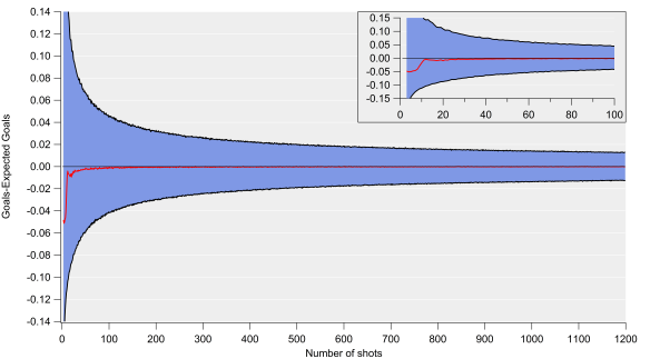
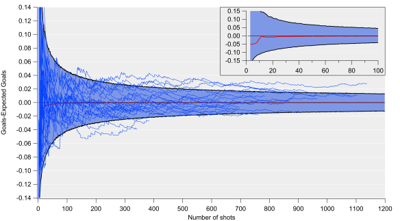
Below are various figures exploring how well expected goals matches up with actual goals. These are based on an expected goal model that I’ve been working on, the details of which aren’t too relevant here (I’ve tested this on various models with different levels of complexity and the results are pretty consistent). The figures plot the differences between the total number of goals and expected goals when looking at certain numbers of shots. These residuals are calculated via bootstrap resampling, which works by randomly extracting groups of shots from the data-set and calculating actual and expected goal totals and then seeing how large the difference is.

The top plot is for 500 shot samples, which equates to the number of shots that a decent shots team might take over a Premier League season. The residuals show a very narrow distribution, which closely resembles a Gaussian or normal distribution, with the centre of the peak being very close to zero i.e. goal and expected goal values are on average very similar over these shot sample sizes. There is a slight tendency for expected goals to under-predict goals here, although the difference is quite minor over these samples (2.6 goals over 500 shots). The take home from this plot is that we would anticipate expected and actual goals for an average team being approximately equivalent over such a sample (with some level of randomness and bias in the mix).
The middle plot is for samples of 50 shots, which would equate to around 3-6 matches at the team level. The distribution is quite similar to the one for 500 shots but the width is quite a lot wider; we would therefore expect random variation to play a larger role over this sample than the 500 shot sample, which would manifest itself in teams or players over or under-performing their expected goal numbers. The other factor at play will be aspects not accounted for by the model, which may be more important over smaller samples but even out more over larger ones.
One of these things is not like the others
The bottom plot is for samples of 13 shots, which equates to the approximate average number of shots by a team in an individual match. This is where expected goals starts having major issues; the distributions are very wide and it also has multiple local maximums. What that means is that over a single match, expected goal totals can be out by a very large amount (routinely exceeding more than one goal) and that the total estimates are pretty poor over these small samples.
Such large residuals aren’t entirely unexpected but the multiple peaks make reporting a ‘best’ estimate extremely troublesome.
I tested these results using some other publicly available expected goal estimates (kudos to American Soccer Analysis and Paul Riley for publishing their numbers) and found very similar results. I also did a similar exercise using whole match totals rather than individual shots and found similar.
I also checked that this wasn’t a result of differing scorelines when each shot was taken (game state as the analytics community calls it) by only looking at shots when teams were level – the results were the same, so I don’t think you can put this down to differences in game state. I suspect this is just a consequence of elements of football that aren’t accounted for by the model, which are numerous; such things appear to even out over larger samples (over 20 shots, the distributions look more like the 50 and 500 shot samples). As a result, teams/matches where the number of shots is larger will have more reliable estimates (so take figures involving Manchester United with a chip-shop load of salt).
Essentially, expected goal estimates are quite messy over single matches and I would be very wary of saying that a team should have scored or conceded a certain number of goals.
Busted?
So, is that it for expected goals over a single match? While I think there are a lot of issues based on the results above, it can still illuminate upon the balance of play in a given match. If you’ve made it this far then I’m assuming you agree that metrics and observations that go beyond the final scoreline are potentially useful.
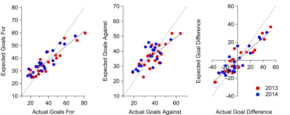
In the figure below, I’ve averaged actual goal difference from individual matches into expected goal ‘buckets’. I excluded data beyond +/- two expected goals as the sample size was quite small, although the general trends continues. Averaging like this hides a lot of details (as partially illustrated above) but I think it broadly demonstrates how the two match up.
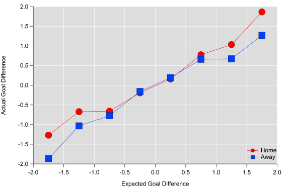
Actual goals compared to expected goals for single matches when binned into 0.5 xG buckets.
The figure also illustrates that ‘winning’ the expected goals (xG difference greater than 1) doesn’t always mean winning the actual goal battle, particularly for the away team. James Yorke found something similar when looking at shot numbers. Home teams ‘scoring’ with a 1-1.5 xG advantage outscore their opponents around 66% of the time based on my numbers but this drops to 53% for away teams; away teams have to earn more credit than home teams in order to translate their performance into points.
What these figures do suggest though is that expected goals are a useful indicator of quality over a single match i.e. they do reflect the balance of play in a match as measured by the volume and quality of chances. Due to the often random nature of football and the many flaws of these models, we wouldn’t expect a perfect match between actual and expected goals but these results suggest that incorporating these numbers with other observations from a match is potentially a useful endeavour.
Summary
Don’t say:
Team x should have scored y goals today.
Do say:
Team x’s expected goal numbers would typically have resulted in the following…here are some observations of why that may or may not be the case today.