Identifying and assessing team-level strategies: 2017 OptaPro Forum Presentation

At the recent OptaPro Analytics Forum, I was honoured to be selected to present for a second time to an audience of analysts and other representatives from the sporting industry. My aim was to explore the multifaceted approaches employed by teams using cluster analysis of possession chains.

My thinking was that this could be used to assess the strengths and weaknesses of teams in both attack and defense, which could be used for opposition scouting. The results can also be used to evaluate how well players contribute to certain styles of play and potentially use this in recruitment.

The video of the presentation is below, so go ahead and watch it for more details. The slides are available here and I’ve pulled out some of the key graphics below.

The main types of attacking moves that result in shots are in the table below. I used the past four full English Premier League seasons plus the current 2016/17 season for the analysis here but an obvious next step is to expand the analysis across multiple leagues.

Cluster Profile Summary.png

Below is a comparison of the efficiency (in terms of shot conversion) and frequency of these attack types. The value of regaining the ball closer to goal and quickly transitioning into attack is clear, while slower or flank-focussed build-up is less potent. Much of the explanation for these differences in conversion rate can be linked to the distance from which such shots are taken on average.

An interesting wrinkle is the similarity in conversion rates between the ‘deep build-up’ and ‘deep fast-attacks’ profiles, with shots taken in the build-up focussed profile being approximately 2 yards further away from goal on average than the faster attacks. Looking through examples of the ‘deep build-up’ attacks, these are often characterised by periods of ball circulation in deeper areas followed by a quick transition through the opposition half towards goal with the opposition defense caught higher up the pitch, which may explain the results somewhat.

EfficiencyVsFrequency

Finally, here is a look at how attacking styles have evolved over time. The major changes are the decline in ‘flank-focussed build-up’ and increase in the ‘midfield regain & fast attack’ profile, which is perhaps unsurprising given wider tactical trends and the managerial changes over the period. There is also a trend in attacks from deep being generated from faster-attacks rather than build-up focussed play. A greater emphasis on transitions coupled with fast/direct attacking appears to have emerged across the Premier League.

EPL_ProfileTimeline

These are just a few observations and highlights from the presentation and I’ll hopefully put together some more team and player focussed work in the near future. It has been nearly a year since my last post but hopefully I’ll be putting out a steadier stream of content over the coming months.

Advertisement

Leicester City: Need for Speed?

Originally published on StatsBomb.

Leicester City’s rise to the top of the Premier League has led to many an analysis by now. Reasons for their ascent have mainly focused on smart recruitment and their counter-attacking style of play, as well as a healthy dose of luck. While their underlying defensive numbers leave something to be desired, their attack is genuinely good. The pace and directness of their attack has regularly been identified as a key facet of their style by writers with analytical leanings.

Analysis by Daniel Altman has been cited in both the Economist and the Guardian, with the crux being that the ‘key’ to stopping Leicester is to ‘slow them down’. Using slightly different metrics, David Sumpter illustrated this further at the recent Opta Pro Forum and on the Sky Sports website, where his analysis surmised that:

For Leicester, it’s about the speed of the attack.

An obvious and somewhat unaddressed question here is whether the pace of Leicester’s attack is the key to their increased effectiveness this season? Equating style with success in football is often a fraught exercise; the often tedious and pale imitations of Guardiola’s possession-orientated approach being a recent example across football.

Below are a raft of numbers comparing various facets of Leicester’s style and effectiveness this season with last season.

LCFC_Summary_Table.png

Comparison between Leicester City’s speed of attack and shot profile from ‘fast’ possessions. A possession is a passage of play where a team maintains unbroken control of the ball. Possessions moving at greater than 5 m/s on average are classed as ‘fast’. All values are for open-play possessions only. Data via Opta.

The take home message here is that the average pace of Leicester’s play has barely shifted this season compared to last. Only Burnley in 2014/15 and Aston Villa in 2013/14 have attacked at a greater pace than Leicester this season over the past four years.

The proportion of their shots generated via fast paced possessions has risen this year (from 27.5% to 32.1%) and Leicester currently occupy the top position by this metric over this period. In terms of counter-attacking situations, their numbers have barely changed this season (20.1%) compared to last season (20.8%), with only the aforementioned Aston Villa having a greater proportion (21.3%) than them in my dataset.

What has altered is the effectiveness of their attacks this season, as we can see that their expected goal figures have risen. Below are charts comparing their shots from counter-attacking situations, where we can see more shots in the central zone of the penalty area this season and several better quality chances.

LCFC_CounterAttack_Shots.png

Comparison of Leicester City’s shots from ‘fast’ and ‘deep’ attacks in 2014/15 and 2015/16. Points are coloured by their expected goal value (red = higher xG, lighter = lower xG). Any resemblance to the MK Shot Maps is entirely intentional. Data via Opta.

Their improvement this year sees them currently rank first and second in expected goals per game from fast-attacks and counter-attacks respectively over the past four season (THAT Liverpool team rank second and first). Based on my figures, Leicester’s goals from these situations are closely in line with expectations also (N.B. my expected goal model doesn’t explicitly account for counter-attacking moves).

The figure below shows how this has evolved over the past two seasons, where we see fast-attacks helping drive their improved attack at the end of 2014/15, which continued into this season. There has been a gradual decline since an early-season peak, although their expected goals from fast-attacks has reduced more than their overall attacking output in open-play, indicating some compensation from other forms of attack.

LCFC_CA_TimeLine

Rolling ten-match samples of Leicester City’s expected goals for in 2014/15 and 2015/16. All data is for open-play shots only. Data via Opta.

The effectiveness of these attacks has gone a long way to improving Leicester’s offensive numbers. According to my expected goal figures in open-play, they’ve improved from 0.70 per game to 0.94 per game this season. About half of that improvement has come from ‘fast’ paced possessions, with many of these possessions starting from deep areas in their own half.

Examining the way these chances are being created highlights that Leicester are completing more through-balls during their build-up play this season. The absolute numbers are small, with an increase from 11 to 17 through-balls during ‘fast’ possessions and from 6 to 12 during ‘fast’ possessions from their own half, but they do help to explain the increased effectiveness of their play. Approximately 27% of their shots from counter-attacks include a through-ball during their build-up this season, compared to just 11% last season. Through-balls are an effective means of opening up space and increasing the likelihood of scoring during these fast-paced moves. Leicester’s counter-attacks are also far less reliant on crosses this season, with just 2 of these attacks featuring a cross during build-up compared to 9 last season, which will further increase the likelihood of scoring.

Speed is an illusion. Leicester’s doubly so.

Overall, attacking at pace is a difficult skill to master but the rewards can be high. The pace and verve of Leicester’s attack has been eye-catching but it is the execution of these attacks, rather than the actual speed of them that has been the most important factor. Slowing Leicester down isn’t the key to stopping them, rather the focus should be either on denying them those potential counter-attacking situations or diluting their impact should you find yourself on the receiving end of one.

Whether they can sustain their attacking output from these situations is a difficult question to answer. If we examine how well output is maintained from one year to the next, the correlation for expected goals from counter-attacks is reasonable (0.55), while goal expectation per shot is lower (0.30). Many factors will determine the values here, not least the relatively small number of shots per season of this type, as well as a host of other intrinsic football factors. For fast-attacks, the correlations rise to 0.59 for expected goals and 0.52 for expected goals per shot. For comparison, the values for all open-play shots in my data-set are 0.91 and 0.63.

Examining the data in a little more depth suggests that the better counter-attacking and/or fast-paced teams tend to maintain their output, particularly if they retain managerial and squad continuity. Leicester have a good attack overall that is excellent at exploiting space with fast-attacking moves.

Retaining and perhaps even supplementing their attacking core over the summer would likely go a long way to maintaining a style of play that has brought them rich rewards.


Counting counters

Over on StatsBomb, I’ve written about Leicester’s attacking exploits this season, specifically focusing on the style and effectiveness of their attack. That required a fair amount of research into various aspects relating to the speed and directness of teams attacks, which I’ve looked into since I started looking at possessions and expected goals.

One output of all that is a bunch of numbers at the team and player level stretching back over the past four seasons about fast-attacks and counter-attacks, some of which I will post below along with some comments.

As a brief reminder, a possession is a passage of play where a team maintains unbroken control of the ball. I class a possession moving at greater than 5 m/s on average as ‘fast’ based on looking at a bunch of diagnostics relating to all possessions i.e. not just those ending with a shot. The final number is fairly arbitrary as I just went with a round number rather than a precisely calculated one but the interpretation of the results didn’t shift much when altering the boundary. Looking at the data, there is probably some separation into slow attacks (<2 m/s), medium-paced attacks (2-5 m/s) and then the fast attacks (>5 m/s). Note that some attacks go away from goal, so they end up with a negative speed (technically I’m calculating velocity here but I’ll leave that for another time), so these are attacks towards the goal.

Counter-attacks are when these fast-paced moves begin in a teams own half. Again this is fairly arbitrary from a data point-of-view but it at least fits in with what I think most would consider to be a counter-attack and it’s very easy to split the data into narrower bands in future.

I should add that Michael Caley has published analysis and data relating to counter-attacking, although he is apparently in the process of revising these.

All of the numbers below are based on my expected goals model using open-play shots only. I don’t include a speed of attack or counter-attacking adjustment in my model.

So, without further ado, here are some graphs…

Top-20 offensive fast-attacking teams

Fast_xGfor_Top20.png

Top 20 teams in terms of fast-attacking expected goals for over the past four seasons.

Champions Elect Leicester City sit atop the pile with a reasonable gap on THAT Liverpool team, with a fairly big drop to the chasing pack behind. Arsenal and Manchester City are quite well represented here illustrating the diversity of their attacks – while both are typically among the slowest teams on average, they can step it up effectively when presented with the opportunity.

Top-20 offensive counter-attacking teams

Counter_xGfor_Top20.png

Top 20 teams in terms of counter-attacking expected goals for over the past four seasons.

Number one isn’t a huge shock, with this years Leicester City narrowly ahead of the 12/13 iteration of Liverpool. A lot of the same teams are found in both the fast-attacking and counter-attacking brackets, which isn’t a great surprise perhaps.

Southampton this year are perhaps a little surprising and it is a big shift from previous seasons (0.056-0.075 per game), although I’ll admit I haven’t paid them that much attention this year. Their defense is the 6th worst in this period on counter-attacks also (3rd worst on fast-attacks). When did Southampton become a basketball team?

What is particularly noticeable is the prevalence of teams from the past two seasons in the top-10. A trend towards more-transition orientated play? Something to examine in more detail at another time perhaps.

Top-20 defensive fast-attacking teams

Fast_xGagainst_Top20.png

Top 20 teams in terms of fast-attacking expected goals against over the past four seasons.

Most of the best performances on the defensive side are from the 12/13 and 13/14 seasons, which might give some credence to a greater emphasis more recently on transitions along with an inability to cope with them.

The list overall is populated by the relative mainstays of Manchester City, Liverpool and West Brom along with various fingerprints from Mourinho, Warnock and Pulis

Top-20 defensive counter-attacking teams

Counter_xGagainst_Top20

Top 20 teams in terms of counter-attacking expected goals against over the past four seasons.

Interestingly there is a greater diversity between the counter-attacking and fast-attacking metrics on the defensive side of the ball than on the offensive side, which might point to potential strengths and/or weaknesses in certain teams.

Spurs last season rank as the worst defensive side in terms of counter-attacking expected goals against, and are narrowly beaten into second spot for fast-attacks by the truly awful 2012/13 Reading team.

Top-20 fast-attacking players

Fast_Players_Top20

Top 20 players in terms of fast-attacking expected goals per 90 minutes over the past four seasons. Minimum 2,700 minutes played.

Lastly, we’ll take a quick look at players. For now, I’m just isolating the player who took the shot, rather than those who participated in the build-up to the goal. A lot of this will be tied up in playing style and team effects.

Jamie Vardy is clearly the standout name here, followed by Daniel Sturridge and Danny Ings. Sturridge leads the chart in terms of actual goals with 0.21 goals per 90 minutes, with Vardy third on 0.18.

Vardy’s overall open-play expected goals per 90 minutes stands at 0.26 by my numbers over the past two seasons, so over half of his xG per 90 comes from getting on the end of fast-attacking moves. He sits in 16th place over all for those with over 2,700 minutes played, which is respectable but he is clearly elite when it comes to faster-paced attacks.

Top-20 counter-attacking players

Counter_Players_Top20.png

Top 20 players in terms of counter-attacking expected goals per 90 minutes over the past four seasons. Minimum 2,700 minutes played.

Danny Ings sits on top when it comes to counter-attacking, which bodes well for his future under Jürgen Klopp at Liverpool, providing his injury hasn’t unduly affected him. Again, Sturridge leads the list in terms of actual goals with 0.13 per 90 minutes, with Vardy second on 0.12. The sample sizes are lower here, so we would expect a greater degree of variance in terms of the comparison between reality and expectation.

One of the interesting things when comparing these lists is the divergence and/or similarities between the overall goal scorer chart. For example, Edin Džeko and Wilfried Bony sit in first and fourth place respectively in the overall table for this period but lie outside the top-20 when it comes to faster-paced attacks. A clear application of this type of work is player profiling to fit the particular style and needs of a prospective team, which Paul Riley has previously shown to be a useful method for evaluating forwards.

Moving forward

I wanted to post these as a starting point for discussion before I drill down further into the details in the future. The data presented here and that underlying it are very rich in detail and potential applications, which I have already started to explore. In particular, there is a lot of spatial information encapsulated in the data that can inform how teams attack and defend, which can help to build further descriptive elements to team styles along side measures of their effectiveness.

I’ll keep you posted.

Fools Gold: xG +/-

Football is a complex game that has many facets that are tough to represent with numbers. As far as public analytics goes, the metrics available are best at assessing team strength, while individual player assessments are strongest for attacking players due to their heavy reliance on counting statistics relating to on-the-ball numbers. This makes assessing defenders and goalkeepers a particular challenge as we miss the off-ball positional adjustments and awareness that marks out the best proponents of the defensive side of the game.

One potential avenue is to examine metrics from a ‘top-down’ perspective i.e. we look at overall results and attempt to untangle how a player contributed to that result. This has the benefit of not relying on the incomplete picture provided by on-ball statistics but we do lose process level information on how a player contributes to overall team performance (although we could use other methods to investigate this).

As far as football is concerned, there are a few methods that aim to do this, with Goalimpact being probably the most well-known. Goalimpact attempts to measure ‘the extent that a player contributes to the goal difference per minute of a team’ via a complex method and impressively broad dataset. Daniel Altman has a metric based on ‘Shapley‘ values that looks at how individual players contribute to the expected goals created and conceded while playing.

Outside of football, one of the most popular statistics to measure player contribution to overall results is the concept of plus-minus (or +/-) statistics, which is commonly used within basketball, as well as ice hockey. The most basic of these metrics simply counts the goals or points scored and conceded while a player is on the pitch and comes up with an overall number to represent their contribution. There are many issues with such an approach, such as who a player is playing along side, their opponent and the venue of a match; James Grayson memorably illustrated some of these issues within football when WhoScored claimed that Barcelona were a better team without Xavi Hernández.

Several methods exist in other sports to control for these factors (basically they add in a lot more maths) and some of these have found their way to football. Ford Bohrmann and Howard Hamilton had a crack at the problem here and here respectively but found the results unsatisfactory. Martin Eastwood used a Bayesian approach to rate players based on the goal difference of their team while they are playing, which came up with more encouraging results.

Expected goals

One of the potential issues with applying plus-minus to football is the low scoring nature of the sport. A heavily influential player could play a run of games where his side can’t hit the proverbial barn door, whereas another player could be fortunate to play during a hot-streak from one of his fellow players. Goal-scoring is noisy in football, so perhaps we can utilise a measure that irons out some of this noise but still represents a good measure of team performance. Step forward expected goals.

Instead of basing the plus-minus calculation on goals, I’ve used my non-shot expected goal numbers as the input. The method splits each match into separate periods and logs which players are on the pitch at a given time. A new segment starts when a lineup changes i.e. when a substitution occurs or a player is sent off. The expected goals for each team are then calculated for each period and converted to a value per 90 minutes. Each player is a ‘variable’ in the equation, with the idea being that their contribution to a teams expected goal difference can be ‘solved’ via the regression equation.

For more details on the maths side of plus-minus, I would recommend checking out Howard Hamilton’s article. I used ridge regression, which is similar to linear regression but the calculated coefficients tend to be pulled towards zero (essentially it increases bias while limiting huge outliers, so there is a tradeoff between bias and variance).

As a first step, I’ve calculated the plus-minus figures over the previous three English Premier League seasons (2012/13 to 2014/15). Every player that has appeared in the league is included as I didn’t find there was much difference when excluding players under a certain threshold of minutes played (this also avoids having to include such players in some other manner, which is typically done in basketball plus-minus). However, estimates for players with fewer than approximately 900 minutes played are less robust.

The chart below shows the proportion of players with a certain plus-minus score per 90 minutes played. As far as interpretation goes, if we took a team made up of 11 players, each with a plus-minus score of zero, the expected goal difference of the team would add up to zero. If we then replaced one of the players with one with a plus-minus of 0.10, the team’s expected goal difference would be raised to 0.10.

PM_Dist.png

Distribution of xG plus-minus scores.

The range of plus-minus scores is from -0.15 to 0.15, so replacing a player with a plus-minus score of zero with one with a score of 0.15 would equate to an extra 5.7 goals over a Premier League season. Based on this analysis by James Grayson, that would equate to approximately 3.5-4.0 points over a season on average. This is comparable to figures published relating to calculations based on the Goalimpact metric system discussed earlier. That probably seems a little on the low side for what we might generally assume would be the impact of a single player, which could point towards the method either narrowing the distribution too much (my hunch) or an overestimate in our intuition. Validation will have to wait for another day

Most valuable players

Below is a table of the top 13 players according to the model. Vincent Kompany is ranked the highest by this method; on one hand this is surprising given the often strong criticism that he receives but then on the other, when he is missing, those replacing him in Manchester City’s back-line look far worse and the team overall suffers. According to my non-shots xG model, Manchester City have been comfortably the best team over the previous three seasons and are somewhat accordingly well-represented here.

xG_PM_Top10_Table

Top 13 players by xG plus-minus scores for the 2012/13-2014/15 Premier League seasons. Minimum minutes played was 3420 i.e. equivalent to a full 38 match season.

Probably the most surprising name on the list is at number three…step forward Joe Allen! I doubt even Joe’s closest relatives would rate him as the third best player in the league but I think that what the model is trying to say here is that Allen is a very valuable cog who improves the overall performance level of the team. Framed in that way, it is perhaps slightly more believable (if only slightly) that his skill set gets more out of his team mates. When fit, Allen does bring added intelligence to the team and as a Liverpool fan, ‘intelligence’ isn’t usually a word I associate with the side. Highlighting players who don’t typically stand-out is one of the goals of this sort of analysis, so I’ll run with it for now while maintaining a healthy dose of skepticism.

I chose 13 as the cutoff in the table so that the top goalkeeper on the list, Hugo Lloris, is included so that an actual team could be put together. Note that this doesn’t factor in shot-stopping (I’ve actually excluded rebound shots, which might have been one way for goalkeepers to influence the scores more directly), so the rating for goalkeepers should be primarily related to other aspects of goalkeeping skills. Goalkeepers are probably still quite difficult to nail down with this method due to them rarely missing matches though, so there is a fairly large caveat with their ratings.

Being as this is just an initial look, I’m going to hold off on putting out a full list but I definitely will do in time once I’ve done some more validation work and ironed out some kinks.

Validation, Repeatability & Errors

Fairly technical section. You’ve been warned.

One of the key facets of using ridge regression is choosing a ‘suitable’ regularization parameter, which is what controls the bias-to-variance tradeoff; essentially larger values will pull the scores closer to zero. Choosing this objectively is difficult and in reality, some level of subjectivity is going to be involved at some stage of the analysis. I did A LOT of cross-validation analysis where I split the match segments into even and odd sets and ran the regression while varying a bunch of parameters (e.g. minutes cutoff, weighting of segment length, the regularization value). I then looked at the error between the regression coefficients (the player plus-minus scores) in the out-of-sample set compared to the in-sample set to choose my parameters. For the regularization parameter, I chose a value of 50 as that was where the error reached a minimum initially with relatively little change for larger values.

I also did some repeatability testing comparing consecutive seasons. As is common with plus-minus, the repeatability is very limited. That isn’t much of a surprise as the method is data-hungry and a single season doesn’t really cut it for most players. The bias introduced by the regularization doesn’t help either here. I don’t think that this is a death-knell for the method though, given the challenges involved and the limitations of the data.

In the table above, you probably noticed I included a column for errors, specifically the standard error. Typically, this has been where plus-minus has fallen down, particularly in relation to football. Simply put, the errors have been massive and have rendered interpretation practically impossible e.g. the errors for even the most highly rated players have been so large that statistically speaking it has been difficult to evaluate whether a player is even ‘above-average’.

I calculated the errors from the ridge regression via bootstrap resampling. There are some issues with combining ridge regression and bootstrapping (see discussion here and page 18 here) but these errors should give us some handle on the variability in the ratings.

You can see above that the errors are reasonably large, so the separation between players isn’t as good as you would want. In terms of their magnitude relative to the average scores, the errors are comparable to those I’ve found published for basketball. That provides some level of confidence as they’ve been demonstrated to have genuine utility there. Note that I’ve not cherry-picked the players above in terms of their standard errors either; encouragingly the errors don’t show any relationship with minutes played after approximately 900 minutes.

The gold road’s sure a long road

That is essentially it so far in terms of what I’m ready to share publicly. In terms of next steps, I want to expand this to include other leagues so that the model can keep track of players transferring in and out of a league. For example, Luis Suárez disappears when the model reaches the 2014/15 season, when in reality he was settling in quite nicely at Barcelona. That likely means that his rating isn’t a true reflection of his overall level over the period.

Evaluating performance over time is also a big thing I want to be able to do; a three year average is probably not ideal, so either some weighting for more recent seasons or a moving two season window would be better. This is typically what has been done in basketball and based on initial testing, it doesn’t appear to add more noise to the results.

Validating the ratings in some fashion is going to be a challenge but I have some ideas on how to go about that. One of the advantages of plus-minus style metrics is that they break-down team level performance to the player level, which is great as it means that adding the players back up into a team or squad essentially correlates perfectly with team performance (as represented by expected goals here). However, that does result in a tautology if the validation is based on evaluating team performance unless there are fundamental shifts in team makeup e.g. a large number of transfers in and out of a squad or injuries to key personnel.

This is just a start, so there will be more to come over time. The aim isn’t to provide a perfect representation of player contribution but to add an extra viewpoint to squad and player evaluation. Combining it with other data analysis and scouting would be the longer-term goal.

I’ll leave you with piano carrier extradionaire, Joe Allen.

Joe_Allen

Joe Allen on hearing that he is Liverpool’s most important player over the past three years.

Not quite the same old Arsenal

The narrative surrounding Arsenal has been strong this week, with their fall to fourth place in the table coming on Groundhog Day no less. This came despite a strong second half showing against Southampton, with Fraser Forster denying them. Arsenal’s season has been characterised by several excellent performances in terms of expected goals but the scoreline hasn’t always reflected their statistical dominance. Colin Trainor illustrated their travails in front of goal in this tweet.

I wrote in this post on how Arsenal’s patient approach eschews more speculative shots in search of high quality chances and that this was seemingly more pronounced this season. Arsenal are highly rated by expected goal models this season but traditional shot metrics are nowhere near as convinced.

Analytical folk will point to the high quality of Arsenal’s shots this season to explain the difference, where quality is denoted by the average probability that a shot will be scored. For example, a team with an average shot quality of 0.10 would ‘expect’ to score around 10% of their shots taken.

In the chart below, I’ve looked at the full distribution of Arsenal’s shots in open-play this season in terms of ‘shot quality’ and compared them with their previous incarnations and peers from the 2012/13 season through to the present. Looking at shot quality in this manner illustrates that the majority of shots are of relatively low quality (less than 10% chance of being scored) and that the distribution is heavily-skewed.

ShotQualFor_Arsenal

Proportion of total shots in open-play according to the probability of them being scored (expected goals per shot). Grey lines are non-Arsenal teams from the English Premier League from 2012/13 to the present. Blue lines are previous Arsenal teams, while red is Arsenal from this season. Data via Opta.

In terms of Arsenal, what stands out here is that their current incarnation are taking a smaller proportion of ‘low-quality’ shots (those with an expected goal estimate from 0-0.1) than any previous team by a fairly wide margin. At present, 59% of Arsenal’s shots reside in this bracket, with the next lowest sitting at 64%. Their absolute number of shots in this bracket has also fallen compared to previous seasons.

Moving along the scale, Arsenal reside along the upper edge in terms of these higher quality shots and actually have the largest proportion in the 0.2-0.3 and 0.3-0.4 ranges. As you would expect, they’ve traded higher quality shots for lower quality efforts according to the data.

Arsenal typically post above average shot quality figures but the shift this season appears to be significant. The question is why?

Mesut Özil?

One big change this season is the sustained presence (and excellence) of Mesut Özil; so far this season he has made 22 appearances (playing in 88% of available minutes) compared to 22 appearances last season (54%) and 26 matches in his debut season (63%). According to numbers from the Football in the Clouds website, his contribution to Arsenal’s shots while he is on the pitch is at 40% compared to 30% in 2014/15. Daniel Altman also illustrated Özil’s growing influence in his post in December.

Özil is the star that Arsenal’s band of attacking talent orbits, so it is possible that he is driving this focus on quality via his creative skills. His attacking contribution in terms of shots and shot-assists is among the highest in the league but is heavily-skewed towards assisting others, which is unusual among high-volume contributors.

Looking at the two previous seasons though, there doesn’t appear to be any great shift in Arsenal’s shot quality during the periods when Özil was out of the team through injury. His greater influence and regular presence in the side this season has probably shifted the dial but quantifying how much would require further analysis.

Analytics?

Another potential driver could be that Wenger and his coaching staff have attempted to adjust Arsenal’s tactics/style with a greater focus on quality.

Below is a table of Arsenal’s ‘volume’ shooters over the past few seasons, where I’ve listed their number of shots from outside of the box per 90 minutes and the proportion of their shots from outside the box. Note that these are for all shots, so set-pieces are included but it shouldn’t skew the story too much.

Arsenal_OoB_Shots_Table
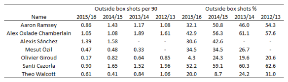
The general trend is that Arsenal’s players have been taking fewer shots from outside of the box this season compared to previous and that there has been a decline proportionally for most players also. Some of that may be driven by changing roles/positions in the team but there appears to be a clear shift in their shot profiles. Giroud for example has taken just 3 shots from outside the box this season, which is in stark contrast to his previous profile.

Given the data I’ve already outlined, the above isn’t unexpected but then we’re back to the question of why?

Wenger has mentioned expected goals on a few occasions now and has reportedly been working more closely with the analytics team that Arsenal acquired in 2012. Given his history and reputation, we can be relatively sure that Wenger would appreciate the merits of shot quality; could the closer working relationship and trust developed with the analytics team have led to him placing an even greater emphasis on seeking better shooting opportunities?

The above is just a theory but the shift in emphasis does appear to be significant and is an interesting feature to ponder.

Adjusted expectations?

Whatever has driven this shift in Arsenal’s shot profile, the change is quite pronounced. From an opposition strategy perspective, this presents an interesting question: if you’re aware of this shift in emphasis, whether through video analysis or data, do you alter your defensive strategy accordingly?

While Arsenal’s under-performance in terms of goals versus expected goals currently looks like a case of variance biting hard, could this be prolonged if their opponents adjust? It doesn’t look like their opponents have altered tactics thus far based on examining the data but having shifted the goalposts in terms of shot quality, could this be their undoing?

Shooting the breeze

Who will win the Premier League title this season? While Leicester City and Tottenham Hotspur have their merits, the bookmakers and public analytics models point to a two-horse race between Manchester City and Arsenal.

From an analytics perspective, this is where things get interesting, as depending on your metric of choice, the picture painted of each team is quite different.

As discussed on the recent StatsBomb podcast, Manchester City are heavily favoured by ‘traditional’ shot metrics, as well as by combined team ratings composed of multiple shooting statistics (a method pioneered by James Grayson). Of particular concern for Arsenal are their poor shot-on-target numbers.

However, if we look at expected goals based on all shots taken and conceded, then Arsenal lead the way: Michael Caley has them with an expected goal difference per game of 0.98, while City lie second on 0.83. My own figures in open-play have Arsenal ahead but by a narrower margin (0.69 vs 0.65); Arsenal have a significant edge in terms of ‘big chances’, which I don’t include in my model, whereas Michael does include them. Turning to my non-shots based expected goal model, Arsenal’s edge is extended (0.66 vs 0.53). Finally, Paul Riley’s expected goal model favours City over Arsenal (0.88 vs 0.69), although Spurs are actually rated higher than both. Paul’s model considers shots on target only, which largely explains the contrast with other expected goal models.

Overall, City are rated quite strongly across the board, while Arsenal’s level is more mixed. The above isn’t an exhaustive list of models and metrics but the differences between how they rate the two main title contenders is apparent. All of these metrics have demonstrated utility at making in-season predictions but clearly assumptions about the relative strength of these two teams differs between them.

The question is why? If we look at the two extremes in terms of these methods, you would have total shots difference (or ratio, TSR) at one end and non-shots expected goals at the other i.e. one values all shots equally, while the other doesn’t ‘care’ whether a shot is taken or not.

There likely exists a range of happy mediums in terms of emphasising the taking of shots versus maximising the likelihood of scoring from a given attack. Such a trade-off likely depends on individual players in a team, tactical setup and a whole other host of factors including the current score line and incentives during a match.

However, a team could be accused of shooting too readily, which might mean spurning a better scoring opportunity in favour of a shot from long-range. Perhaps data can pick out those ‘trigger-happy’ teams versus those who adopt a more patient approach.

My non-shots based expected goal model evaluates the likelihood of a goal being scored from an individual chain of possession. If I switch goals for shots in the maths, then I can calculate the probability that a possession will end with a shot. We’ll refer to this as ‘expected shots’.

I’ve done this for the 2012/13 to 2014/15 Premier League seasons. Below is the data for the actual versus expected number of shots per game that each team attempted.

xShots_historic_AVB

Actual shots per game compared with expected shots per game. Black line is the 1:1 line. Data via Opta.

We can see that the model does a reasonable job of capturing shot expectation (r-squared is at 0.77, while the mean absolute error is 0.91 shots per game). There is some bias in the relationship though, with lower shot volume teams being estimated more accurately, while higher shot volume sides typically shoot less than expected (the slope of the linear regression line is 0.79).

If we take the model at face value and assume that it is telling a reasonable approximation of the truth, then one interpretation would be that teams with higher expected shot volumes are more patient in their approach. Historically these have been teams that tend to dominate territory and possession such as Manchester City, Arsenal and Chelsea; are these teams maintaining possession in the final third in order to take a higher value shot? It could also be due to defenses denying these teams shooting opportunities but looking at the figures for expected and actual shots conceded, the data doesn’t support that notion.

What is also clear from the graph is that it appears to match our expectations in terms of a team being ‘trigger-happy’ – by far the largest outlier in terms of actual shots minus expected shots is Tottenham Hotspurs’ full season under André Villas-Boas, a team that was well known for taking a lot of shots from long-range. We also see a decline as we move into the 2013/14 season when AVB was fired after 16 matches (42% of the full season) and then the 2014/15 season under Pochettino. Observations such as these that pass the ‘sniff-test’ can give us a little more confidence in the metric/method.

If we move back to the season at hand, then we see some interesting trends emerge. Below I’ve added the data points for this current season and highlighted Arsenal, Manchester City, Liverpool and Tottenham (the solid black outlines are for this season). Throughout the dataset, we see that Arsenal have been consistently below expectations in terms of the number of shots they attempt and that this is particularly true this season. City have also fallen below expectations but to a smaller extent than Arsenal and are almost in line with expectations this year. Liverpool and Tottenham have taken a similar number of shots but with quite different levels of expectation.

xShots_Historic_plus_Current

Actual shots per game compared with expected shots per game. Black line is the 1:1 line. Markers with solid black outline are for the current season. Data via Opta.

None of the above indicates that there is a better way of attempting to score but I think it does illustrate that team style and tactics are important factors in how we build and assess metrics. Arsenal’s ‘pass it in the net’ approach has been known (and often derided) ever since they last won the league and it is quite possible that models that are more focused on quality in possession will over-rate their chances in the same way that focusing on just shots would over-rate AVB’s Spurs. Manchester City have run the best attack in the league over the past few seasons by combining the intricate passing skills of their attackers with the odd thunder-bastard from Yaya Touré.

The question remains though: who will win the Premier League title this season? Will Manchester City prevail due to their mixed-approach or will Arsenal prove that patience really is a virtue? The boring answer is that time will tell. The obvious answer is Leicester City.

Unexpected goals

A sumptuous passing move ends with the centre forward controlling an exquisite through-ball inside the penalty area before slotting the ball past the goalkeeper.

Rewind.

A sumptuous passing move ends with the centre forward controlling an exquisite through-ball inside the penalty area before the goalkeeper pulls off an incredible save.

Rewind.

A sumptuous passing move ends with the centre forward controlling an exquisite through-ball inside the penalty area before falling on his arse.

giphy

Source: Giphy

Rewind.

Events in football matches can take many turns that will affect the overall outcome, whether it be a single event, a match or season. In the above examples, the centre forward has received the ball in a super-position but what happens next varies drastically.

Were we to assess the striker or his team, traditional analysis would focus on the first example as goals are the currency of football. The second example would appeal to those familiar with football analytics, which has illustrated that the scoring of goals is a noisy endeavour that can be potentially misleading; focusing on shots and/or the likelihood of a shot being scored is the foundation of many a model to assess players and teams. The third example will often be met with a shrug and a plethora of gifs on social media.

This third example is what I want to examine here by building a model that accounts for these missed opportunities to take a shot.

Expected goals

Expected goals are a hugely popular concept within football analytics and are becoming increasingly visible outside of the air-conditioned basements frequented by analysts. The fundamental basis of expected goals is assigning a value to the chances that a team create or concede.

Traditionally, such models have focused on shots, building upon earlier work relating to shots and shots on target. Many models have sprung up over the past few years with Michael Caley and Paul Riley models being probably the most prominent, particularly in terms of publishing their methods and results.

More recently, Daniel Altman presented a model that went ‘beyond shots‘, which aimed to value not just shots but also attacking play that moved the ball into dangerous areas. Various analysts, including myself, have looked at the value of passing in a similar vein e.g. Dustin Ward and Sam Gregory have looked at dangerous passing here and here respectively.

Valuing possession

The model that I have built is essentially a conversion of my dangerous possession model. Each sequence of possession that a team has is classified according to how likely a goal is to be scored.

This is based on a logistic regression that includes various factors that I will outline below. The key thing is that this is based on all possessions, not just those ending with shots. The model is essentially calculating the likelihood of a shot occurring in a given position on the field and then estimating the probability of a potential shot being scored. Consequently, we can put a value on good attacking (or poor defending) that doesn’t result in a shot being taken.

I’ve focused on open-play possessions here and the data is from the English Premier League from 2012/13-2014/15..

Below is a summary of the major location-related drivers of the model.

xG_factors

Probability of a goal being scored based on the end point of possession (top panel) and the location of the final pass or cross during the possession (bottom panel).

By far the biggest factor is where the possession ends; attacks that end closer to goal are valued more highly, which is an intuitive and not at all ground-breaking finding.

The second panel illustrates the value of the final pass or cross in an attacking move. The closer to goal this occurs, the more likely a goal is to be scored. Again this is intuitive and has been illustrated previously by Michael Caley.

Where the possession starts is also factored into the model as I found that this can increase the likelihood of a goal being scored. If a team builds their attack from higher up the pitch, then they have a better chance of scoring. I think this is partly a consequence of simply being closer to goal, so the distance to move the ball into a dangerous position is shortened. The other probable big driver here is that the likelihood of a defence being out of position is increased e.g. a turnover of possession through a high press.

The other factors not related to location include through-ball passes, which boost the chances of a goal being scored (such passes will typically eliminate defenders during an attacking move and present attackers with more time and space for their next move). Similarly, dribbles boost the likelihood of a goal being scored, although not to the same extent as a through-ball. Attacking moves that feature a cross are less likely to result in a goal. These factors are reasonably well established in the public analytics literature, so it isn’t a surprise to see them crop up here.

How does it do?

Below are some plots and a summary table comparing actual goals to expected goals for each team in the dataset. The correlation is stronger for goals for than against, although the bias is larger also as the ‘best’ teams tend to score more than expected and the ‘worst’ teams score fewer than expected. Looking at goal difference, the relationship is very strong over a season.

I also performed several out-of-sample tests to test the regressions by spitting the data-set into two sets (2012/13-2013/14 and 2014/15 only) and ran cross-validation tests on them. The model performed well out-of-sample, with the summary statistics being broadly similar when compared to the in-sample tests.

Non_shots_Plot

Comparison between actual goals and expected goals. Red dots are individual teams in each season. Dashed black line is 1:1 line and solid black line is the line of best fit.

Stats_Table

Comparison between actual goals and expected goals. MAE refers to Mean Absolute Error, while slope and intercept are calculated from a linear regression between the actual and expected totals.

I also ran the regression on possessions ending in shots and the results were broadly quite similar, although I would say that the shot-based expected goal model performed slightly better overall. Overall, the non-shots based expected goals model is very good at explaining past performance and is comparable to more traditional expected goal models.

On the predictive side, I ran a similar test to what Michael Caley did here as a quick check of how well the model did. I looked at each clubs matches in chronological order and calculated how well the expected goal models predicted actual goals in their next 19 matches (half a season in the Premier League) using an increasing number of prior matches to base the prediction on. For example, for a 10 match sample, I started at matches 1-10 and calculated statistics for matches 11-30, followed by matches 2-11 for matches 12-31 and so on.

Note that the ‘wiggles’ in the data are due to the number of teams changing as we move from one seasons worth of games to another i.e. some teams have only 38 games worth of matches, while others have 114. I also ran the same analysis for the next 38 matches and found similar features to those outlined below. I also did out-of-sample validation tests and found similar results, so I’m just showing the full in-sample tests below.

Capability of non-shot based and shot-based expected goals to predict future goals over the next 19 matches using differing numbers of previous matches as the input. Actual goals are also shown for reference. R-squared is shown on the left, while the mean absolute error is shown on the right.

I’m not massively keen on using r-squared as a diagnostic for predictions, so I also calculated the mean absolute errors for the predictions. The non-shots expected goals model performs very well here and compares very favourably with the shots-based version (the errors and correlations are typically marginally better). After around 20-30 matches, expected goals and actual goals converge in terms of their predictive capability – based on some other diagnostic tests I’ve run, this is around the point where expected goals tends to ‘match’ quite well with actual goals i.e. actual goals regresses to our mean expectation, so this convergence here is not too surprising.

The upshot is that the expected goal models perform very well and are a better predictor of future goals than goals themselves, particularly over small samples. Furthermore, they pick up information about future performance very quickly as the predictive capability tends to flat-line after less than 10 matches. I plan to expand the model to include set-play possessions and perform point projections, where I will do some more extensive investigation of the predictive performance of the model but I would say this is an encouraging start.

Bonus round

Below are the current expected goal difference rankings for the current Premier League season. The numbers are based on the regression I performed on the 2012/13-2014/15 dataset. I’ll start posting more figures as the season continues on my Twitter feed.

Open-play expected goal difference totals after 19 games of the 2015/16 Premier League season.

Open-play expected goal difference totals after 19 games of the 2015/16 Premier League season.

On single match expected goal totals

It’s been a heady week in analytics-land with expected goals hitting the big time. On Friday, they appeared in the Times courtesy of Rory Smith, Sunday saw them crop up on bastion of proper football men, Sunday Supplement, before again featuring via the Times’ Game Podcast. Jonathan Wilson then highlighted them in the Guardian on Tuesday before dumping them in a river and sorting out an alibi.

The analytics community promptly engaged in much navel-gazing and tedious argument to celebrate.

Expected goals

The majority of work on the utility of expected goals as a metric has focused on the medium-to-long term; see work by Michael Caley detailing his model here for example (see his Twitter timeline for examples of his single match expected goal maps). Work on expected goals over single matches has been sparser, aside from those highlighting the importance of accounting for the differing outcomes when there are significant differences in the quality of chances in a given match; see these excellent articles by Danny Page and Mark Taylor.

As far as expected goals over a single match are concerned, I think there are two overarching questions:

  1. Do expected goal totals reflect performances in a given match?
  2. Do the values reflect the number of goals a team should have scored/conceded?

There are no doubt further questions that we could add to the list but I think these relate most to how these numbers are often used. Indeed, Wilson’s piece in particular covered these aspects including the following statement:

According to the Dutch website 11tegen11, Chelsea should have won 2.22-0.77 on expected goals.

There are lots of reason why ‘should’ is problematic in that article but ignoring the probabilistic nature and uncertainties surrounding these expected goal estimates, let’s look at how well expected goals matches up over various numbers of shots.

You’ve gotta pick yourself up by the bootstraps

Below are various figures exploring how well expected goals matches up with actual goals. These are based on an expected goal model that I’ve been working on, the details of which aren’t too relevant here (I’ve tested this on various models with different levels of complexity and the results are pretty consistent). The figures plot the differences between the total number of goals and expected goals when looking at certain numbers of shots. These residuals are calculated via bootstrap resampling, which works by randomly extracting groups of shots from the data-set and calculating actual and expected goal totals and then seeing how large the difference is.

The top plot is for 500 shot samples, which equates to the number of shots that a decent shots team might take over a Premier League season. The residuals show a very narrow distribution, which closely resembles a Gaussian or normal distribution, with the centre of the peak being very close to zero i.e. goal and expected goal values are on average very similar over these shot sample sizes. There is a slight tendency for expected goals to under-predict goals here, although the difference is quite minor over these samples (2.6 goals over 500 shots). The take home from this plot is that we would anticipate expected and actual goals for an average team being approximately equivalent over such a sample (with some level of randomness and bias in the mix).

The middle plot is for samples of 50 shots, which would equate to around 3-6 matches at the team level. The distribution is quite similar to the one for 500 shots but the width is quite a lot wider; we would therefore expect random variation to play a larger role over this sample than the 500 shot sample, which would manifest itself in teams or players over or under-performing their expected goal numbers. The other factor at play will be aspects not accounted for by the model, which may be more important over smaller samples but even out more over larger ones.

One of these things is not like the others

The bottom plot is for samples of 13 shots, which equates to the approximate average number of shots by a team in an individual match. This is where expected goals starts having major issues; the distributions are very wide and it also has multiple local maximums. What that means is that over a single match, expected goal totals can be out by a very large amount (routinely exceeding more than one goal) and that the total estimates are pretty poor over these small samples.

Such large residuals aren’t entirely unexpected but the multiple peaks make reporting a ‘best’ estimate extremely troublesome.

I tested these results using some other publicly available expected goal estimates (kudos to American Soccer Analysis and Paul Riley for publishing their numbers) and found very similar results. I also did a similar exercise using whole match totals rather than individual shots and found similar.

I also checked that this wasn’t a result of differing scorelines when each shot was taken (game state as the analytics community calls it) by only looking at shots when teams were level – the results were the same, so I don’t think you can put this down to differences in game state. I suspect this is just a consequence of elements of football that aren’t accounted for by the model, which are numerous; such things appear to even out over larger samples (over 20 shots, the distributions look more like the 50 and 500 shot samples). As a result, teams/matches where the number of shots is larger will have more reliable estimates (so take figures involving Manchester United with a chip-shop load of salt).

Essentially, expected goal estimates are quite messy over single matches and I would be very wary of saying that a team should have scored or conceded a certain number of goals.

Busted?

So, is that it for expected goals over a single match? While I think there are a lot of issues based on the results above, it can still illuminate upon the balance of play in a given match. If you’ve made it this far then I’m assuming you agree that metrics and observations that go beyond the final scoreline are potentially useful.

In the figure below, I’ve averaged actual goal difference from individual matches into expected goal ‘buckets’. I excluded data beyond +/- two expected goals as the sample size was quite small, although the general trends continues. Averaging like this hides a lot of details (as partially illustrated above) but I think it broadly demonstrates how the two match up.

Actual goals compared to expected goals for single matches when binned into 0.5 xG buckets.

Actual goals compared to expected goals for single matches when binned into 0.5 xG buckets.

The figure also illustrates that ‘winning’ the expected goals (xG difference greater than 1) doesn’t always mean winning the actual goal battle, particularly for the away team. James Yorke found something similar when looking at shot numbers. Home teams ‘scoring’ with a 1-1.5 xG advantage outscore their opponents around 66% of the time based on my numbers but this drops to 53% for away teams; away teams have to earn more credit than home teams in order to translate their performance into points.

What these figures do suggest though is that expected goals are a useful indicator of quality over a single match i.e. they do reflect the balance of play in a match as measured by the volume and quality of chances. Due to the often random nature of football and the many flaws of these models, we wouldn’t expect a perfect match between actual and expected goals but these results suggest that incorporating these numbers with other observations from a match is potentially a useful endeavour.

Summary

Don’t say:

Team x should have scored y goals today.

Do say:

Team x’s expected goal numbers would typically have resulted in the following…here are some observations of why that may or may not be the case today.

Recruitment by numbers: the tale of Adam and Bobby

One of the charges against analytics is that it hasn’t really demonstrated its utility, particularly in relation to recruitment. This is an argument I have some sympathy with. Having followed football analytics for over three years, I’m well-versed in the metrics that could aid decision making in football but I can appreciate that the body of work isn’t readily accessible without investing a lot of time.

Furthermore, clubs are understandably reticent about sharing the methods and processes that they follow, so successes and failures attributable to analytics are difficult to unpick from the outside.

Rather than add to the pile of analytics in football think-pieces that have sprung up recently, I thought I would try and work through how analysing and interpreting data might work in practice from the point of view of recruitment. Show, rather than tell.

While I haven’t directly worked with football clubs, I have spoken with several people who do use numbers to aid recruitment decisions within them, so I have some idea of how the process works. Data analysis is a huge part of my job as a research scientist, so I have a pretty good understanding of the utility and limits of data (my office doesn’t have air-conditioning though and I rarely use spreadsheets).

As a broad rule of thumb, public analytics (and possibly work done in private also) is generally ‘better’ at assessing attacking players, with central defenders and goalkeepers being a particular blind-spot currently. With that in mind, I’m going to focus on two attacking midfielders that Liverpool signed over the past two summers, Adam Lallana and Roberto Firmino.

The following is how I might employ some analytical tools to aid recruitment.

Initial analysis

To start with I’m going to take a broad look at their skill sets and playing style using the tools that I developed for my OptaPro Forum presentation, which can be watched here. The method uses a variety of metrics to identify different player types, which can give a quick overview of playing style and skill set. The midfielder groups isolated by the analysis are shown below.

Midfielders

Midfield sub-groups identified using the playing style tool. Each coloured circle corresponds to an individual player. Data via Opta.

I think this is a useful starting point for data analysis as it can give a quick snap shot of a player and can also be used for filtering transfer requirements. The utility of such a tool is likely dependent on how well scouted a particular league is by an individual club.

A manager, sporting director or scout could feed into the use of such a tool by providing their requirements for a new signing, which an analyst could then use to provide a short-list of different players. I know that this is one way numbers are used within clubs as the number of leagues and matches that they take an interest in outstrips the number of ‘traditional’ scouts that they employ.

As far as our examples are concerned, Lallana profiles as an attacking midfielder (no great shock) and Firmino belongs in the ‘direct’ attackers class as a result of his dribbling and shooting style (again no great shock). Broadly speaking, both players would be seen as attacking midfielders but the analysis is picking up their differing styles which are evident from watching them play.

Comparing statistical profiles

Going one step further, fairer comparisons between players can be made based upon their identified style e.g. marking down a creative midfielders for taking a low number of shots compared to a direct attacker would be unfair, given their respective roles and playing style.

Below I’ve compared their statistical output during the 2013/14 season, which is the season before Lallana signed for Liverpool and I’m going to make the possibly incorrect assumption that Firmino was someone that Liverpool were interested in that summer also. Some of the numbers (shots, chances created, throughballs, dribbles, tackles and interceptions) were included in the initial player style analysis above, while others (pass completion percentage and assists) are included as some additional context and information.

The aim here is to give an idea of the strengths, weaknesses and playing style of each player based on ranking a player against their peers. Whether a player ranks low or high on a particular metric is a ‘good’ thing or not is dependent on the statistic e.g. taking shots from outside the box isn’t necessarily a bad thing to do but you might not want to be top of the list (Andros Townsend in case you hadn’t guessed). Many will also depend on the tactical system of their team and their role within it.

The plots below are to varying degrees inspired by Ted Knutson, Steve Fenn and Florence Nightingale (Steve wrote about his ‘gauge’ graph here). There are more details on these figures at the bottom of the post*.

Lallana.

Data via Opta.

Lallana profiles as a player who is good/average at several things, with chances created seemingly being his stand-out skill here (note this is from open-play only). Firmino on the other hand is strong and even elite at several of these measures. Importantly, these are metrics that have been identified as important for attacking midfielders and they can also be linked to winning football matches.

Firmino.

Data via Opta.

Based on these initial findings, Firmino looks like an excellent addition, while Lallana is quite underwhelming. Clearly this analysis doesn’t capture many things that are better suited to video and live scouting e.g. their defensive work off the ball, how they strike a ball, their first touch etc.

At this stage of the analysis, we’ve got a reasonable idea of their playing style and how they compare to their peers. However, we’re currently lacking further context for some of these measures, so it would be prudent to examine them further using some other techniques.

Diving deeper

So far, I’ve only considered one analytical method to evaluate these players. An important thing to remember is that all methods will have their flaws and biases, so it would be wise to consider some alternatives.

For example, I’m not massively keen on ‘chances created’ as a statistic, as I can imagine multiple ways that it could be misleading. Maybe it would be a good idea then to look at some numbers that provide more context and depth to ‘creativity’, especially as this should be a primary skill of an attacking midfielder for Liverpool.

Over the past year or so, I’ve been looking at various ways of measuring the contribution and quality of player involvement in attacking situations. The most basic of these looks at the ability of a player to find his team mates in ‘dangerous’ areas, which broadly equates to the central region of the penalty area and just outside it.

Without wishing to go into too much detail, Lallana is pretty average for an attacking midfielder on these metrics, while Firmino was one of the top players in the Bundesliga.

I’m wary of writing Lallana off here as these measures focus on ‘direct’ contributions and maybe his game is about facilitating his team mates. Perhaps he is the player who makes the pass before the assist. I can look at this also using data by looking at the attacks he is involved in. Lallana doesn’t rise up the standings here either, again the quality and level of his contribution is basically average. Unfortunately, I’ve not worked up these figures for the Bundesliga, so I can’t comment on how Firmino shapes up here (I suspect he would rate highly here also).

Recommendation

Based on the methods outlined above, I would have been strongly in favour of signing Firmino as he mixes high quality creative skills with a goal threat. Obviously it is early days for Firmino at Liverpool (a grand total of 239 minutes in the league so far), so assessing whether the signing has been successful or not would be premature.

Lallana’s statistical profile is rather average, so factoring in his age and price tag, it would have seemed a stretch to consider him a worthwhile signing based on his 2013/14 season. Intriguingly, when comparing Lallana’s metrics from Southampton and those at Liverpool, there is relatively little difference between them; Liverpool seemingly got the player they purchased when examining his statistical output based on these measures.

These are my honest recommendations regarding these players based on these analytical methods that I’ve developed. Ideally I would have published something along these lines in the summer of 2014 but you’ll just have to take my word that I wasn’t keen on Lallana based on a prototype version of the comparison tool that I outlined above and nothing that I have worked on since has changed that view. Similarly, Firmino stood out as an exciting player who Liverpool could reasonably obtain.

There are many ways I would like to improve and validate these techniques and they might bear little relation to the tools used by clubs. Methods can always be developed, improved and even scraped!

Hopefully the above has given some insight into how analytics could be a part of the recruitment process.

Coda

If analytics is to play an increasing role in football, then it will need to build up sufficient cachet to justify its implementation. That is a perfectly normal sequence for new methods as they have to ‘prove’ themselves before seeing more widespread use. Analytics shouldn’t be framed as a magic bullet that will dramatically improve recruitment but if it is used well, then it could potentially help to minimise mistakes.

Nothing that I’ve outlined above is designed to supplant or reduce the role of traditional scouting methods. The idea is just to provide an additional and complementary perspective to aid decision making. I suspect that more often than not, analytical methods will come to similar conclusions regarding the relative merits of a player, which is fine as that can provide greater confidence in your decision making. If methods disagree, then they can be examined accordingly as a part of the process.

Evaluating players is not easy, whatever the method, so being able to weigh several assessments that all have their own strengths, flaws, biases and weaknesses seems prudent to me. The goal of analytics isn’t to create some perfect and objective representation of football; it is just another piece of the puzzle.

truth … is much too complicated to allow anything but approximations – John von Neumann


*I’ve done this by calculating percentile figures to give an indication of how a player compares with their peers. Values closer to 100 indicate that a player ranks highly in a particular statistic, while values closer to zero indicate they attempt or complete few of these actions compared to their peers. In these examples, Lallana and Firmino are compared with other players in the attacking midfielder, direct attacker and through-ball merchant groups. The white curved lines are spaced every ten percentiles to give a visual indication of how the player compares, with the solid shading in each segment corresponding to their percentile rank.

Networking for success

In my previous post, I described my possession danger rating model, which classifies attacks according to their proximity to goal and their relative occurrence compared to other areas of the pitch. Each possession sequence in open-play is assigned a value depending on where it ends. The figure below outlines the model, with possession sequences ending closer to goal given more credit than those that break down further away.

Map of the pass weighting model based on data from the English Premier League. Data via Opta.

Map of the pass weighting model based on data from the English Premier League. Data via Opta.

Instead of just looking at this metric at the team level, there are numerous ways of breaking it down to the player level.

For each possession, a player could be involved in numerous ways e.g. winning the ball back via a tackle, a successful pass or cross, a dribble past an opponent or a shot at goal. Players that are involved in more dangerous possessions may be more valuable, particularly when we compare them to their peers. When viewing teams, we may identify weak links who reduce the effectiveness of an attack. Conversely, we can pick out the stars in a team or indeed the league.

Networking

One popular method of analysing the influence of players on a team is network analysis. This is something I’ve used in the past to examine how a team plays and who the crucial members of a team are. It looks at who a player passes the ball to and who they receive passes from, with players with many links to their teammates usually rated more highly. For example, a midfield playmaker who provides the link between a defence and attack will often score more highly than a centre back who mainly receives passes from their goalkeeper and then plays a simple pass to their central defensive partner.

In order to assess the influence of players on attacking possessions, I’ve combined the possession danger rating model with network analysis. This adjusts the network analysis to give more credit to players involved in more dangerous attacks, while also allowing us to identify the most influential members of a team.

Below is an example network for Liverpool last season during a 10 match period where they mainly played in a 3-4-3 formation. The most used eleven players during this period are shown according to their average position, with links between each player coloured according to how dangerous the possessions these links contributed to were.

Possession network for Liverpool for the ten matches from Swansea City (home) to Burnley (home) during the 2014/15 season. Lines are coloured according to the relative danger rating per each possession between each player. Player markers are sized by their adjusted closeness centrality score.

Possession network for Liverpool for the ten matches from Swansea City (home) to Burnley (home) during the 2014/15 season. Lines are coloured according to the relative danger rating per each possession between each player. Player markers are sized by their adjusted closeness centrality score (see below). Data via Opta.

Philippe Coutinho (10) was often a crucial cog in the network as he linked up with many of his team mates and the possessions he was involved with were often dangerous. His links with Sakho (17) and Moreno (18) appears to have been a fruitful avenue for attacks – this is an area we could examine in more detail via both data and video analysis if we were scouting Liverpool’s play. Over the whole season, Coutinho was easily the most crucial link in the team, which will come as no surprise to anyone who watched Liverpool last season.

Making the play

We can go further than players on a single team and compare across the entire league last season. To do this, I’ve calculated each players ‘closeness centrality‘ score or player influence score but scaled it according to how dangerous the possessions they were involved in were over the season. The rating is predominantly determined by how many possessions they are involved in, how well they link with team mates and the danger rating of the possessions they contribute to.

Yaya Touré leads the league by some distance due to him essentially being the crucial cog in the best attack in the league last season. Many of the players on the list aren’t too surprising, with a collection of Arsenal and Manchester City players high on the list plus the likes of Coutinho and Hazard also featuring.

The ability to effectively dictate play and provide a link for your team mates is likely desirable but the level of involvement a player has may be strongly governed by team tactics and their position on the field. One way around this is to control for the number of possessions a player is involved in to separate this out from the rating; Devin Pleuler made a similar adjustment in this Central Winger post.

Below are the top twenty players from last season according to this adjusted rating, which I’m going to refer to as an ‘influence rating’.

Top twenty players (minimum 1800 minutes) per the adjusted influence rating for the 2014/15 Premier League season. The number of completed passes each player made per 90 minutes is shown on the left. Data via Opta.

When accounting for their level of involvement, Mesut Özil rises to the top, narrowly ahead of Santi Cazorla and Yaya Touré. While players such as these don’t lead the league in terms of the most dangerous passes in open-play, they appear to be crucial conduits for their respective attacks. That might entail choosing the best options to facilitate attacks, making space for their team mates or playing a crucial line-breaking pass to open up a defence or all of the above and more.

There are some surprising names on the list, not least the Burnley duo of Danny Ings and George Boyd! Their level of involvement was very low (the lowest of those in the chart above) but when they were involved, Burnley created quite dangerous attacks and they linked well with the rest of the team. Burnley had a reasonably decent attack last season based on their underlying numbers but they massively under-performed when it came to actual goals scored. The question here is would this level of influence be maintained in a different setup and with greater involvement?

Ross Barkley is perhaps another surprising inclusion given his reputation outside of those who depict him as the latest saviour of English football. Looking at his passing chart and links, this possibly points to the model not accounting for crossing often being a less effective method of attack; his passing chart in the final third is biased towards passes to wide areas, which often then results in a cross into the box. Something for version 2.0 to explore. He was Everton’s attacking hub player, which perhaps helps to explain their lack of penetration in attack last season.

Conclusion

The above is just one example of breaking down my dangerous possession metric to the player level. As with all metrics, it could certainly be improved e.g. additional measures of quality of possession could be included and I’m aware that there are likely issues with team effects inflating or deflating certain players. Rating across all players isn’t completely fair, as there is an obvious bias towards attack-minded players, so I will look to break it down across player positions and roles.

Stay tuned for future developments.