Shooting the breeze

Who will win the Premier League title this season? While Leicester City and Tottenham Hotspur have their merits, the bookmakers and public analytics models point to a two-horse race between Manchester City and Arsenal.

From an analytics perspective, this is where things get interesting, as depending on your metric of choice, the picture painted of each team is quite different.

As discussed on the recent StatsBomb podcast, Manchester City are heavily favoured by ‘traditional’ shot metrics, as well as by combined team ratings composed of multiple shooting statistics (a method pioneered by James Grayson). Of particular concern for Arsenal are their poor shot-on-target numbers.

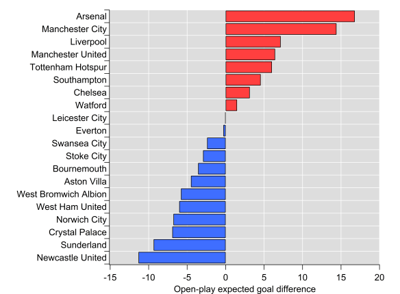
However, if we look at expected goals based on all shots taken and conceded, then Arsenal lead the way: Michael Caley has them with an expected goal difference per game of 0.98, while City lie second on 0.83. My own figures in open-play have Arsenal ahead but by a narrower margin (0.69 vs 0.65); Arsenal have a significant edge in terms of ‘big chances’, which I don’t include in my model, whereas Michael does include them. Turning to my non-shots based expected goal model, Arsenal’s edge is extended (0.66 vs 0.53). Finally, Paul Riley’s expected goal model favours City over Arsenal (0.88 vs 0.69), although Spurs are actually rated higher than both. Paul’s model considers shots on target only, which largely explains the contrast with other expected goal models.

Overall, City are rated quite strongly across the board, while Arsenal’s level is more mixed. The above isn’t an exhaustive list of models and metrics but the differences between how they rate the two main title contenders is apparent. All of these metrics have demonstrated utility at making in-season predictions but clearly assumptions about the relative strength of these two teams differs between them.

The question is why? If we look at the two extremes in terms of these methods, you would have total shots difference (or ratio, TSR) at one end and non-shots expected goals at the other i.e. one values all shots equally, while the other doesn’t ‘care’ whether a shot is taken or not.

There likely exists a range of happy mediums in terms of emphasising the taking of shots versus maximising the likelihood of scoring from a given attack. Such a trade-off likely depends on individual players in a team, tactical setup and a whole other host of factors including the current score line and incentives during a match.

However, a team could be accused of shooting too readily, which might mean spurning a better scoring opportunity in favour of a shot from long-range. Perhaps data can pick out those ‘trigger-happy’ teams versus those who adopt a more patient approach.

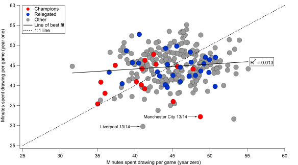
My non-shots based expected goal model evaluates the likelihood of a goal being scored from an individual chain of possession. If I switch goals for shots in the maths, then I can calculate the probability that a possession will end with a shot. We’ll refer to this as ‘expected shots’.

I’ve done this for the 2012/13 to 2014/15 Premier League seasons. Below is the data for the actual versus expected number of shots per game that each team attempted.

xShots_historic_AVB

Actual shots per game compared with expected shots per game. Black line is the 1:1 line. Data via Opta.

We can see that the model does a reasonable job of capturing shot expectation (r-squared is at 0.77, while the mean absolute error is 0.91 shots per game). There is some bias in the relationship though, with lower shot volume teams being estimated more accurately, while higher shot volume sides typically shoot less than expected (the slope of the linear regression line is 0.79).

If we take the model at face value and assume that it is telling a reasonable approximation of the truth, then one interpretation would be that teams with higher expected shot volumes are more patient in their approach. Historically these have been teams that tend to dominate territory and possession such as Manchester City, Arsenal and Chelsea; are these teams maintaining possession in the final third in order to take a higher value shot? It could also be due to defenses denying these teams shooting opportunities but looking at the figures for expected and actual shots conceded, the data doesn’t support that notion.

What is also clear from the graph is that it appears to match our expectations in terms of a team being ‘trigger-happy’ – by far the largest outlier in terms of actual shots minus expected shots is Tottenham Hotspurs’ full season under André Villas-Boas, a team that was well known for taking a lot of shots from long-range. We also see a decline as we move into the 2013/14 season when AVB was fired after 16 matches (42% of the full season) and then the 2014/15 season under Pochettino. Observations such as these that pass the ‘sniff-test’ can give us a little more confidence in the metric/method.

If we move back to the season at hand, then we see some interesting trends emerge. Below I’ve added the data points for this current season and highlighted Arsenal, Manchester City, Liverpool and Tottenham (the solid black outlines are for this season). Throughout the dataset, we see that Arsenal have been consistently below expectations in terms of the number of shots they attempt and that this is particularly true this season. City have also fallen below expectations but to a smaller extent than Arsenal and are almost in line with expectations this year. Liverpool and Tottenham have taken a similar number of shots but with quite different levels of expectation.

xShots_Historic_plus_Current

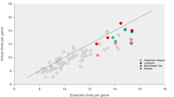
Actual shots per game compared with expected shots per game. Black line is the 1:1 line. Markers with solid black outline are for the current season. Data via Opta.

None of the above indicates that there is a better way of attempting to score but I think it does illustrate that team style and tactics are important factors in how we build and assess metrics. Arsenal’s ‘pass it in the net’ approach has been known (and often derided) ever since they last won the league and it is quite possible that models that are more focused on quality in possession will over-rate their chances in the same way that focusing on just shots would over-rate AVB’s Spurs. Manchester City have run the best attack in the league over the past few seasons by combining the intricate passing skills of their attackers with the odd thunder-bastard from Yaya Touré.

The question remains though: who will win the Premier League title this season? Will Manchester City prevail due to their mixed-approach or will Arsenal prove that patience really is a virtue? The boring answer is that time will tell. The obvious answer is Leicester City.

Advertisement

Unexpected goals

A sumptuous passing move ends with the centre forward controlling an exquisite through-ball inside the penalty area before slotting the ball past the goalkeeper.

Rewind.

A sumptuous passing move ends with the centre forward controlling an exquisite through-ball inside the penalty area before the goalkeeper pulls off an incredible save.

Rewind.

A sumptuous passing move ends with the centre forward controlling an exquisite through-ball inside the penalty area before falling on his arse.

giphy

Source: Giphy

Rewind.

Events in football matches can take many turns that will affect the overall outcome, whether it be a single event, a match or season. In the above examples, the centre forward has received the ball in a super-position but what happens next varies drastically.

Were we to assess the striker or his team, traditional analysis would focus on the first example as goals are the currency of football. The second example would appeal to those familiar with football analytics, which has illustrated that the scoring of goals is a noisy endeavour that can be potentially misleading; focusing on shots and/or the likelihood of a shot being scored is the foundation of many a model to assess players and teams. The third example will often be met with a shrug and a plethora of gifs on social media.

This third example is what I want to examine here by building a model that accounts for these missed opportunities to take a shot.

Expected goals

Expected goals are a hugely popular concept within football analytics and are becoming increasingly visible outside of the air-conditioned basements frequented by analysts. The fundamental basis of expected goals is assigning a value to the chances that a team create or concede.

Traditionally, such models have focused on shots, building upon earlier work relating to shots and shots on target. Many models have sprung up over the past few years with Michael Caley and Paul Riley models being probably the most prominent, particularly in terms of publishing their methods and results.

More recently, Daniel Altman presented a model that went ‘beyond shots‘, which aimed to value not just shots but also attacking play that moved the ball into dangerous areas. Various analysts, including myself, have looked at the value of passing in a similar vein e.g. Dustin Ward and Sam Gregory have looked at dangerous passing here and here respectively.

Valuing possession

The model that I have built is essentially a conversion of my dangerous possession model. Each sequence of possession that a team has is classified according to how likely a goal is to be scored.

This is based on a logistic regression that includes various factors that I will outline below. The key thing is that this is based on all possessions, not just those ending with shots. The model is essentially calculating the likelihood of a shot occurring in a given position on the field and then estimating the probability of a potential shot being scored. Consequently, we can put a value on good attacking (or poor defending) that doesn’t result in a shot being taken.

I’ve focused on open-play possessions here and the data is from the English Premier League from 2012/13-2014/15..

Below is a summary of the major location-related drivers of the model.

xG_factors

Probability of a goal being scored based on the end point of possession (top panel) and the location of the final pass or cross during the possession (bottom panel).

By far the biggest factor is where the possession ends; attacks that end closer to goal are valued more highly, which is an intuitive and not at all ground-breaking finding.

The second panel illustrates the value of the final pass or cross in an attacking move. The closer to goal this occurs, the more likely a goal is to be scored. Again this is intuitive and has been illustrated previously by Michael Caley.

Where the possession starts is also factored into the model as I found that this can increase the likelihood of a goal being scored. If a team builds their attack from higher up the pitch, then they have a better chance of scoring. I think this is partly a consequence of simply being closer to goal, so the distance to move the ball into a dangerous position is shortened. The other probable big driver here is that the likelihood of a defence being out of position is increased e.g. a turnover of possession through a high press.

The other factors not related to location include through-ball passes, which boost the chances of a goal being scored (such passes will typically eliminate defenders during an attacking move and present attackers with more time and space for their next move). Similarly, dribbles boost the likelihood of a goal being scored, although not to the same extent as a through-ball. Attacking moves that feature a cross are less likely to result in a goal. These factors are reasonably well established in the public analytics literature, so it isn’t a surprise to see them crop up here.

How does it do?

Below are some plots and a summary table comparing actual goals to expected goals for each team in the dataset. The correlation is stronger for goals for than against, although the bias is larger also as the ‘best’ teams tend to score more than expected and the ‘worst’ teams score fewer than expected. Looking at goal difference, the relationship is very strong over a season.

I also performed several out-of-sample tests to test the regressions by spitting the data-set into two sets (2012/13-2013/14 and 2014/15 only) and ran cross-validation tests on them. The model performed well out-of-sample, with the summary statistics being broadly similar when compared to the in-sample tests.

Non_shots_Plot

Comparison between actual goals and expected goals. Red dots are individual teams in each season. Dashed black line is 1:1 line and solid black line is the line of best fit.

Stats_Table

Comparison between actual goals and expected goals. MAE refers to Mean Absolute Error, while slope and intercept are calculated from a linear regression between the actual and expected totals.

I also ran the regression on possessions ending in shots and the results were broadly quite similar, although I would say that the shot-based expected goal model performed slightly better overall. Overall, the non-shots based expected goals model is very good at explaining past performance and is comparable to more traditional expected goal models.

On the predictive side, I ran a similar test to what Michael Caley did here as a quick check of how well the model did. I looked at each clubs matches in chronological order and calculated how well the expected goal models predicted actual goals in their next 19 matches (half a season in the Premier League) using an increasing number of prior matches to base the prediction on. For example, for a 10 match sample, I started at matches 1-10 and calculated statistics for matches 11-30, followed by matches 2-11 for matches 12-31 and so on.

Note that the ‘wiggles’ in the data are due to the number of teams changing as we move from one seasons worth of games to another i.e. some teams have only 38 games worth of matches, while others have 114. I also ran the same analysis for the next 38 matches and found similar features to those outlined below. I also did out-of-sample validation tests and found similar results, so I’m just showing the full in-sample tests below.

Capability of non-shot based and shot-based expected goals to predict future goals over the next 19 matches using differing numbers of previous matches as the input. Actual goals are also shown for reference. R-squared is shown on the left, while the mean absolute error is shown on the right.

I’m not massively keen on using r-squared as a diagnostic for predictions, so I also calculated the mean absolute errors for the predictions. The non-shots expected goals model performs very well here and compares very favourably with the shots-based version (the errors and correlations are typically marginally better). After around 20-30 matches, expected goals and actual goals converge in terms of their predictive capability – based on some other diagnostic tests I’ve run, this is around the point where expected goals tends to ‘match’ quite well with actual goals i.e. actual goals regresses to our mean expectation, so this convergence here is not too surprising.

The upshot is that the expected goal models perform very well and are a better predictor of future goals than goals themselves, particularly over small samples. Furthermore, they pick up information about future performance very quickly as the predictive capability tends to flat-line after less than 10 matches. I plan to expand the model to include set-play possessions and perform point projections, where I will do some more extensive investigation of the predictive performance of the model but I would say this is an encouraging start.

Bonus round

Below are the current expected goal difference rankings for the current Premier League season. The numbers are based on the regression I performed on the 2012/13-2014/15 dataset. I’ll start posting more figures as the season continues on my Twitter feed.

Open-play expected goal difference totals after 19 games of the 2015/16 Premier League season.

Open-play expected goal difference totals after 19 games of the 2015/16 Premier League season.

Valuing Possession

Regular visitors will know that I’ve been working on some metrics in relation to possession and territory based on the difficulty of completing passes into various areas of the pitch. To recap, passes into dangerous areas are harder to complete, which isn’t particularly revelatory but by building some metrics around this we can assess how well teams move the ball into dangerous areas as well as how well they prevent their opponents from doing so. These metrics can also be broken down to the player level to see which players complete the most ‘dangerous’ passes.

Below is the current iteration of the pass danger rating model based on data from the 2014/15 Premier League season; working the ball into positions closer to the goal is rewarded with a larger rating, while passes made within a teams own half carry very little weight.

Map of the pass weighting model based on data from the English Premier League. Data via Opta.

Map of the pass weighting model based on data from the English Premier League. Data via Opta.

One particular issue with the Territorial-Possession Dominance (TPD) metric that I devised was that as well as having a crap name, the relationship with points and goal difference could have been better. The metric tended to over-rate teams who make a lot of passes in reasonably dangerous areas around the edge of the box but infrequently complete passes into the central zone of the penalty area. On the other side of the coin, it tended to under-rate more direct teams who don’t attack with sustained possession.

In order to account for this, I’ve calculated the danger rating by looking at attacks on a ‘possession’ basis i.e. by tracking individual chains of possession in open-play and looking at where they end. The end of the chain could be due to a number of reasons including shots, unsuccessful passes or a tackle by an opponent. Each possession is then assigned a danger rating based on the model in the figure above. Possessions which end deep into opponent territory will score more highly, while those that break down close to a team’s own goal are given little weight.

Conceptually, the model is similar to Daniel Altman’s non-shot based model (I think), although he views things through expected goals, whereas I started out looking at passing. You can find some of the details regarding the model here, plus a video of his presentation at the Opta Pro Analytics Forum is available here, which is well worth watching.

Danger Zone

The ratings for last season’s Premier League teams are shown below, with positive values meaning a team had more dangerous possessions than their opponents over the course of the season and vice versa for the negative values. Overall, the correlation between the metric and goal difference and points is pretty good (r-squared values of 0.76 and 0.77 respectively). This is considering open-play only, so it ignores set pieces and penalties, plus I omitted possessions made up of just one shot. The correlation with open-play goal difference is a little larger, so it appears to be an encouraging indicator of team strength.

Open-Play Possession Danger Rating for the 2014/15 English Premier League season. Data via Opta.

Open-Play Possession Danger Rating for the 2014/15 English Premier League season. Zero corresponds to a rating of 50%. Data via Opta.

The rating only takes into account the location of where the possession ends so there is plenty of scope for improvement e.g. throughball passes could carry more weight, counter-attacks could receive an increased danger rating, while moves featuring a cross might be down-weighted. Regardless of such improvements, these initial results are encouraging and are at a similar descriptive level to traditional shot ratios and expected goal models.

Arsenal are narrowly ahead of Manchester City here, as they make up a clear top-two which is strongly driven by their attacking play. Intriguingly, Manchester City’s rating was much greater (+7%) for possessions ending with a shot, while Arsenal’s was almost unchanged (-1%). Similarly to City, Chelsea’s rating for possessions ending with a shot was also greater (+4%)  than their rating for all possessions. I don’t know yet if this is a repeatable trait but it suggests Chelsea and City were more efficient at generating quality shots and limiting their opponents.

Manchester United sit narrowly ahead of Liverpool and Southampton and round out the top four, which was mainly driven by their league-leading defensive performance; few teams were able to get the ball into dangerous positions near their goal. Manchester United’s ability to keep their opponents at arms length has been a consistent trend from the territory-based numbers I’ve looked at.

Analytics anti-heroes Sunderland and a West Brom team managed by Tony Pulis for a large chunk of last season reside at the bottom of the table. Sunderland comfortably allowed the most dangerous possessions in the league last season.

Possessed

So, we’re left with yet another team strength metric to add to the analytics pile. The question is what does this add to our knowledge and how might we use it?

Analytics has generally based metrics around shots, which is sometimes not reflective of how we often experience the game from a chance creation point of view. The concept of creating a non-shot based chance isn’t a new one – the well worn cliché about a striker ‘fluffing a chance’ tells us that much but what analytics is striving to do is quantify these opportunities and hopefully do something useful with them. Basing the metric on all open-play possessions rather than just focusing on shots potentially opens up some interesting avenues for future research in terms of examining how teams attack and defend. Furthermore, using all possessions rather than those just ending with a shot increases our sample size and opens up the potential for new ways of assessing player contributions.

Looking at player contributions to these possessions will be the subject of my next post.

Liverpool Looking Up? EPL 2015/16 Preview

Originally published on StatsBomb.

After the sordid love affair that culminated in a strong title challenge in 2013/14, Liverpool barely cast a furtive glance at the Champions League places in 2014/15. Their underlying numbers over the whole season provided scant consolation either, with performance levels in line with a decent team lacking the quality usually associated with a top-four contender. Improvements in results and underlying performance will therefore be required to meet the club’s stated aim of Champions League football.

Progress before a fall

Before looking forward to the coming season, let’s start with a look back at Liverpool’s performance over recent seasons. Below is a graphic showing Liverpool’s underlying numbers over the past five seasons, courtesy of Paul Riley’s Expected Goal numbers.

Expected goal rank over the past 5 seasons of the English Premier League. Liverpool seasons highlighted in red.

Expected goal rank over the past 5 seasons of the English Premier League. Liverpool seasons highlighted in red.

From 2010/11 to 2012/13, there was steady progress with an impressive jump in 2013/14 to the third highest rating over the past five years. Paul’s model only evaluates shots on target, so Liverpool’s 2013/14 rating is potentially biased a little high given their unusual/unsustainable proportion of shots on target that year. However, the quality was clear, particularly in attack. Not to be outdone, 2014/15 saw another impressive jump but unfortunately the trajectory was in the opposite direction. Other metrics such as total shots ratio and shots on target ratio tell a similar story, although 2013/14 isn’t quite as impressive.

The less charitable among you may ascribe Liverpool’s trajectory with the presence and performance of one Luis Suárez; when joining in January 2010, Suárez was an erratic yet gifted performer who went on to become a genuine superstar before departing in the summer of 2014. Suárez’s attacking wizardry in 13/14 was remarkable and he served as a vital multiplier in the sides’ pinball style of play. Clearly he was a major loss but there were already reasons to suspect that some regression was due with or without him: Andrew Beasley wrote about the major and likely unsustainable role of set piece goals, while James Grayson and Colin Trainor highlighted the unusually favourable proportions of shots on target and blocked shots respectively during their title challenge. I wrote about how Liverpool’s penchant for early goals had led to an incredible amount of time spent winning over the season (a handy circumstance for a team so adept at counter-attacking), which may well have helped to explain some of their unusual numbers and that it was unlikely to be repeated.

These mitigating and potentially unsustainable factors notwithstanding, the dramatic fall in underlying performance, points (22 in all) and goals scored (an incredible 49 goal decline) is where Liverpool find themselves ahead of the coming season. Such a decline sees Brendan Rodgers go into this season under pressure to justify FSG’s backing of him over the summer, particularly with a fairly nightmarish run of away fixtures to start the season and the spectre of Jürgen Klopp on the horizon.

So, where do Liverpool need to improve this season?

Case for the defence

With the concession of six goals away at Stoke fresh in the memory, the narrative surrounding Liverpool’s defence is strong i.e. the defence is pretty horrible. Numbers paint a somewhat different story with Liverpool’s shots conceded (10.9 per game) standing as the joint-fifth lowest in the league last year according to statistics compiled by the Objective-Football website (rising to fourth lowest in open play). Shots on target were less good (3.8 per game and a rank of joint-seventh) although the margins are fairly small here. By Michael Caley’s and Paul Riley’s expected goal numbers, Liverpool ranked fourth and sixth respectively in expected goals against. Looking at how effective teams were at preventing their opponents from getting the ball into dangerous areas in open-play, my own numbers ranked Liverpool fifth best in the league.

It should be noted that analytics often has something of a blind spot when it comes to analysing defensive performances; metrics which typically work very well on the offensive side often work less well on the defensive side. Liverpool also tend to be a fairly dominant team and their opponents typically favour a deep defence and counter strategy against them, which will limit the number of chances they create.

One area where their numbers (courtesy of Objective-Football again) were noticeably poor was at set-pieces where they conceded on 11.6% of the shots by their opponents, which was 3rd worst in the league, compared to a league average conversion of 8.7%. Set-piece conversion rates are notoriously unsustainable year-on-year though, so some regression towards more normal conversion rates could potentially bring down Liverpool’s goal per game average compared to last season.

While Liverpool’s headline numbers were reasonable, their tendency to shoot themselves in the foot and concede some daft goals was impressive in its ineptitude at times. Culprits typically included combinations of Rodgers’ tactics, Dejan Lovren’s ‘whack a mole’ approach to defending and the embers of Steven Gerrard’s Liverpool career. The defensive structure of the team should be improved now that Gerrard no longer needs to be accommodated at the heart of midfield, while Glen Johnson’s prolonged audition for an extra role in the Walking Dead will continue at Stoke. Nathaniel Clyne should be a significant upgrade at full back, with youngsters Ilori and Gomez presently with the squad and aiming to compete for a first team role.

Broadly speaking though, Liverpool’s defensive numbers were reasonable but with room for improvement. Their numbers looked ok for a Champions League hopeful rather than a title challenger. A more mobile midfield should enhance the protection afforded to the central defence, however it should line up. Whether the individual errors were a bug and not a feature of this Liverpool team will likely determine how the narrative around the defence continues this year.

Under-powered attack

Liverpool’s decline in underlying performance in 2014/15 was driven by a significant drop-off in their attacking numbers. The loss of Suárez was compounded by Daniel Sturridge playing just 750 minutes in the league all season; Sturridge isn’t at the same level as Suárez (few are) but he does represent a truly elite forward and the alternatives at the club weren’t able to replace him.

The loss of Suárez and Sturridge meant that Coutinho and Sterling were now the principal conduits for Liverpool’s attack. Both performed admirably and were among the most dangerous attackers in the division. The figure below details Liverpool’s players according to the number of dangerous passes per 90 minutes played, which is related to my pass-danger rating score. In terms of volume, Coutinho and Sterling were way ahead of their teammates and both ranked in the top 15 in the league (minimum of 900 minutes played). James Milner actually ranked seventh by this metric, so he could well provide an additional source of creativity and link well with Liverpool’s forward players.

Dangerous passes per 90 minutes played metric for Liverpool players in 2014/15. Right hand side shows total number of completed passes per 90 minutes.

Dangerous passes per 90 minutes played metric for Liverpool players in 2014/15. Right hand side shows total number of completed passes per 90 minutes.

As good as Coutinho and Sterling were from a creative perspective, they did lag behind the truly elite players in the league by these metrics. As with many of Liverpool’s better players, you’re often left with the caveat of stating how good they are for their age. That’s not a criticism of the players themselves, merely a recognition of their overall standing relative to their peers.

What didn’t help was the lack of attacking contribution from Liverpool’s peak-age attacking players; Lallana’s contribution was decidedly average, Sturridge is obviously capable of making a stellar contribution but injuries curtailed him, while Balotelli certainly provided a high shot volume powered by a predilection for shooting from range but a potential dose of bad luck meant his goal-scoring record was well below expectation.

While there were clearly good elements to Liverpool’s attack, they were often left shooting from long range. According to numbers published by Michael Caley, Liverpool took more shots from outside the box than any other team last year and had the fourth highest proportion of shots from outside the box (48%). Unsurprisingly, they had the third lowest proportion of shots from the central region inside the penalty area (34%), which is the so-called ‘danger zone’ where shots are converted at much greater rates than wide in the box and outside the area. With their shot volumes being pretty good last season (third highest total shots and fourth highest shots on target), shifting the needle towards better quality chances would certainly improve Liverpool’s prospects. The question is where will that quality come from?

Bobby & Ben

With Sturridge not due back until the autumn coupled with his prior injury record, Liverpool moved to sign Christian Benteke as a frontline striker with youngsters Ings and Origi brought in to fill out the forward ranks. Roberto Firmino was added before Sterling’s departure but the expectation is that he will line-up in a similar role as the dynamic attacking midfielder/forward.

Firmino brings some impressive statistical pedigree with him: elite dribbler, dangerous passer, a tidy shot profile for a non-striker and stand-out tackling numbers for his position. If he can replicate his Bundesliga form then he should be a more than adequate replacement for Sterling, while also having the scope to develop over coming seasons.

Benteke brings a good but not great goal-scoring record, with his record in open-play being particularly average. Although there have been question marks regarding his stylistic fit within the team, Liverpool have seemingly been pursuing a physical forward to presumably act as a ‘reference point’ in their tactical system over the past few years; Diego Costa was a target in 2013, while Wilfred Bony was linked in 2014. Benteke brings that to the table alongside a more diverse range of skills than he is given credit for having been seemingly cast as an immobile lump of a centre forward by some.

Whether he has the necessary quality to improve this Liverpool team is the more pertinent question. From open-play, Benteke averages 2.2 shots per 90 minutes and 0.34 goals per 90 minutes over the past three seasons, which is essentially the average rate for a forward in the top European leagues. For comparison, Daniel Sturridge averages 4.0 shots per 90 minutes and 0.65 goals per 90 minutes over the same period. Granted, Sturridge has played for far greater attacking units than Aston Villa over that period but based on some analysis of strikers moving clubs that I’ve done, there is little evidence that shot and goal rates rise when moving to a higher quality team. Benteke does provide a major threat from set-pieces, which has been a productive source of goals for him but I would prefer to view these as an added extra on top of genuine quality in open-play, rather than a fig leaf.

Benteke will need to increase his contribution significantly if he is to cover for Sturridge over the coming season, otherwise Liverpool may find themselves in the good but not great attacking category again.

Conclusion

So where does all of the above leave Liverpool going into the season? Most of the underlying numbers for last season suggested that Chelsea, Manchester City and Arsenal were well ahead of the pack and I don’t see much prospect of one of them dropping out of the top four. Manchester United, Liverpool and Southampton made up the trailing group, with these three plus perhaps Tottenham in a battle to be the ‘best of the rest’ or ‘least crap’ and claim the coveted fourth place trophy.

When framed this way, Liverpool’s prospects look more viable, although fourth place looks like the ceiling at present unless the club procure some adamantium to alleviate Sturridge’s injury woes. While Liverpool currently operate outside the financial Goldilocks zone usually associated with a title challenge, they should have the quality to mount a concerted challenge for that Champions League spot in what could be a tight race. They did put together some impressive numbers during the 3-4-3 phase of last season that was in-line with those expected of a Champions League contender; replicating and sustaining that level of quality should be the aim for the team this coming season.

Prediction: 4-6th, most likely 5th.

P.S. Can Liverpool to be more fun this year? If you can’t be great, at least be fun.

Uncertain expectations

In this previous post, I describe a relatively simple version of an expected goals model that I’ve been developing recently. In this post, I want to examine the limitations and uncertainties relating to how well the model predicts goals.

Just to recap, I built the model using data from the Premier League from 2013/14 and 2014/15. For the analysis below, I’m just going to focus on non-penalty shots with the foot, so it includes both open-play and set piece shot situations. Mixing these will introduce some bias but we have to start somewhere. The data amounts to over 16,000 shots.

What follows is a long and technical post. You have been warned.

Putting the boot in

One thing to be aware of is how the model might differ if we used a different set of shots for input; ideally the answer we get shouldn’t change if we only used a subset of the data or if we resample the data. If the answer doesn’t change appreciably, then we can have more confidence that the results are robust.

Below, I’ve used a statistical technique known as ‘bootstrapping‘ to assess how robust the regression is for expected goals. Bootstrapping belongs to a class of statistical methods known as resampling. The method works by randomly extracting shots from the dataset and rerunning the regression many times (1000 times in the plot below). Using this, I can estimate a confidence interval for my expected goal model, which should provide a reasonable estimate of goal expectation for a given shot.

For example, the base model suggests that a shot from the penalty spot has an xG value of 0.19. The bootstrapping suggests that the 90% confidence interval gives an xG range from 0.17 to 0.22. What this means is that on 90% of occasions that Premier League footballers take a shot from the penalty spot, we would expect them to score somewhere between 17-22% of the time.

The plot below shows the goal expectation for a shot taken in the centre of the pitch at varying distances from the goal. Generally speaking, the confidence interval range is around ±1-2%. I also ran the regressions on subsets of the data and found that after around 5000 shots, the central estimate stabilised and the addition of further shots in the regression just narrows the confidence intervals. After about 10,000 shots, the results don’t change too much.

Test.

Expected goal curve for shots in the centre of the pitch at varying distances from the goal. Shots with the foot only. The red line is the median expectation, while the blue shaded region denotes the 90% confidence interval.

I can use the above information to construct a confidence interval for the expected goal totals for each team, which is what I have done below. Each point represents a team in each season and I’ve compared their expected goals vs their actual goals. The error bars show the range for the 90% confidence intervals.

Most teams line up with the one-to-one line within their respective confidence intervals when comparing with goals for and against. As I noted in the previous post, the overall tendency is for actual goals to exceed expected goals at the team level.

Expected goals vs actual goals for teams in the 2013/14 and 2014/15 Premier League. Dotted line is the 1:1 line, the solid line is the line of best fit and the error bars denote the 90% confidence intervals based on the xG curve above.

Expected goals vs actual goals for teams in the 2013/14 and 2014/15 Premier League. Dotted line is the 1:1 line, the solid line is the line of best fit and the error bars denote the 90% confidence intervals based on the xG curve above.

As an example of what the confidence intervals represent, in the 2013/14 season, Manchester City’s expected goal total was 59.8, with a confidence interval ranging from 52.2 to 67.7 expected goals. In reality, they scored 81 non-penalty goals with their feet, which falls outside of their confidence interval here. On the plot below, Manchester City are the red marker on the far right of the expected goals for vs actual goals for plot.

Embracing uncertainty

Another method of testing the model is to look at the model residuals, which are calculated by subtracting the outcome of a shot (either zero or one) from its expected goal value. If you were an omnipotent being who knew every aspect relating to the taking of a shot, you could theoretically predict the outcome of a shot (goal or no goal) perfectly (plus some allowance for random variation). The residuals of such a model would always be zero as the outcome minus the expectation of a goal would equal zero in all cases. In the real world though, we can’t know everything so this isn’t the case. However, we might expect that over a sufficiently large sample, the residual will be close to zero.

In the figure below, I’ve again bootstrapped the data and looked at the model residuals as the number of shots increases. I’ve done this 10,000 times for each number of shots i.e. I extract a random sample from the data and then calculate the residual for that number of shots. The red line is the median residual (goals minus expected goals), while the blue shaded region corresponds to the standard error range (calculated as the 90% confidence interval). The residual is normalised to a per shot basis, so the overall uncertainty value is equal to this value multiplied by the number of shots taken.

BootStrap_xGdiff_col

Goals-Expected Goals versus number of shots calculated via bootstrapping. Inset focusses on the first 100 shots. The red line is the median, while the blue shaded region denotes the 90% confidence interval (standard error).

The inset shows how this evolves up to 100 shots and we see that over about 10 shots, the residual approaches zero but the standard errors are very large at this point. Consequently, our best estimate of expected goals is likely highly uncertain over such a small sample. For example, if we expected to score two goals from 20 shots, the standard error range would span 0.35 to 4.2 goals. To add a further complication, the residuals aren’t normally distributed at that point, which makes interpretations even more challenging.

Clearly there is both a significant amount of variation over such small samples, which could be a consequence of both random variation and factors not included in the model. This is an important point when assessing xG estimates for single matches; while the central estimate will likely have a very small residual, the uncertainty range is huge.

As the sample size increases, the uncertainty decreases. After 100 shots, which would equate to a high shot volume for a forward, the uncertainty in goal expectation would amount to approximately ±4 goals. After 400 shots, which is close to the average number of shots a team would take over a single season, the uncertainty would equate to approximately ±9 goals. For a 10% conversion rate, our expected goal value after 100 shots would be 10±4, while after 400 shots, our estimate would be 40±9 (note the percentage uncertainty decreases as the number of shots increases).

BootStrap_xGdiff_col_wTeams

Same as above but with individual teams overlaid.

Above is the same plot but with the residuals shown for each team over the past two seasons (or one season if they only played for a single season). The majority of teams fall within the uncertainty envelope but there are some notable deviations. At the bottom of the plot are Burnley and Norwich, who significantly under-performed their expected goal estimate (they were also both relegated). On the flip side, Manchester City have seemingly consistently outperformed the expected goal estimate. Part of this is a result of the simplicity of the model; if I include additional factors such as how the chance is created, the residuals are smaller.

How well does an xG model predict goals?

Broadly speaking, the central estimates of expected goals appear to be reasonably good; the residuals tend to zero quickly and even though there is some bias, the correlations and errors are encouraging. When the uncertainties in the model are propagated through to the team level, the confidence intervals are on average around ±15% for expected goals for and against.

When we examine the model errors in more detail, they tend to be larger (around ±25% at the team level over a single season). The upshot of all this is that there appears to be a large degree of uncertainty in expected goal values when considering sample sizes relevant at the team and player level. While the simplicity of the model used here may mean that the uncertainty values shown represent a worst-case scenario, it is still something that should be considered when analysts make statements and projections. Having said this, based on some initial tests, adding extra complexity doesn’t appear to reduce the residuals to any great degree.

Uncertainty estimates and confidence intervals aren’t sexy and having spent the last 1500ish words writing about them, I’m well aware they aren’t that accessible either. However, I do think they are useful and important in the real world.

Quantifying these uncertainties can help to provide more honest assessments and recommendations. For example, I would say it is more useful to say that my projections estimate that player X will score 0.6-1.4 goals per 90 minutes next season along with some central value, rather than going with a single value of 1 goal per 90 minutes. Furthermore, it is better to state such caveats in advance – if you just provided the central estimate and the player posted say 0.65 goals per 90 and you then bring up your model’s uncertainty range, you will just sound like you’re making excuses.

This also has implications regarding over and under performance by players and teams relative to expected goals. I frequently see statements about regression to the mean without considering model errors. As George Box wisely noted:

Statisticians, like artists, have the bad habit of falling in love with their models.

This isn’t to say that expected goal models aren’t useful, just that if you want to wade into the world of probability and modelling, you should also illustrate the limitations and uncertainties associated with the analysis.

Perhaps those using expected goal models are well aware of these issues but I don’t see much discussion of it in public. Analytics is increasingly finding a wider public audience, along with being used within clubs. That will often mean that those consuming the results will not be aware of these uncertainties unless you explain them. Speaking as a researcher who is interested in the communication of science, I can give many examples of where not discussing uncertainty upfront can backfire in the long run.

Isn’t uncertainty fun!

——————————————————————————————————————–

Thanks to several people who were kind enough to read an initial draft of this article and the proceeding method piece.

Great Expectations

One of the most popular metrics in football analytics is the concept of ‘expected goals’ or xG for short. There are various flavours of expected goal models but the fundamental objective is to assess the quality of chances created or conceded by a team. The models are also routinely applied to assessing players using various techniques.

Michael Caley wrote a nice explanation of the what and the why of expected goals last month. Alternatively, you could check out this video by Daniel Altman for a summary of some of the potential applications of the metric.

I’ve been building my own expected goals model recently and I’ve been testing out a fundamental question regarding the performance of the model, namely:

How well does it predict goals?

Do expected goal models actually do what they say on the tin? This is a really fundamental and dumb question that hasn’t ever been particularly clear to me in relation to the public expected goal models that are available.

This is a key aspect, particularly if we want to make statements about prior over or under-performance and any anticipated changes in the future. Further to this, I’m going to talk about uncertainty and how that influences the statements that we can make regarding expected goals.

In this post, I’m going to describe the model and make some comparisons with a ‘naive’ baseline. In a second post, I’m going to look at uncertainties relating to expected goal models and how they may impact our interpretations of them.

The model

Before I go further, I should note that the initial development closely resembles the work done by Michael Caley and Martin Eastwood, who detailed their own expected goal methods here and here respectively.

I built the model using data from the Premier League from 2013/14 and 2014/15. For the analysis below, I’m just going to focus on non-penalty shots with the foot, so it includes both open-play and set piece shot situations. Mixing these will introduce some bias but we have to start somewhere. The data amounts to over 16,000 shots.

I’m only including distance from the centre of the goal in the first instance, which I calculated in a similar manner to Michael Caley in the link above as the distance from the goal line divided by the relative angle. I didn’t raise the relative angle to any power though.

I then calculate the probability of a goal being scored with the adjusted distance of each shot as the input; shots are deemed either successful (goal) or unsuccessful (no goal). Similarly to Martin Eastwood, I found that an exponential decay formula represented the data well. However, I found that there was a tendency towards under-predicting goals on average, so I included an offset in the regression. The equation I used is below:

xG = exp(-Distance/α) + β

Based on the dataset, the fit coefficients were 6.65 for α and 0.017 for β. Below is what this looks like graphically when I colour each shot by the probability of a goal being scored; shots from close to the goal line in central positions are far more likely to be scored than long distance shots or shots from narrow angles, which isn’t a new finding.

xGmap

Expected goals based on shot location using data from the 2013/14 and 2014/15 Premier League seasons. Shots with the foot only.

So, now we have a pretty map and yet another expected goal model to add to the roughly 1,000,001 other models in existence.

Baseline

In the figure below, I’ve compared the expected goal totals with the actual goals. Most teams are close to the one-to-one line when comparing with goals for and against, although the overall tendency is for actual goals to exceed expected goals at the team level. When looking at goal difference, there is some cancellation for teams, with the correlation being tighter and the line of best fit passing through zero.

Text.

Expected goals vs actual goals for teams in the 2013/14 and 2014/15 Premier League. Dotted line is the 1:1 line, the solid line is the line of best fit. Click on the graph for an enlarged version.

Inspecting the plot more closely, we can see some bias in the expected goal number at the extreme ends; high-scoring teams tend to out-perform their expected goal total, while the reverse is true for low scoring teams. The same is also true for goals against, to some extent, although the general relationship is less strong than for goals for. Michael Caley noted a similar phenomenon here in relation to his xG model. Overall, it looks like just using location does a reasonable job.

Text.

The table above includes R2 and mean absolute error (MAE) values for each metric and compares them to a ‘naïve’ baseline where just the average conversion rate is used to calculate the xG values i.e. the location of the shot is ignored. The Rvalue assesses the strength of the relationship between expected goals and goals, with values closer to one indicating a stronger link. Mean absolute error takes an average of the difference between the goals and expected goals; the lower the value the better. In all cases, including location improves the comparison. ‘Naïve’ xG difference is effectively Total Shot Difference as it assumes that all shots are equal.

What is interesting is that the correlations are stronger in both cases for goals for than goals against. This could be a fluke of the sample I’m using but the differences are quite large. There is more stratification in goals for than goals against, which likely helps improve the correlations. James Grayson noted here that there is more ‘luck’ or random variation in goals against than goals for.

How well does an xG model predict goals?

Broadly speaking, the central estimates of expected goals appear to be reasonably good. Even though there is some bias, the correlations and errors are encouraging. Adding location into an xG model clearly improves our ability to predict goals compared to a naïve baseline. This obviously isn’t a surprise but it is useful to quantify the improvements.

The model can certainly be improved though and I also want to quantify the uncertainties within the model, which will be the topic of my next post.

Premier League Pass Masters

In this previous post, I combined territory and possession to create a Territorial-Possession Dominance (TPD) metric. The central basis for this metric is that it is more difficult to pass the ball into dangerous areas. Essentially teams that have the ball in areas closer to their opponent’s goal, while stopping their opponent moving the ball close to their own, will score more highly on this metric.

In the graphic below, I’ve looked at how the teams in the Premier League have been shaping up this year (data correct up to 24/04/15). The plot splits this performance on the offensive side (with the ball) and the defensive side (without the ball). For a frame of reference, league average is defined as a score of 100.

Broadly, these two terms show that teams who dominate territory with the ball also limit the amount of possession they concede close to their own goal. This makes sense given there is only one ball on the pitch, so pinning your opponent back in their half makes it more difficult to maintain possession in dangerous areas in return. Alternatively, teams may choose to sit back, soak up pressure and then aim to counter attack; this would yield a low rating offensively and a higher rating defensively.

Territorial-possession for and against for the 2014/15 English Premier League. A score of 100 denotes league average. Marker colour refers to Territorial-Possession Dominance. Data via Opta.

The top seven (plus Everton) tend to dominate territory and possession, while the bottom thirteen (minus Everton) are typically pinned back. Stoke City are somewhat peculiar, as they are below average on both scores,so while they limit their opponents, they seemingly struggle to manoeuvre the ball into dangerous areas themselves. Michael Caley’s expected goals numbers suggest that Everton have seemingly struggled to convert their territorial and possession dominance into an abundance of good quality chances; essentially they look pretty in-between both boxes.

Sunderland’s passivity is evident as they routinely saw their opponents pass the ball into dangerous areas; based on where their defensive actions occur and the league-leading number of shots from outside of the box they concede, the aim is to get men behind the ball and prevent good quality chances from being created. That is possibly a reasonable tactical system if you can combine that with swift counter-attacking and high quality chances but Poyet’s dismissal is indicative of how that worked out.

On the flip side, Manchester United rank lowest for territorial-possession against. Their system is designed to prevent their opponent’s from building pressure on their defense close to their own goal. Think of it as a system designed to prevent Phil Jones’ face from trending on Twitter. Of course, when the system breaks down and/or opposition skill breaks through, things look awful and high quality chances are conceded.

Finally, Manchester City clearly aren’t trying hard enough.

Passing maestros

The metric I’ve devised classifies each pass completed based on the destination of the pass, so it is relatively straight-forward to breakdown the metric by the player passing the ball. Below are the top twenty players this season ranked according to the average ‘danger’ of their passes (non-headed passes only, minimum 900 minutes played). I can also do this for players receiving the ball but I’ll leave that for another time.

Players who routinely complete passes into dangerous areas will score highly here, so there is an obvious bias towards forwards and attacking midfielders/wingers. Bias will also be introduced by team systems, which would be a good thing to examine in the future. I’ve also noted on the right-hand-side the number of passes each player completes per 90 minutes to give a sense of their involvement.

Some players, like Diafra Sakho and Jamie Vardy, are rarely involved but their passes are often dangerous. Others manage to combine a high-volume of passes with danger; PFA Player of the Year, Eden Hazard, is the standout here (very much a Sum 41 kind of footballer). The link-up skills of Sánchez and Agüero are also evident.

Pass Danger Rating for English Premier League players in the 2014/15 season. Numbers on right indicate number of completed passes played per 90 minutes by each player. Minimum of 900 minutes played. Data via Opta.

I quite like this as a metric, as the results aren’t always obvious; it is nice to have confirmatory metrics but informative metrics are potentially more valuable from an analytics point of view. For instance, the metric can quickly identify the dangerous passers for the opposition, who could then be targeted to reduce their influence. It can also be useful in identifying players who could possibly do more on your own team (*cough* Lallana *cough*). Finally, it’s a metric that could be used as a part of an analytics based scouting system. I’m hoping to develop this further, so watch this space.

Square pegs for square holes: OptaPro Forum Presentation

At the recent OptaPro Forum, I was delighted to be selected to present to an audience of analysts and representatives from the football industry. I presented a technique to identify different player types using their underlying statistical performance. My idea was that this would aid player scouting by helping to find the “right fit” and avoid the “square peg for a round hole” cliché.

In the presentation, I outlined the technique that I used, along with how Dani Alves made things difficult. My vision for this technique is that the output from the analysis can serve as an additional tool for identifying potential transfer signings. Signings can be categorised according to their team role and their performance can then be compared against their peers in that style category based on the important traits of those player types.

The video of my presentation is below, so rather than repeating myself, go ahead and watch it! The slides are available here.

Each of the player types is summarised below in the figures. My plan is to build on this initial analysis by including a greater number of leagues and use more in-depth data. This is something I will be pursuing over the coming months, so watch this space.

Some of my work was featured in this article by Ben Lyttleton.

Forward player types.

Forward player types

Midfielder player types.

Midfielder player types.

Defender player types.

Defender player types.

Territorial advantage?

One of the recurring themes regarding the playing style of football teams is the idea that teams attempt to strike a balance between controlling space and controlling possession. The following quote is from this Jonathan Wilson article during the European Championships in 2012, where he discusses the spectrum between proactive and reactive approaches:

Great teams all have the same characteristic of wanting to control the pitch and the ball – Arrigo Sacchi.

No doubt there are multiple ways of defining both sides of this idea.

Controlling the ball is usually represented by possession, that is the proportion of the passes that a team plays in a single match or series of matches. If a team has the ball, then by definition, they are controlling it.

One way of defining the control of space is to think about ball possession in relation to the location of the ball on the pitch. A team that routinely possesses the ball closer to their opponents goal potentially benefits from the increased attacking opportunities that this provides, while also benefiting from the ball being far away from their own goal should they lose it.

There are certainly issues with defining control of space in this way though e.g. a well-drilled defence may be happy to see a team playing the ball high up the pitch in front of them, especially if they are adept at counter-attacking when they win the ball back.

Below is a heat map of the location of received passes in the 2013/14 English Premier League. The play is from left-to-right i.e. the team in possession is attacking towards the right-hand goal. We can see that passes are most frequently received in midfield areas, with the number of passes received decreasing quickly as we head towards each penalty area.

Text.

Heat map of the location of received passes in the 2013/14 English Premier League. Data via Opta.

Below is another heat map showing pass completion percentage based on the end point of the pass. The completion percentage is calculated by adding up all of the passes to a particular area on the pitch and comparing that to the number of passes that are successfully received. One thing to note here is that the end point of uncompleted passes relates to where possession was lost, as the data doesn’t know the exact target of each pass (mind-reading isn’t part of the data collection process as far as I know). That does mean that the pass completion percentage is an approximation but this is based on over 300,000 passes, so the effect is likely small.

What is very clear from the below graphic is that when within a teams own half, passes are completed routinely. The only areas where this drops are near the corner flags; I assume this is due to players either clearing the ball or playing it against an opponent when boxed into the corner.

Text.

Heat map of pass completion percentage based on the target of all passes in the 2013/14 English Premier League. Data via Opta.

As teams move further into the attacking half, pass completion drops. In the central zone within the penalty area, less than half of all passes are completed and this drops to less than 20% within the six yard box. These passes within the “danger zone” are infrequent and completed far less frequently than other passes. This danger zone is frequently cited by analysts looking at shot location data as the prime zone for scoring opportunities; you would imagine that receiving passes in this zone would be beneficial.

None of the above is new. In fact, Gabe Desjardins wrote about these features using data from a previous Premier League season here and showed broadly similar results (thanks to James Grayson for highlighting his work at various points). The main thing that looks different is the number of passes played into the danger zone, I’m not sure why this is but 2012/13 and 2014/15 so far look very similar to the above in my data.

Gabe used these results to calculate a territory statistic by weighting each pass by its likelihood of being completed. He found that this measure was strongly related to success and the performance of a team.

Below is my version of territory plotted against possession for the 2013/14 Premier League season. Broadly there are four regimes in the below plot:

  1. Teams like Manchester City, Chelsea and Arsenal who dominate territory and have plenty of possession. These teams tend to pin teams in close to their goal.
  2. Teams like Everton, Liverpool and Southampton who have plenty of possession but don’t dominate territory (all there are just under a 50% share). Swansea are an extreme case in as they have lots of possession but it is concentrated in their own half where passes are easier to complete.
  3. Teams like West Brom and Aston Villa who have limited possession but move the ball into attacking areas when they do have it. These are quite direct teams, who don’t waste much time in their build-up play. Crystal Palace are an extreme in terms of this approach.
  4. Teams that have limited possession and when they do have it, they don’t have much of it in dangerous areas at the attacking end of the pitch. These teams are going nowhere, slowly.
Text.

Territory percentage plotted against possession for English Premier League. Data via Opta.

Liverpool are an interesting example, as while their overall territory percentage ranks at fourteenth in the league, this didn’t prevent them moving the ball into the danger zone. For just passes received within the danger zone, they ranked third on 3.4 passes per game behind Chelsea (3.8) and Manchester City (4) and ahead of Arsenal on 2.9.

This ties in with Liverpool’s approach last season, where they would often either attack quickly when winning the ball or hold possession within their own half to try and draw teams out and open up space. Luis Suárez was crucial in this aspect, as he averaged 1.22 completed passes into the danger zone per 90 minutes. This was well ahead of Sergio Agüero in second place on 0.94 per 90 minutes.

The above is just a taster of what can be learnt from this type of data. I’ll be expanding on the above in more detail and for more leagues in the future.

Win, lose or draw

The dynamics of a football match are often dictated by the scoreline and teams will often try to influence this via their approach; a fast start in search of an early goal, keeping it tight with an eye on counter-attacking or digging a moat around the penalty area.

With this in mind, I’m going to examine the repeatability of the amount of time a team spends winning, losing and drawing from year to year. I’m basically copying the approach of James Grayson here who has looked at the repeatability of several statistical metrics. This is meant to be a broad first look; there are lots of potential avenues for further study here.

I’ve collected data from football-lineups.com (tip of the hat to Andrew Beasley for alerting me to the data via his blog) for the past 15 English Premier League seasons and then compared each teams performance from one season (year zero) to the next (year one). Promoted or relegated teams are excluded as they don’t spend two consecutive seasons in the top flight.

Losers

Below is a plot showing how the time spent losing varies in consecutive seasons. Broadly speaking, there is a reasonable correlation from one season to the next but with a degree of variation also (R^2=0.41). The data suggests that 64% of time spent winning is repeatable, leaving 36% in terms of variation from one season to the next. This variation could result due to many factors such as pure randomness/luck, systemic or tactical influences, injury, managerial and/or player changes etc.

Blah.

Relationship between time spent losing per game from one season to the next.

As might be expected, title winning teams and relegated sides tend towards the extreme ends in terms of time spent losing. Generally, teams at these extreme ends in terms of success over and under perform respectively compared to the previous season.

Winners

Below is the equivalent plot for time spent winning. Again there is a reasonable correlation from one season to the next, with the relationship for time spent winning (R^2=0.47) being stronger than for time spent losing. The data suggests that 67% of time spent winning is repeatable, leaving 33% in terms of variation from one season to the next.

Blah.

Relationship between time spent winning per game from one season to the next.

As might be expected, title winning teams spend a lot of time winning. The opposite is true for relegated teams. Title winners generally improve their time spent winning compared to the previous season. Interestingly, they often then see a drop off in the following season.

Manchester City and Liverpool really stick out here in terms of their improvement relative to 2012/13. Liverpool spent 19 minutes more per game in a winning position in 2013/14 than they did the previous season; I have this as the second biggest improvement in the past 15 seasons. They were narrowly pipped into second place (sounds familiar) by Manchester City this season, who improved by close to 22 minutes. They spent 51 and 48 minutes in a winning position per game respectively. They occupy the top two slots for time spent winning in the past 15 seasons.

According to football-lineups.com, Manchester City and Liverpool scored their first goals of the match in the 26th and 27th minutes respectively. Chelsea were the next closest in the 38th minute. They were also in the top four for how late they conceded their first goal on average, with Liverpool conceding in the 55th minute and City in the 57th. Add in their ability to rack up the goals when leading and you have a recipe for spending a lot of time winning.

Illustrators

The final plot below is for time spent drawing. Football-lineups doesn’t report the figures for drawing directly so I just estimated it by subtracting the winning and losing figures from 90. There will be some error here as this doesn’t account for injury time but I doubt it would hugely alter the general picture. The relationship here from season to season is almost non-existent (R^2=0.013), which implies that time spent drawing regresses to the mean by 89% from season to season.

Blah.

Relationship between time spent drawing per game from one season to the next.

Teams seemingly have limited control on the amount of time they spend drawing. I suspect this is a combination of team quality and incentives. Good teams have a reasonable control on the amount of time they spend winning and losing (as seen above) and it is in their interests to push for a win. Bad teams will face a (literally) losing battle against better teams in general, leading to them spending a lot of time losing (and not winning). It should be noted that teams do spend a large proportion of their time drawing though (obviously this is the default setting for a football match given the scoreline starts at 0-0), so it is an important period.

We can also see the shift in Liverpool and Manchester City’s numbers; they replaced fairly average numbers for time spent drawing in 2012/13 with much lower numbers in 2013/14. Liverpool’s time spent drawing figure of 29.8 minutes this season was the lowest value in the past 15 seasons according to this data!

Baked

There we have it then. In broad terms, time spent winning and losing exhibit a reasonable degree of repeatability but with significant variation superimposed. In particular, it seems that title winners require a boost in their time spent winning and a drop in their time spent losing to claim their prize. Perhaps unsurprisingly, things have to go right for you to win the title.

As far as this season goes, Manchester City and Liverpool both improved their time spent winning dramatically. If history is anything to go by, both will likely regress next season and not have the scoreboard so heavily stacked in their favour. It will be interesting to see how they adapt to such potential challenges next year.