Bayern Munich defeated Barcelona 4-0 with a dominant performance. The way both teams approached the game in terms of their passing was interesting and worth some additional analysis.
Much of the post-match discussion on TV focussed on Barcelona’s dominance of possession not being reflected in the final scoreline. According to UEFA, Barcelona had 63%, while WhoScored/Opta had it at 66%. However, Bayern were well ahead in terms of shots (15-4 in favour of Bayern, with a 7-1 advantage for on-target shots). It seems that whenever Barcelona lose, their possession statistics are trotted out as a stick to beat them with. Given that Barcelona have gone more than 300 games and close to half a decade since they last played a game with less than 50% possession, I very much doubt there is causality between their possession statistics and match results. Barcelona choose to play this way and it has certainly been successful. However, it is worth remembering that not all teams play the same way and the assumption that there is a single holy grail metric that can ‘explain’ winning football matches is probably a fool’s errand. Even if one does exist, it isn’t a match aggregated possession statistic.
Process, not outcome
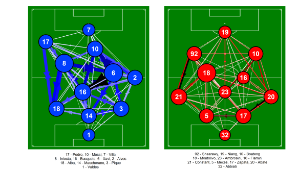
In terms of passing, I’ve tried to look more at the process using network analysis to establish how teams pass the ball and which players are the most influential in passing terms in a given match, rather than focussing on a single statistic. Below is the passing network for the match. The positions of the players are loosely based on the formations played by the two teams, although some creative license is employed for clarity. It is important to note that these are fixed positions, which will not always be representative of where a player passed/received the ball. Only the starting eleven is shown as the substitutes had little impact in a passing sense.
Passing network for Bayern Munich and Barcelona from the Champions League match at the Allianz Arena on the 23rd April 2013. Only completed passes are shown. Darker and thicker arrows indicate more passes between each player. The player markers are sized according to their passing influence, the larger the marker, the greater their influence. The size and colour of the markers is relative to the players on their own team i.e. they are on different scales for each team. Only the starting eleven is shown. Click on the image for a larger view.
As might be expected, the contrast between the two teams is quite clear. Bayern focussed their passing down the flanks, with Ribery and Robben combining well with their respective full-backs. Neuer, Dante and Boateng fed the full-backs well to begin these passing transitions. Barcelona on the other hand engaged in their familiar multitude of passing triangles, although with a bias towards their right flank. There are a number of strong links although the somewhat uninspiring Bartra-Pique link was the strongest (23 passes).
Sterile domination
The issue for Barcelona was that their possession was largely in deeper areas, away from Bayern’s penalty area. This was neatly summed up by this tweet (including a graphic) by Albert Larcada:
Barcelona finishes with 10 touches in the attacking penalty area, its fewest in any league or UCL match since 2010 twitpic.com/clg2tb
— Albert Larcada (@adlarcada_ESPN) April 23, 2013
While Barcelona’s passing network showed plenty of combinations in deeper areas, their more attacking players combined much less, with the links between Alexis, Messi and Pedro being relatively weak. In particular, the passes to Messi were low in number as he received just 7 passes combined from Iniesta (3), Pedro (2) and Alexis (2). Messi had much stronger links with Xavi (received 20 passes) and Alves (received 19 passes) although I suspect many of these were in deeper areas. While, Barcelona’s midfield three exerted their usual influence, the next most influential players were Pique and Bartra. This is a stark comparison with the home match against AC Milan, where Messi was the most influential player after the midfield trio.
Bayern did a great job of limiting Messi’s influence, although his injury likely contributed also.
Avoid the puddle
Schweinsteiger was the most influential player for Bayern, linking well with Dante, Alaba and Ribery. After the centre-backs, Bayern’s next most influential players were Robben and Ribery who counter-attacked superbly, with excellent support from their full-backs. As discussed by Zonal Marking, Bayern preyed on Barcelona’s weakness on the counter-attack with speedy breaks down the flanks.
Bayern were incredibly effective and deservedly won the match and very likely the tie.
Passing network for Barcelona and AC Milan from the Champions League match at the Camp Nou on the 12th March 2013. Only completed passes are shown. Darker and thicker arrows indicate more passes between each player. The player markers are sized according to their passing influence, the larger the marker, the greater their influence. The size and colour of the markers is relative to the players on their own team i.e. they are on different scales for each team. Only the starting eleven is shown. Click on the image for a larger view.
——————————————————————————————————————–
Passing matrices from Uefa.com press kits.
More information on these passing networks is available here.
I don’t have time for a fuller write-up but this from Zonal Marking is excellent.
Liverpool beat Zenit 3-1 at Anfield but went out of the Europa League on away goals. Below is the passing network analysis for Liverpool for both the first hour and the final 30 minutes of the match. This coincides with Liverpool’s sumptuous third goal and the double substitution that saw Assaidi and Shelvey replace Henderson and Allen. More information on how these passing networks are put together is available here in my previous posts on this subject.
The positions of the players are loosely based on the formations played by the two teams, although some creative license is employed for clarity. It is important to note that these are fixed positions, which will not always be representative of where a player passed/received the ball. The starting eleven is shown on the pitch for the first hour, with the substitutes shown for the final 30 minutes. Sterling was only on the pitch for a brief period so I’ve omitted him from the second network.
Passing networks for Liverpool for the first 60 minutes and final 30 minutes of the match against Zenit St Petersburg from the match at Anfield on the 21st February 2013. Only completed passes are shown. Darker and thicker arrows indicate more passes between each player. The player markers are sized according to their passing influence, the larger the marker, the greater their influence. Players with an * next to their name were substituted. Click on the image for a larger view.
Liverpool’s initial selection circulated possession well within the midfield zone, which is perhaps unsurprising given how possession friendly the midfield was. Compared with Coutinho and Suárez in the match against Swansea, Henderson and Allen primarily look to maintain possession rather than being more direct with their approach play. This meant that Liverpool dominated possession and kept Zenit pinned back in their half generally. Enrique and Johnson were also heavily involved and provided a great deal of width. At the hub of Liverpool’s play was Lucas who knitted things together superbly and combined effectively with all of his team mates.
Zenit did generally defend very well though and Liverpool struggled to create particularly incisive moves, although Allen’s goal was the result of excellent interplay between Henderson and Enrique (the strongest passing link in the first hour). Two set-piece goals from Suárez though set the platform for a potentially memorable comeback after Zenit’s away goal.
Anything could happen in the next half hour
Liverpool’s double substitution after the third goal saw two more direct attacking threats joining the fray as the side looked for a potential tie-winning goal. However, looking at the passing network for the last half hour, Liverpool struggled to bring their attacking players into the game. Liverpool shot frequency actually declined in this period with a succession of crosses from both open-play and set-pieces being delivered into the box. Zenit defended particularly well during this period and maintained possession for short periods to stem the tide of Liverpool attacks. They also pressed high up the pitch which saw some nervous moments in the crowd as well as the odd passage on the pitch! While the changes likely didn’t help Liverpool to any great extent, chances were still created that could have won the tie plus Zenit also boxed clever while often under a lot of pressure.
Over and out
Unfortunately Liverpool weren’t able to score that crucial fourth goal in the final 30 minutes that could have seen them go through. On a personal note, it was a privilege to be a part of a fantastic atmosphere at Anfield, which nearly saw an improbable comeback to add to Liverpool Football Club’s folklore.
I’ve previously looked at whether different playing styles can be assessed using seasonal data for the 2011/12 season. The piece concentrated on whether it was possible to separate different playing styles using a method called Principal Component Analysis (PCA). At a broad level, it was possible to separate teams between those that were proactive and reactive with the ball (Principal Component 1) and those that attempted to regain the ball more quickly when out of possession (Principal Component 2). What I didn’t touch upon was whether such features were potentially more successful than others…
Below is the relationship between points won during the 2011/12 season and the proactive/reactive principal component. The relationship between these variables suggests that more proactive teams, that tend to control the game in terms of possession and shots, are more successful. However, the converse could also be true to an extent in that successful teams might have more of the ball and thus have more shots and concede fewer. Either way, the relationship here is relatively strong, with an R2 value of 0.61.
Relationship between number of points won in the 2011/12 season with principal component 1, which relates to the proactive or reactive nature of a team. More proactive teams are to the right of the horizontal axis, while more reactive teams are to the left of the horizontal axis. The data is based on the teams in the top division in Germany, England, Spain, France and Italy from WhoScored. The black line is the linear trend between the two variables. A larger interactive version of the plot is available either by clicking on the graph or clicking here.
Looking at the second principal component, there is basically no relationship at all with points won last season, with an R2 value of a whopping 0.0012. The trend line on the graph is about as flat as a pint of lager in a chain sports bar. There is a hint of a trend when looking at the English and French leagues individually but the sample sizes are small here, so I wouldn’t get too excited yet.
Playing style is important then?
It’s always tempting when looking at scatter plots with nice trend lines and reasonable R2 values to reach very steadfast conclusions without considering the data in more detail. This is likely an issue here as one of the major drivers of the ‘proactive/reactive’ principal component is the number of shots attempted and conceded by a team, which is often summarised as a differential or ratio. James Grayson has shown many times how Total Shots Ratio (TSR, the ratio of total shots for/(total shots for+total shots against)) is related to the skill of a football team and it’s ability to turn that control of a game into success over a season. That certainly appears to play a roll here, as this graph demonstrates, as the relationship between points and TSR yields an R2 value of 0.59. For comparison, the relationship between points and short passes per game yields an R2 value of 0.52. As one would expect based on the PCA results and this previous analysis, TSR and short passes per game are correlated also (R2 = 0.58).
Circular argument
As ever, it is difficult to pin down cause and effect when assessing data. This is particularly true in football when using seasonal averaged statistics as score effects likely play a significant role here in determining the final totals and relationships. Furthermore, the input data for the PCA is quite limited and would be improved with more context. However, the analysis does hint at more proactive styles of play being more successful; it is a challenge to ascribe how much of this is cause and how much is effect.
Danny Blanchflower summed up his footballing philosophy with this quote:
The great fallacy is that the game is first and last about winning. It is nothing of the kind. The game is about glory, it is about doing things in style and with a flourish, about going out and beating the other lot, not waiting for them to die of boredom.
The question is, is the glory defined by the style or does the style define the glory?
Liverpool lost to West Bromwich Albion 2-0 at Anfield. Below is the passing network analysis for Liverpool and West Brom. More information on how these are put together is available here in my previous posts on this subject.
The positions of the players are loosely based on the formations played by the two teams, although some creative license is employed for clarity. It is important to note that these are fixed positions, which will not always be representative of where a player passed/received the ball. Only the starting eleven is shown on the pitch, as the substitutes weren’t hugely interesting from a passing perspective in this instance.
Passing network for Liverpool and West Brom from the match at Anfield on the 11th February 2013. Only completed passes are shown. Darker and thicker arrows indicate more passes between each player. The player markers are sized according to their passing influence, the larger the marker, the greater their influence. The size and colour of the markers is relative to the players on their own team i.e. they are on different scales for each team. The player markers are coloured by the number of times they lost possession during the match, with darker colours indicating more losses. Only the starting eleven is shown. Players with an * next to their name were substituted. Click on the image for a larger view.
There are some contrasting features between the two sides here. Liverpool’s standard recycling of possession in deeper areas is evident, with interplay between Reina, the back four and the midfield two of Lucas and Gerrard. West Brom showed some similar features, although the link between their centre backs is much weaker than the link between Agger and Carragher.
Mulumbu and Morrison were impressive for West Brom, linking well with the players around them. They formed some nice triangular passing structures with those around them, particularly with their midfield partner Yacob. Based on their passing network, West Brom passed the ball around well when they had it although Long wasn’t hugely involved (he did provide his usual nuisance value though).
One of the major differences is how both sides involved their respective centre forwards. Long generally either received the ball from deeper areas e.g. the long link between himself and Foster (although many of the passes were unsuccessful) or by linking up with Morrison, who was typically the most advanced of West Brom’s central midfielders. In contrast, the link between Shelvey and Suárez is almost non-existent. Given that these two were ostensibly Liverpool’s two most attacking players, the lack of interplay between them was disappointing.
Ineffectual width
With Henderson and Downing continuing on their “unnatural” sides, Liverpool’s fullbacks had plenty of space to move into down the flanks. This meant they were often a natural passing outlet for their team mates and this is highlighted by the high passing influence scores they both received. Unfortunately, much of the attacking impetus that Enrique and Johnson provided was highly wasteful. As noted on the Oh you beauty blog, their pass completion in the final third was woeful. Between them, Enrique and Johnson accounted for 30% of Liverpool’s total losses of possession. Enrique misplaced 9 passes within his own half also, as noted by WhoScored. Generally I’ve interpreted a higher passing influence score as being a good thing but perhaps in this instance this wasn’t the case.
That is why we like him
Aside from Enrique and Johnson, the main passing influence for Liverpool was Lucas. Lucas’ absolute and relative passing influence within in the team has been steadily increasing over recent matches, which is encouraging as he recovers from his injury issues. Unfortunately for Liverpool, Gerrard, Henderson and Downing had less influence than in recent weeks, which alongside the lack of partnership between Shelvey and Suárez, went some way to Liverpool struggling to open up West Brom.
Manchester City drew 2-2 with Liverpool at the Etihad. Below is the passing network analysis for Manchester City and Liverpool. More information on how these are put together is available here in my previous posts on this subject.
The positions of the players are loosely based on the formations played by the two teams, although some creative license is employed for clarity. It is important to note that these are fixed positions, which will not always be representative of where a player passed/received the ball. Only the starting eleven is shown on the pitch, as the substitutes weren’t hugely interesting from a passing perspective in this instance.
Passing network for Manchester City and Liverpool from the match at the Etihad on the 3rd February 2013. Only completed passes are shown. Darker and thicker arrows indicate more passes between each player. The player markers are sized according to their passing influence, the larger the marker, the greater their influence. The size and colour of the markers is relative to the players on their own team i.e. they are on different scales for each team. Only the starting eleven is shown. Players with an * next to their name were substituted. Click on the image for a larger view.
In the reverse fixture, Yaya Touré and De Jong were very influential for City but Touré was away at the African Cup of Nations, while De Jong joined Milan shortly after that fixture. Their replacements in this game, Barry and Garcia, were less influential, although Barry had the strongest passing influence for City in this match, with Milner second. The central midfield two, Lucas and Gerrard, were very influential for Liverpool and strongly dictated the passing patterns of the team. They both linked well with the fullbacks and wider players, while Lucas also had strong links with Suárez and Sturridge. Certainly in this area of the pitch, Liverpool had the upper hand over City and this provided a solid base for Liverpool in the match.
No Silva lining
Something that Liverpool did particularly well was limit the involvement of David Silva, who posted his worst pass completion rate (73% via EPL-Index) this season. Usually, Silva completes a pass every 96 seconds this season, whereas against Liverpool it was every 162 seconds. While Mancini’s tactical change did bring Silva more into the game briefly, overall it had a negligible impact upon Silva’s influence when comparing the networks before and after the substitution. However, one of the few occasions where Silva was able to find some time and space, he combined well with James Milner to help create City’s first goal. Goes to show it is difficult to keep good players quiet for a whole match.
Moving forward
Similarly to the Arsenal game, Liverpool showed less of an emphasis upon recycling the ball in deeper areas. Instead, they favoured moving the ball forward more directly, with Enrique often being an outlet for this via Reina and Agger. Liverpool’s fullbacks combined well with their respective wide-players, while also being strong options for Lucas and Gerrard. Strurridge was generally excellent in this match and was more influential in terms of passing than in his previous games against Norwich and Arsenal, combining well with Suárez, Lucas and Gerrard.
At least based on the past few games, Liverpool have shown the ability to alter their passing approach with a heavily possession orientated game against Norwich, followed up by more direct counter-attacking performances against Arsenal and Manchester City. The game against City was particularly impressive as this was mixed in with some good control in midfield via Lucas and Gerrard, which was absent against Arsenal. How this progresses during Liverpool’s next run of fixtures will be something to look out for.
Arsenal and Liverpool drew 2-2 at the Emirates, as Arsenal came back from two goals down. Below is the passing network analysis for Arsenal and Liverpool. More information on how these are put together is available here in my previous posts on this subject.
The positions of the players are loosely based on the formations played by the two teams, although some creative license is employed for clarity. It is important to note that these are fixed positions, which will not always be representative of where a player passed/received the ball. The starting eleven is shown on the pitch, while Enrique and Santos, who came on as substitutes are shown on the sidelines.
Passing network for Arsenal and Liverpool from the match at the Emirates on the 30th January 2013. Only completed passes are shown. Darker and thicker arrows indicate more passes between each player. The player markers are sized according to their passing influence, the larger the marker, the greater their influence. The size and colour of the markers is relative to the players on their own team i.e. they are on different scales for each side. The starting eleven is shown on the pitch, with the substitutes on the sidelines. Click on the image for a larger view.
The contrast between the two teams approach is apparent, with Arsenal dominating possession (62% according to EPL-Index), which is reflected in their much stronger passing links across the team. Much of Arsenal’s play went through Aaron Ramsey, who played a similar role to that played by Mikel Arteta in the reverse fixture, although Arsenal saw more of the ball in this match. Arsenal’s midfield-three of Ramsey, Wilshire and Cazorla combined very well and dictated the passing patterns of the side excellently.
For Liverpool, the story was slightly different. The side was happy to counter-attack, which meant that the usual recycling of possession in deeper areas was less prevalent than for example against Norwich. Most of Liverpool’s play went through Henderson and Gerrard (again Liverpool’s major passing influence), with Johnson and Downing providing good support down the left and right flanks respectively. Daniel Agger was also able to influence the game from deeper positions, with his passing influence score being third behind Gerrard and Downing. Suárez was reasonably involved, combining well with Agger, Johnson and Henderson.
Hymns & Arias
In terms of passing influence, Ramsey was the undoubted star of the show. He conducted Arsenal’s play from deep beautifully, completing over 100 passes in the process. Obviously this was partially a result of Liverpool’s approach, which allowed him the time and space to dictate play but he combined well with Arsenal’s attacking players throughout the match. Gerrard was the major influence for Liverpool, while Jordan Henderson provided a passing option higher up the pitch and brought Downing, Suárez and to a lesser extent, Sturridge into the game. This was an important function in the team’s counter-attacking.
Liverpool delivered a different passing performance in this match. There are many parallels with the Everton match here, where Liverpool had a similar passing network and employed a more pragmatic counter-attacking style. It will be interesting to see if they use such tactics in the next match against Manchester City
Liverpool beat Norwich City 5-0 at Anfield while posting some impressive passing statistics. I’ve previously used network analysis to assess Liverpool’s passing this season. It has been a while since I last posted something on this but now seemed a good time to get back to it.
Below is the passing network for both Liverpool and Norwich City. The positions of the players are loosely based on the formations played by the two teams, although some creative license is employed for clarity e.g. Suárez’s position is shifted left-of-centre. It is important to note that these are fixed positions, which will not always be representative of where a player passed/received the ball. Only the starting eleven are shown in this instance.
Passing network for Liverpool and Norwich City from the match at Anfield on the 19th January 2013. Only completed passes are shown. Darker and thicker arrows indicate more passes between each player. The player markers are sized according to their passing influence, the larger the marker, the greater their influence. Only the starting eleven is shown.
Liverpool: Jones (1), Johnson (2), Agger (5), Carragher (23), Wisdom (47), Lucas* (21), Gerrard (8), Henderson* (14), Suárez (7), Sturridge* (15), Downing (19)
Norwich: Bunn (28), Garrido (18), R Bennett (24), Turner (6), Martin (2), Johnson (4), Tettey (27), E Bennett* (17), Howson (8), Snodgrass* (7), Holt (9)
There is a stark contrast between how the two teams approached passing the ball. Looking at Jones, the back four and Lucas, there are a multitude of connections between them as Liverpool aim to build from the back. Furthermore, Henderson and Gerrard are heavily involved in this area as the team aims to recycle possession – look at the strong links between them, Lucas and the centre-backs. This is completely missing in Norwich’s network as they sought to be more direct – see the long link between Bunn and Holt for example. Norwich created relatively little during the game and it is clear from their passing network that Holt was fairly uninvolved. I’ll not delve into Norwich’s passing network any further.
Sharing the load
An important diagnostic for network analysis is a measure known as “closeness centrality”, which in this context is dictated by the number of passes played and received by a given player. The higher the value the better and this can be thought of as the “passing influence” that a player has on their team. The absolute values aren’t important in this instance* so the main thing to look at is the relative size of the circles for each team. One of the major aspects of Liverpool’s network is that all of the outfield players aside from Sturridge were heavily involved in the passing movements of the team. Sturridge’s lesser involvement isn’t a criticism as such, as he clearly combined well with Liverpool’s more advanced players. In some ways, strikers can be disadvantaged by such a measure as they have less opportunity to get involved with everyone in the team, which can also be the case for goalkeepers. A more even distribution of passing responsibilities allows a side to create multiple attacking angles/opportunities – notice the large level of criss-crossing of the networks for Liverpool’s attacking players. Liverpool’s front-five plus Glen Johnson had a large amount of interplay with able support from Wisdom and Lucas.
O Captain! My Captain!
However, there was clearly a stand-out performer in terms of passing influence as Steven Gerrard dominates the passing network for Liverpool. Gerrard was the hub of the team’s passing. This combined with the rest of the team stepping up to the (passing?) plate, meant that Liverpool delivered an excellent passing performance. Whether they can continue this level of performance over the coming games will be crucial.
——————————————————————————————————————–
*At some point I want to put these measures into a more quantitative context, which will hopefully add further detail regarding how Liverpool’s passing develops.
The perceived playing style of a football team is a much debated topic with conversations often revolving around whether a particular style is “good/bad” or “entertaining/boring”. Such perceptions are usually based upon subjective criteria and personal opinions. The question is whether the playing style of a team can be assessed using data to categorise and compare different teams.
WhoScored report several variables (e.g. data on passing, shooting, tackling) for the teams in the top league in England, Spain, Italy, Germany and France. I’ve collated these variables for last season (2011/12) in order to examine whether they can be used to assess the playing style of these sides. In total there are 15 variables, which are somewhat limited in scope but should serve as a starting point for such an analysis. Goals scored or conceded are not included as the interest here is how teams actually play, rather than how it necessarily translates into goals. The first step is to combine the data in some form in order to simplify their interpretation.
Principal Component Analysis
One method for exploring datasets with multiple variables is Principal Component Analysis (PCA), which is a mathematical technique that attempts to find the most common patterns within a dataset. Such patterns are known as ‘principal components’, which describe a certain amount of the variability in the overall dataset. These principal components are numbered according to the amount of variance in the dataset that they account for. Generally this means that only the first few principal components are examined as they account for the greatest percentage variance in the dataset. Furthermore, the object is to simplify the dataset so examining a large number of principal components would somewhat negate the point of the analysis.
The video below gives a good explanation of how PCA might be applied to an everyday object.
Below is a graph showing the first and second principal components plotted against each other. Each data point represents a single team from each of the top leagues in England, Spain, Italy, Germany and Italy. The question though is what do each of these principal components represent and what can they tell us about the football teams included in the analysis?
Principal component analysis of all teams in the top division in England, Spain, Italy, Germany and France. Input variables are taken from WhoScored.com for the 2011/12 season.
The first principal component accounts for 37% of the variance in the dataset, which means that just over a third of the spread in the data is described by this component. This component is represented predominantly by data relating to shooting and passing, which can be seen in the graph below. Passing accuracy and the average number of short passes attempted per game are both strongly negatively-correlated (r=-0.93 for both) with this principal component, which suggests that teams positioned closer to the bottom of the graph retain possession more and attempt more short passes; unsurprisingly Barcelona are at the extreme end here. Total shots per game and total shots on target per game are also strongly negatively-correlated (r=-0.88 for both) with the first principal component. Attempted through-balls per game are also negatively correlated (r=-0.62). In contrast, total shots conceded per game and total aerial duels won per game are positively-correlated (r=0.65 & 0.59 respectively). So in summary, teams towards the top of the graph typically concede more shots and win more aerial duels, while as you move down the graph, teams attempt more short passes with greater accuracy and have more attempts at goal.
The first principal component is reminiscent of a relationship that I’ve written about previously, where the ratio of shots attempted:conceded was well correlated with the number of short passes per game. This could be interpreted as a measure of how “proactive” a team is with the ball in terms of passing and how this transfers to a large number of shots on goal, while also conceding fewer shots. Such teams tend to have a greater passing accuracy also. These teams tend to control the game in terms of possession and shots.
The second principal component accounts for a further 18% of the variance in the dataset [by convention the principal components are numbered according to the amount of variance described]. This component is positively correlated with tackles (0.77), interceptions (0.52), fouls won (0.68), fouls conceded (0.74), attempted dribbles (0.59) and offsides won (0.63). In essence, teams further to the right of the graph attempt more tackles, interceptions and dribbles which unsurprisingly leads to more fouls taking place during their matches.
The second principal component appears to relate to changes in possession or possession duels, although the data only relates to attempted tackles, so there isn’t any information on how successful these are and whether possession is retained. Without more detail, it’s difficult to sum up what this component represents but we can describe the characteristics of teams and leagues in relation to this component.
Correlation score graph for the principal component analysis. PS stands for Pass Success.
The first and second components together account for 55% of the variance in the dataset. Adding more and more components to the solution would drive this figure upwards but in ever diminishing amounts e.g. the third component accounts for 8% and the fourth accounts for 7%. For simplicity and due to the further components adding little further interpretative value, the analysis is limited to just the first two components.
Assessing team playing styles
So what do these principal components mean and how can we use them to interpret team styles of play? Putting all of the above together, we can see that there are significant differences between teams within single leagues and when comparing all five as a whole.
Within the English league, there is a distinct separation between more proactive sides (Liverpool, Spurs, Chelsea, Manchester United, Arsenal and Manchester City) and the rest of the league. Swansea are somewhat atypical, falling between the more reactive English teams and the proactive 6 mentioned previously. Stoke could be classed as the most “reactive” side in the league based on this measure.
There isn’t a particularly large range in the second principal component for the English sides, probably due the multiple correlations embedded within this component. One interesting aspect is how all of the English teams are clustered to the left of the second principal component, which suggests that English teams attempt fewer tackles, make fewer interceptions and win/concede fewer fouls compared with the rest of Europe. Inspection of the raw data supports this. This contrasts with the clichéd blood and thunder approach associated with football in England, whereby crunching tackles fly in and new foreign players struggle to adapt to the intense tackling approach. No doubt there is more subtlety inherent in this area and the current analysis doesn’t include anything about the types of tackles/interceptions/fouls, where on the pitch they occur or who perpetrates them but this is an interesting feature pointed out by the analysis worthy of further exploration in the future.
The substantial gulf in quality between the top two sides in La Liga from the rest is well documented but this analysis shows how much they differed in style with the rest of the league last season. Real Madrid and Barcelona have more of the ball, take more shots and concede far fewer shots compared with their Spanish peers. However, in terms of style, La Liga is split into three groups: Barcelona, Real Madrid and the rest. PCA is very good at evaluating differences in a dataset and with this in mind we could describe Barcelona as the most “different” football team in these five leagues. Based on the first principal component, Barcelona are the most proactive team in terms of possession and this translates to their ratio of shots attempted:conceded; no team conceded fewer shots than Barcelona last season. This is combined with their pressing style without the ball, as they attempt more tackles and interceptions relative to many of their peers across Europe.
Teams from the Bundesliga are predominantly grouped to the right-hand-side of the second principal component, which suggests that teams in Germany are keen to regain possession relative to the other leagues analysed. The Spanish, Italian and French tend to fall between the two extremes of the German and English teams in terms of this component.
All models are wrong, but some are useful
The interpretation of the dataset is the major challenge here; Principal Component Analysis is purely a mathematical construct that doesn’t know anything about football! While the initial results presented here show potential, the analysis could be significantly improved with more granular data. For example, the second principal component could be improved by including information on where the tackles and interceptions are being attempted. Do teams in England sit back more compared with German teams? Does this explain the lower number of tackles/interceptions in England relative to other leagues? Furthermore, the passing and shooting variables could be improved with more context; where are the passes and shots being attempted?
The results are encouraging here in a broad sense – Barcelona do play a different style compared with Stoke and they are not at all like Swansea! There are many interesting features within the analysis, which are worthy of further investigation. This analysis has concentrated on the contrasts between different teams, rather than whether one style is more successful or “better” than another (the subject of a future post?). With that in mind, I’ll finish with this quote from Andrés Iniesta from his interview with Sid Lowe for the Guardian from the weekend.
…the football that Spain and Barcelona play is not the only kind of football there is. Counter-attacking football, for example, has just as much merit. The way Barcelona play and the way Spain play isn’t the only way. Different styles make this such a wonderful sport.
Liverpool began their season with a disappointing result against West Bromwich Albion at the Hawthorns. Much has been made since Brendan Rodgers’ appointment about his passing philosophy, so the focus here will be upon analysing how Liverpool passed the ball against West Brom.
Passing network analysis
One method of analysing passing by a football team is network analysis, which I’ve used previously to assess Liverpool’s passing against FC Gomel. The idea with network analysis is that the connections between players are analysed to look at passing patterns in the team and to identify key players in the network in terms of passing. The number of passes played and received by each player is collated according to the player they passed to and who they received from respectively. The data for passes played and received is taken from the Stats Zone application, which was kindly provided by the excellent Anfield-Index. One caveat to note is that throw-ins are included, which boosts Johnson and Kelly’s passes completed in particular.
Below is the passing network for Liverpool and shows completed passes only. The larger and darker the arrow is, the greater the number of passes played by one player to another. The positions of the players are based on their average positions during the match provided by WhoScored, although Lucas and Allen are slightly separated horizontally for clarity as their average positions were practically next to each other. It is important to note that these are the average positions, which will not always be representative of where a player passed/received the ball. Also, only the starting 11 is shown as the substitutes had a fairly limited impact upon the game in terms of passing.
Passing network for Liverpool from the away match against West Bromwich Albion on the 18th August 2012. Only completed passes are shown. Darker and thicker arrows indicate more passes between each player. The position of each marker is based upon their average position and the size of each marker is related to their closeness centrality, which is described in the text below. Asterisk indicates players who did not play the full match. Only the starting eleven is shown.
The main features in the above network are the reciprocal passes played between the defenders and the criss-crossing of passes in the midfield zone. Liverpool clearly kept the ball efficiently in deeper areas as the back four plus Lucas and Allen retained the ball well. The main issue for Liverpool was getting the ball to their attackers further up the pitch. Borini and Downing received the ball just 31 and 33 times respectively, with Downing in particular tending to pass the ball back to players in deeper areas; Downing completed a pass to Suárez twice and Borini once. Borini tended to combine with Johnson and Suárez in the main, passing to both of them on 7 occasions. Liverpool did effectively get the ball to Suárez, as he received the ball on 51 occasions and he was Liverpool’s main attacking outlet. Suárez tended to receive the ball from players in wide areas and from Lucas and Allen, whereas against Gomel the main link was with Gerrard and the quick interchanging of passes between them was less in evidence sadly.
Where you gonna pass to now, where you gonna go?
One of the useful tools of network analysis is that you can derive measures that indicate which players in the team are the most influential in terms of passing. One of these measures is known as “closeness centrality”, which in this context is dictated by the number of passes played and received by a given player. The key aspect of this measure is that it is greater when the passes that the player plays and receives are distributed more evenly across the team. If a hypothetical player makes 100 passes in a match and receives the ball 100 times, they would have a greater closeness centrality if they passed and received the ball 10 times to and from each team-mate compared to if they simply passed the ball back and forth to just 1 team-mate. Players with a larger closeness centrality score are interpreted as being a greater influence upon the passing of the team as they dictate the movement of the ball within the side.
In the figure above, the size of the player markers is dictated by their closeness centrality score. Joe Allen was Liverpool’s stand out player as he dictated Liverpool’s passing play. He generally received the ball from his centre-backs and Johnson prior to playing his passes. He linked well with Johnson and Borini on the left, his midfield partner Lucas and Suárez further forward. A feature of Allen’s play was his movement to make himself available for a pass and he received a pass on 62 occasions, more than any other player.
Skrtel had the next highest closeness score, although he was some way behind Allen. Agger was far less effective compared to the Gomel match, partly due to the sending off but also due to his passing recipients being lesser in scope as he favoured passes to Johnson, Skrtel and Allen. Lucas was also less of an influence, again partly due to not playing the full game but also due to being less central to the teams passing. Johnson was more effective than Kelly from full-back and was probably Liverpool’s most influential attacking force as he played high up the pitch on the left and created 3 scoring opportunities according to the EPL-Index Stats Centre. Downing and Borini’s involvement was very limited compared to their team-mates (only Reina was less involved). The involvement of Suárez and Gerrard was also disappointing. Overall, the lack of involvement of Liverpool’s front-4 was a hindrance over the course of the match, as most of the play was contained in the defensive and midfield zones.
Hey Joe
Liverpool’s passing against West Brom was reasonable, particularly in the 1st half and there were definite signs of Brendan Rodgers’ philosophy bedding in. However, the lack of involvement of the front-4 and in particular, Borini and Downing was disappointing. The major bright spot was the performance of Joe Allen, who dictated the passing play of the team to good effect. Unfortunately, Lucas wasn’t up to his usual level, which may be due to his ongoing recovery from injury and also this match being the first time he started with Allen. Hopefully future games will see this partnership blossoming as they begin to complement each other in terms of their roles within the team. Such a partnership could be crucial in implementing the control that Brendan Rodgers desires.