Premier League Pass Masters

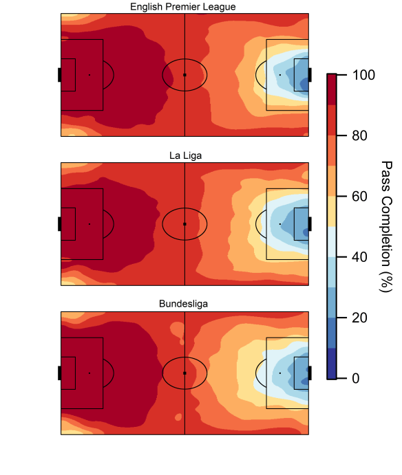
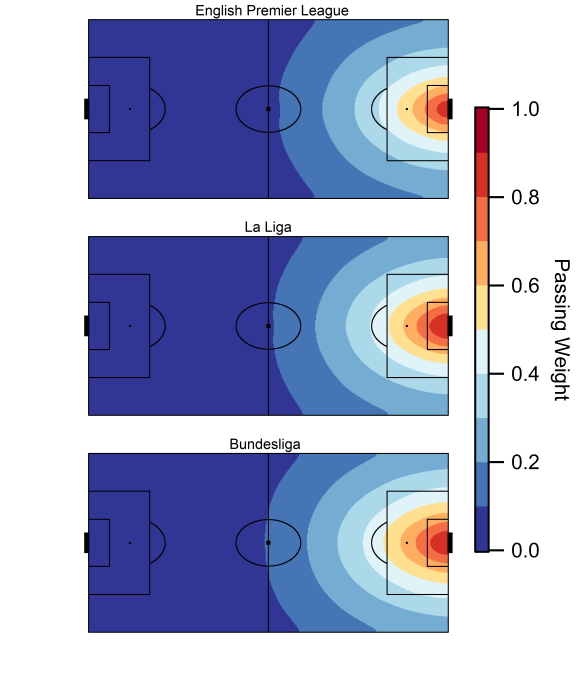
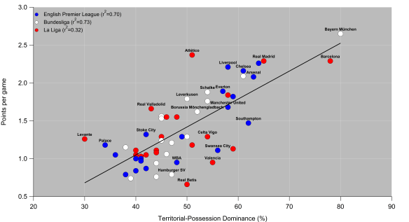
In this previous post, I combined territory and possession to create a Territorial-Possession Dominance (TPD) metric. The central basis for this metric is that it is more difficult to pass the ball into dangerous areas. Essentially teams that have the ball in areas closer to their opponent’s goal, while stopping their opponent moving the ball close to their own, will score more highly on this metric.

In the graphic below, I’ve looked at how the teams in the Premier League have been shaping up this year (data correct up to 24/04/15). The plot splits this performance on the offensive side (with the ball) and the defensive side (without the ball). For a frame of reference, league average is defined as a score of 100.

Broadly, these two terms show that teams who dominate territory with the ball also limit the amount of possession they concede close to their own goal. This makes sense given there is only one ball on the pitch, so pinning your opponent back in their half makes it more difficult to maintain possession in dangerous areas in return. Alternatively, teams may choose to sit back, soak up pressure and then aim to counter attack; this would yield a low rating offensively and a higher rating defensively.

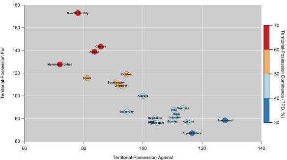
Territorial-possession for and against for the 2014/15 English Premier League. A score of 100 denotes league average. Marker colour refers to Territorial-Possession Dominance. Data via Opta.

The top seven (plus Everton) tend to dominate territory and possession, while the bottom thirteen (minus Everton) are typically pinned back. Stoke City are somewhat peculiar, as they are below average on both scores,so while they limit their opponents, they seemingly struggle to manoeuvre the ball into dangerous areas themselves. Michael Caley’s expected goals numbers suggest that Everton have seemingly struggled to convert their territorial and possession dominance into an abundance of good quality chances; essentially they look pretty in-between both boxes.

Sunderland’s passivity is evident as they routinely saw their opponents pass the ball into dangerous areas; based on where their defensive actions occur and the league-leading number of shots from outside of the box they concede, the aim is to get men behind the ball and prevent good quality chances from being created. That is possibly a reasonable tactical system if you can combine that with swift counter-attacking and high quality chances but Poyet’s dismissal is indicative of how that worked out.

On the flip side, Manchester United rank lowest for territorial-possession against. Their system is designed to prevent their opponent’s from building pressure on their defense close to their own goal. Think of it as a system designed to prevent Phil Jones’ face from trending on Twitter. Of course, when the system breaks down and/or opposition skill breaks through, things look awful and high quality chances are conceded.

Finally, Manchester City clearly aren’t trying hard enough.

Passing maestros

The metric I’ve devised classifies each pass completed based on the destination of the pass, so it is relatively straight-forward to breakdown the metric by the player passing the ball. Below are the top twenty players this season ranked according to the average ‘danger’ of their passes (non-headed passes only, minimum 900 minutes played). I can also do this for players receiving the ball but I’ll leave that for another time.

Players who routinely complete passes into dangerous areas will score highly here, so there is an obvious bias towards forwards and attacking midfielders/wingers. Bias will also be introduced by team systems, which would be a good thing to examine in the future. I’ve also noted on the right-hand-side the number of passes each player completes per 90 minutes to give a sense of their involvement.

Some players, like Diafra Sakho and Jamie Vardy, are rarely involved but their passes are often dangerous. Others manage to combine a high-volume of passes with danger; PFA Player of the Year, Eden Hazard, is the standout here (very much a Sum 41 kind of footballer). The link-up skills of Sánchez and Agüero are also evident.

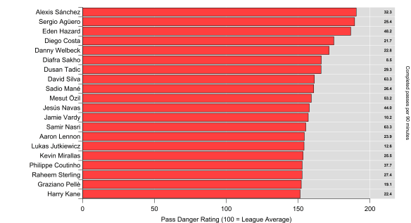
Pass Danger Rating for English Premier League players in the 2014/15 season. Numbers on right indicate number of completed passes played per 90 minutes by each player. Minimum of 900 minutes played. Data via Opta.

I quite like this as a metric, as the results aren’t always obvious; it is nice to have confirmatory metrics but informative metrics are potentially more valuable from an analytics point of view. For instance, the metric can quickly identify the dangerous passers for the opposition, who could then be targeted to reduce their influence. It can also be useful in identifying players who could possibly do more on your own team (*cough* Lallana *cough*). Finally, it’s a metric that could be used as a part of an analytics based scouting system. I’m hoping to develop this further, so watch this space.

Advertisement

Help me rondo

In my previous post, I looked at the relationship between controlling the pitch (territory) and the ball (possession). When looking at the final plot in that post, you might infer that ‘good’ teams are able to control both territory and possession, while ‘bad’ teams are dominated on both counts. There are also teams that dominate only one metric, which likely relates to their specific tactical make-up.

When I calculated the territory metric, I didn’t account for the volume of passes in each area of the pitch as I just wanted to see how things stacked up in a relative sense. Territory on its own has a pretty woeful relationship with things we care about like points (r2=0.27 for the 2013/14 EPL) and goal difference (r2=0.23 for the 2013/14 EPL).

However, maybe we can do better if we combine territory and possession into one metric.

To start with, I’ve plotted some heat maps (sorry) showing pass completion percentage based on the end point of the pass. The completion percentage is calculated by adding up all of the passes to a particular area on the pitch and comparing that to the number of passes that are successfully received. I’ve done this for the 2013/14 season for the English Premier League, La Liga and the Bundesliga.

As you would expect, passes directed to areas closer to the goal are completed at lower rates, while passes within a teams own half are completed routinely.

Blah.

Heat map of pass completion percentage based on the target of all passes in the 2013/14 English Premier League, La Liga and Bundesliga. Data via Opta.

What is interesting in the below plots is the contrast between England and Germany; in the attacking half of the pitch, pass completion is 5-10% lower in the Bundesliga than in the EPL. La Liga sits in-between for the most part but is similar to the Bundesliga within the penalty area. My hunch is that this is a result of the contrasting styles in these leagues:

  1. Defences often sit deeper in the EPL, particularly when compared to the Bundesliga, which results in their opponents completing passes more easily as they knock the ball around in front of the defence.
  2. German and Spanish teams tend to press more than their English counter-parts, which will make passing more difficult. In Germany, counter-pressing is particularly rife, which will make passing into the attacking midfield zone more challenging.

From the above information, I can construct a model* to judge the difficulty of a pass into each area of the pitch and given the differences between the leagues, I do this for each league separately.

I can then use this pass difficulty rating along with the frequency of passes into that location to put a value on how ‘dangerous’ a pass is e.g. a completed pass received on the penalty spot in your opponents penalty area would be rated more highly than one received by your own goalkeeper in his six-yard box.

Below is the resulting weighting system for each league. Passes that are received in-front of the goal within the six-yard box would have a rating close to one, while passes within your own half are given very little weighting as they are relatively easy to complete and are frequent.

There are slight differences between each league, with the largest differences residing in the central zone within the penalty area.

Blah.

Heat map of pass weighting model for the 2013/14 English Premier League, La Liga and Bundesliga. Data via Opta.

Using this pass weighting scheme, I can assign a score to each pass that a team completes, which ‘rewards’ them for completing more dangerous passes themselves and preventing their opponents from moving the ball into more dangerous areas. For example, a team that maintains possession in and around the opposition penalty area will increase their score. Similarly, if they also prevent their opponent from moving the ball into dangerous areas near their own penalty area, this will also be rewarded.

Below is how this Territorial-Possession Dominance (TPD) metric relates to goal difference. It is calculated by comparing the for and against figures as a ratio and I’ve expressed it as a percentage.

Broadly speaking, teams with a higher TPD have a better goal difference (overall r2=0.59) but this varies across the leagues. Unsurprisingly, Barcelona and Bayern Munich are the stand-out teams on this metric as they pin teams in and also prevent them from possessing the ball close to their own goal. Manchester City (the blue dot next to Real Madrid) had the highest TPD in the Premier League.

In Germany, the relationship is much stronger (r2=0.87), which is actually better than both Total Shot Ratio (TSR, r2=0.74) and Michael Caley’s expected goals figures (xGR, r2=0.80). A major caveat here though is that this is just one season in a league with only 18 teams and Bayern Munich’s domination certainly helps to strengthen the relationship.

The relationship is much weaker in Spain (r2=0.35) and is worse than both TSR (r2=0.54) and xGR (r2=0.77).  A lot of this is driven by the almost non-existent explanatory power of TPD when compared with goals conceded (r2=0.06). La Liga warrants further investigation.

England sits in-between (r2=0.69), which is on a par with TSR (r2=0.72). I don’t have xGR numbers for last season but I believe xGR is usually a few points higher than TSR in the Premier League.

Blah.

Relationship between goal difference per game and territorial-possession dominance for the 2013/14 English Premier League, La Liga and Bundesliga. Data via Opta.

The relationship between TPD and points (overall r2=0.56) is shown below and is broadly similar to goal difference. The main difference is that the strength of the relationship in Germany is weakened.

Blah.

Relationship between points per game and territorial-possession dominance for the 2013/14 English Premier League, La Liga and Bundesliga. Data via Opta.

Over the summer, I’ll return to these correlations in more detail when I have more data and the relationships are more robust. For now, the metric appears to be useful and I plan to improve it further. Also, I’ll be investigating what it can tell us about a teams style when combined with other metrics.

——————————————————————————————————————– *For those who are interested in the method, I calculated the relative distance of each pass from the centre of the opposition goal using the distance along the x-axis (the length of the pitch) and the angle relative to a centre line along the length of the pitch.

I then used logistic regression to calculate the probability of a pass being completed; passes are deemed either successful or unsuccessful, so logistic regression is ideal and avoids putting the passes into location buckets on the pitch.

I then weighted the resulting probability according to the frequency of passes received relative to the distance from the opposition goal-line. This gave me a ‘score’ for each pass, which I used to calculate the territory weighted possession for each team.