Burnley: 2018-19 Season Preview

Originally published on StatsBomb.

Burnley enter the new season holding ‘the best of the rest’ crown following their highest place finish since 1974 last time out. The club are breaking new ground in their recent history, with a third consecutive season in the top flight plus the visit of European football to Turf Moor for the first time since the mid-sixties.

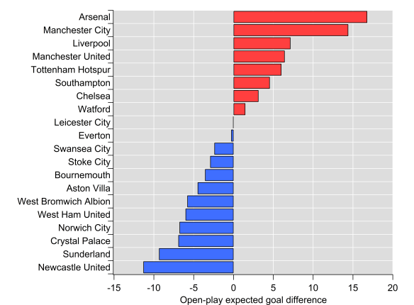
According to StatsBomb’s underlying numbers, Burnley’s finishing position was reasonably well-merited, with the ninth best expected goal difference in the league. That performance was powered by the sixth best defence in the league in both their outcomes and expectation. Fifty-four points wouldn’t usually be enough to secure seventh but Burnley can hardly be blamed for the deficiencies of others; eighth place Everton sitting on forty-nine points tells the story well on that front.

With all of the above considered though, seventh seems like the very top of Burnley’s potential outcomes given they don’t have the financial means to vault into challenging the top-six, so where do they go from here?

Defensive Foundations

Unless this is your first time visiting StatsBomb towers, you’ll no doubt be familiar with Burnley’s annual dance with expected goal models. Over each of the last four seasons, they’ve conceded fewer goals than expected based on traditional expected goal models, with their extreme form of penalty box defending thought to at least partially explain these divergences.

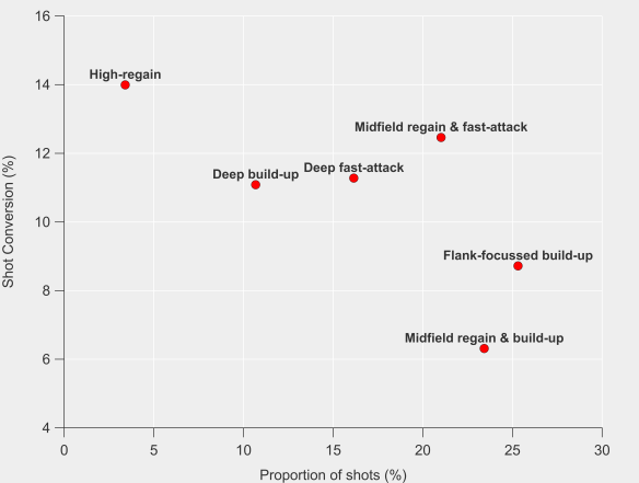
StatsBomb’s new shot event data includes the position of the players at the moment of the shot and it’s fair to say that Burnley keep the data collectors busy. StatsBomb’s expected goal model includes all of that information and puts their average expected goal conceded per shot at 0.084, which is the lowest in the league by some distance. It’s an impressive feat and it is what powers their defensive performance as only Stoke City and West Ham conceded more shots last season, which would usually put you amongst the worst defensive teams in the league.

Sean Dyche has instilled a defensive system based around forcing their opponent’s to take shots from poor locations and getting as many bodies between those shots and the goal as possible, even if those bodies don’t necessarily pressure the shot-taker. To give an overall picture of this, Burnley’s shots conceded rank:

  • Third longest distance from goal (the fundamental building block of expected goals).
  • Lowest proportion of shots where only the goalkeeper was between the shot-taker and the goal.
  • Fourth highest in density of players between the shot-taker and the goal.
  • Seventh highest in proportion of shots under pressure.
  • Ninth shortest distance between the shot-taker and the closest defender.

No other team comes close to putting all of those numbers together and when you add it all up you get a potent defensive cocktail that sees the highest proportion of blocked shots in the league and the lowest proportion of shots on target. Even with all that added to the model melting pot, Burnley still out-performed their expected goal figures to the tune of 12 goals, which is similar result to traditional expected goal models. However, StatsBomb’s model rates them more highly relative to the rest of the league. There was still some air in their numbers, but the process has a more-solid footing.

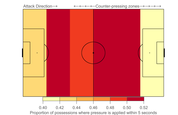
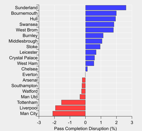
While their bunker-like approach might sound reminiscent of your ‘typical’ English defensive style, Burnley actually differ markedly further up the pitch where they apply a blanket of pressure on their opponents. The average distance of their defensive actions sat at a league average level, as did their opponent’s pass completion rate.

Burnley Defensive Activity Heatmap Premier League 2017_2018

Burnley counter-pressed at a league average intensity, sitting tenth overall. Based on a simple model of the strong relationship between counter-pressing and possession, Burnley counter-pressed more than any other team relative to their level of possession. The midfield pair of Steven Defour and Jack Cork led their defensive-pressing efforts, with able support from their wingers and attacking midfielders.

Defence has been the bedrock of this Burnley side and there is no reason to expect 2018/19 to be any different.

Attacking Concerns

On the attacking end, Burnley were thirteenth in both shots (10.6) and expected goals (1.1) per game, which you can likely surmise meant their expected goal per shot was distinctly league average. They actually under-performed their expected goals to the tune of six goals, which caused them particular problems at home where they were down seven goals against expectation.

Chris Wood provided very good numbers in his debut season, contributing 0.45 expected goals per 90, which was tenth highest of players who played over 900 minutes and third highest of those not at one of the top-six. His shot map illustrates his fondness for the central area of the box, with his expected goals per shot sitting fourth of players taking more than one shot per 90 minutes. Even his shots from outside of the penalty area were reasonably high quality, with two of them coming with the keeper out of position and no defender blocking his path to goal, one of which yielded a goal against Crystal Palace on his full debut.

Chris Wood Premier League 2017_2018

While Wood’s numbers were very good, there was a drop-off in goal-scoring contribution across the rest of the squad; Ashley Barnes and Welsh legend Sam Vokes were contributing at a 1 in 3 game rate in both expectation and actual output, with the midfield ranks providing limited goal-scoring support.

Wood’s medial ligament injury just before Christmas and two-month absence coincided with Burnley’s attack dropping below one expected goal per game. This was compounded by a poor run on the defensive side as well, leading to them collecting just 4 points in 9 games with Wood out of the starting eleven.

Burnley Premier League Trendlines

Gudmundsson carried the creative burden, with Brady chipping in when in the team but both relied heavily on set pieces when examining their expected assist contribution. Burnley were likely a touch unfortunate to not score more from dead-ball situations as their underlying process was good. However, there is certainly a lot of room for improvement in creativity from open-play.

With perhaps less scope for improvement on the defensive side, Burnley could do with improving their attacking output to really establish themselves in the top-half of the table. If Chris Wood can remain healthy and maintain his form then that would certainly help but ideally you would want to see an attack that is less reliant on one individual.

Transfers

From a departures point of view, Scott Arfield is the only player to leave who contributed reasonably significant minutes last season. After going most of the summer without an incoming transfer on the horizon, things have got busier over the last few days of the window

It is unclear whether proper football men or air-conditioned analytics practitioners were more excited by the signing of Joe Hart, with the latter intrigued how a goalkeeper with a history of poor shot-stopping numbers will fair at a club where the previous incumbents have consistently out-performed said numbers. With Nick Pope’s dislocated shoulder expected to keep him out of action for several months and Tom Heaton’s calf strain disrupting his own return from a dislocated shoulder, Hart is likely to start the season between the sticks.

Ben Gibson arrives from one of the better defensive teams in the Championship to provide competition and depth to the central defensive ranks. He could potentially ease Ben Mee out of the starting eleven and form a peak-age partnership with James Tarkowski once he is up to speed with Burnley’s defensive system.

Another arrival from the Championship is Matej Vydra, whose 21 goals last season saw him top the scoring charts, although his total was inflated by 6 penalties. His 15 non-penalty goals put him joint-fourth across the season in terms of volume at a rate of 0.50 goals per 90. However, his goal-scoring record over his career could be charitably described as ‘patchy’, while his two previous stints in the Premier League were mostly spent on the side-lines. Those concerns aside, the hope is that he can form an effective partnership with Wood and provide more creativity and a greater goal-threat than Jeff Hendrick, which is a practically subterranean low-bar.

Burnley have a recent history of reasonably successful recruitment from the Championship and are seemingly following that model again with the signings of Gibson and Vydra. Adding a more creative option in open-play looks like the area where they could have clearly upgraded the existing squad. It’s hard not to wonder whether they could have used their success last season and the draw of European football to improve their first-eleven. That said, being financially prudent isn’t the worst strategy and has seen them progress over recent years, so it’s hard to be too critical.

Where Do We Go from Here?

Burnley’s prospects this season are likely closely-tied to whether they qualify for the Europa League group stage. Injuries aside, they played essentially a first-choice team against Aberdeen, so are clearly aiming to progress. İstanbul Başakşehir are ranked 66th in Europe based on their Elo ranking, with Burnley in 53rd, so their tie is expected to be evenly-balanced.

Burnley ran with the most settled line-up in the league by a wide margin last season and squad depth is a major concern with the potential Thursday-Sunday grind that comes with Europa League qualification. Add in whatever the league cup is called this year and the next few months could be perilous.

The range of potential outcomes for this Burnley squad seems quite broad and the bookmakers are certainly unconvinced. On one end of the scale they could secure another top-half finish and put together a European adventure to bore the next generation of fans with, while on the flip-side they could struggle with the extra strain on the squad and find themselves at the wrong end of the table. The backbone of their past two campaigns has been their form in the first half of the season, which has kept them well-outside the relegation battle. That wasn’t the case in 2014/15 when they spent the entire season in the bottom four and struggled for goals when they needed to put wins on the board. A similar scenario playing out this term amidst a potentially stronger bottom-half could well be in play heading into 2019.

However, Burnley have made a habit of defying expectations and even have the opportunity to expand their exploits abroad this year. We’ll see if Sean Dyche can weave further sorcery from his spell-book.

Advertisement

Using Pressure to Evaluate Centre Backs

Originally published on StatsBomb.

Analysing centre backs is a subject likely to provoke either a shrug or a wistful smile from an analytics practitioner. To varying degrees, there are numbers and metrics aplenty for other positions but in public analytics at least, development has been limited and a genuine track record of successful application is yet to be found. If centre back analysis is the holy grail of public football analytics, then the search thus far has been more Monty Python than Indiana Jones.

One of the major issues with centre back analysis is that positioning isn’t measured directly by on-ball event data and any casual football watcher can tell you that positioning is a huge part of the defensive art. Tracking data would be the ideal means to assess positioning but it comes at a high-cost both computationally and technically, while having a much smaller coverage in terms of leagues than simpler event data provision.

StatsBomb’s new pressure event data serves as a bridge between the traditional on-ball event data and the detailed information provided by tracking data, offering a new prism to investigate the style and effectiveness of centre backs. While it won’t provide information on what a defender is up to when he is not in the immediate vicinity of the ball, it does provide extra information on how they go about their task.

Starting at the basic counting level, centre backs averaged six pressure actions per ninety minutes in the Premier League last season. Tackles and interceptions clock in at 0.8 and 1.3 per 90 respectively, which immediately illustrates that pressure provides a great deal more information to chew on when analysing more ‘proactive’ defending. I’m classing clearances and blocking shots as ‘reactive’ given they mostly take place in the penalty area and are more-directly driven by the opponent, while aerial duels are a slightly different aspect of defending that I’m going to ignore for the purposes of this analysis.

The figure below maps out where these defensive actions occur on the pitch and is split between left and right centre backs. Pressure actions typically occur in wider areas in the immediate vicinity of the penalty area, with another peak in pressure just inside the top corner of the 18-yard box. This suggests that centre backs don’t engage too high up the pitch in terms of pressure and are generally moving out towards the flanks to engage opponents in a dangerous position and either slow-down an attack, cut down an attackers options or directly contest possession.

DefensiveMaps.png

Maps illustrating the location of pressure actions, interceptions and tackles by centre backs in the 2017/18 EPL season. Top row is for left-sided centre backs and the bottom row is for right-sided centre backs.

The location of pressure actions is somewhat similar to the picture for interceptions, although the shape of the latter is less well-defined and tends to extend higher up the pitch. Tackles peak in the same zone just outside the top corners of the penalty area but are also less spatially distinct. Tackles also peak next to the edge of the pitch, a feature that is less distinct in the pressure and interception maps.

Partners in Crime

The number of pressure actions a centre back accumulates during a match will be driven by their own personal inclinations and role within the team, as well as the peculiarities of a given match and season e.g. the tactics of their own team and the opposition or the number of dangerous opportunities their opponent creates. The figure below explores this by plotting each individual centre back’s pressure actions per ninety minutes against their team name. The team axis is sorted by the average number of pressure actions the centre backs on each team make over the season.

CB_Pressure_Actions_per90

Pressure actions per 90 minutes by centre backs in the 2017/18 EPL season (minimum 900 minutes played) by team. Team axis is sorted by the weighted average number of pressure actions the centre backs on each team make over the season.

At the top end of the scale, we see Arsenal and Chelsea, two teams that regularly played a back-three over the past season. Nacho Monreal and César Azpilicueta led the league in pressure actions per ninety minutes by a fair distance and it appears the additional cover provided by playing in a back-three and their natural instincts developed as full backs meant they were frequently putting their opponents under pressure. Manchester United top the list in terms of those predominantly playing with two centre backs, with all of their centre backs applying pressure at similar rates.

At the other end of the scale, Brighton and Leicester’s centre backs appear to favour staying at home in general. Both though are clear examples of there being an obvious split between the number of pressure actions by the primary centre backs on a team, with one being more aggressive while the other presumably holds their position and plays a covering role. This division of roles is perhaps most clearly demonstrated by Chelsea’s centre backs, with Azpilicueta and Antonio Rüdiger as the side centre backs being more proactive than their counter-part in the central defensive slot (Cahill or Christensen).

Liverpool’s improved defensive performance over the course of the season has been attributed to a range of factors, with the signing of Virgil Van Dijk for a world-record fee garnering much of the credit. Intriguingly, his addition to the Liverpool backline has seemingly offered a significant contrast to the club’s incumbents, who all favoured a slightly greater than average number of pressure actions. Furthermore, Van Dijk ranked towards the bottom of the list in terms of pressure actions for Southampton (4.5 per 90) as well, with his figure for Liverpool (3.7 per 90) representing a small absolute decline. As an aside, Van Dijk brings a lot to the table in terms of heading skills, where he ranks highly for both total and successful aerial duels, so he is still an active presence in this aspect, while being a low-event player in others.

Centre backs are often referred to as a partnership and the above illustrates how defensive units often setup to complement each others skill sets and attempt to become greater than the sum of their parts.

The Thompson Triangle

Mark Thompson has led the way in terms of public analytics work on centre backs and has advocated for stylistic-driven evaluations as the primary means of analysis, which can then be built on with more traditional scouting. Pressure actions add another string to this particular bow and the figure below contrasts the three proactive defensive actions discussed earlier. Players in different segments of the triangle are biased towards certain actions, with those in the corners being more strongly inclined towards one action over the other two.

CB-TernaryGraph

Comparison of player tendencies in terms of ‘proactive’ defensive actions in the 2017/18 EPL season (minimum 900 minutes played). Apologies for triggering any flashbacks to chemistry classes. Click figure to open in new window.

There is a lot to pour over in the figure, so I’ll focus on defenders who are most inclined towards pressure actions. One clear theme is that such centre backs frequently featured on the sides of a back-three. Ryan Shawcross is unusual in this aspect given he was generally the middle centre back in Stoke’s back-three, as well as the right centre back in a back four. Ciaran Clark at Newcastle and Kevin Long at Burnley are the only players who featured mostly as one of two centre backs, with their partner adopting a more reserved role.

The additional cover provided by a back-three system and the frequent requirement for the player on the flanks to pull wide and cover in behind their wing-back seemingly plays a large part in determining the profile of centre backs. This illustrates the importance of considering team setup in determining a defenders profile and should feed into any recruitment process alongside their individual inclinations.

The analysis presented provides descriptive metrics and illustrations of the roles played by centre backs and is very much a first look at this new data. While we can’t gain definitive information on positioning without constant tracking of a player, the pressure event data provides a new lens to evaluate centre backs and significantly increases the number of defensive actions that can be evaluated further. Armed with such information, these profiles can be built upon with further data-driven analysis and combined with video and in-person scouting to build a well-rounded profile on the potential fit of a player.

Now all we need is a shrubbery.

Measuring counter-pressing

Originally published on StatsBomb.

The concept of pressing has existed in football for decades but its profile has been increasingly raised over recent years due to its successful application by numerous teams. Jürgen Klopp and Pep Guardiola in particular have received acclaim across their careers, with pressing seen as a vital component of their success. There are numerous other recent examples, such as the rise of Atlético Madrid, Tottenham Hotspur and Napoli under Diego Simeone, Mauricio Pochettino and Maurizio Sarri respectively.

Alongside this rise, public analytics has sought to quantify pressing through various metrics. Perhaps the most notable and widely-used example was ‘passes per defensive action’ or PPDA, which was established by Colin Trainor and first came to prominence on this very website. Anecdotally, PPDA found its way inside clubs and serves as an example of public analytics penetrating the private confines of football. Various metrics have also examined pressing through the prism of ‘possessions’, which Michael Caley has put to effective use on numerous occasions. Over the past year, I sought to illustrate pressing by quantifying a team’s ability to disrupt pass completion. While this was built on some relatively complex numerical modelling, it did provide what I thought was a nice visual representation of the effectiveness of a team’s pressing.

While the above metrics and others have their merits, they tend to ignore that pressing can take several forms and are biased towards the outcome, rather than the actual process. The one public example that side-steps many of these problems is the incredible work by the Anfield Index team through their manual collection of Liverpool’s pressing over the past few seasons but this has understandably been limited to one team.

Step-forward the new pressure event data supplied by StatsBomb Services. This new data is an event that is triggered when a player is within a five-yard radius of an opponent in possession. The radius varies as errors by the opponent would prove more costly, with a maximum range of ten-yards that is usually associated with goalkeepers under pressure. As well as logging the players involved in the pressure event and its location, the duration of the event is also collected.

The data provides an opportunity to explore pressing in greater detail than ever before. Different teams use different triggers to instigate their press, which can now be isolated and quantified. Efficiency and success can be separated from the pressing process in a number of ways at both the team and player-level. Such tools can be used in team-evaluation, opposition scouting and player recruitment.

One such application of the new data is to explore gegenpressing or counter-pressing, which is the process where a team presses the opposition immediately after losing possession. The initial aim of counter-pressing is to disrupt the opponent’s counter-attack, which can be a significant danger during the transition phase from attack-to-defence when a team is more defensively-unstable. Ideally possession is quickly won back from the opponent, with some teams seeking to exploit such situations to attack quickly upon regaining possession. Five seconds is often used as a cut-off for the period where pressure on the opposition is most intensely applied during the counter-press.

The exciting new dimension provided by StatsBomb’s new pressure data is that the definition of counter-pressing you would find in a coaching manual can be directly drawn from the data i.e. a team applies pressure to their opponent following a change in possession. The frequency at which counter-pressing occurs can be quantified and then we can develop various metrics to examine the success or failure of this process. Furthermore, we can analyse counter-pressing at the player-level, which has been out-of-reach previously.

The figure below illustrates where on the pitch counter-pressing occurs based on data from 177 matches from the Premier League this past season. The pitch is split into six horizontal zones and is orientated so that the team out-of-possession is playing from left-to-right. The colouring on the pitch shows the proportion of open-play possessions starting in each zone where pressure is applied within five seconds of a new possession.

AvgCounterPressMap.png

The figure illustrates that pressure is most commonly applied on possessions starting in the midfield zones, with marginally more pressure in the opposition half. Possessions beginning in the highest zone up the pitch come under less pressure, which is likely driven by the lower density of players in this zone on average. Very few possessions actually begin in the deepest zone and a smaller proportion of them come under pressure quickly than those in midfield.

From a tactical perspective, pressing is generally reserved for areas outside of a team’s own defensive third. The exact boundary will vary but for the following analysis, I have only considered possessions starting higher up the pitch, as denoted by the counter-pressing line in the previous figure.

In the figures below, the proportion of possessions in the counter-pressing zones where pressure is applied within five seconds is referred to as the ‘counter-pressing fraction’. In the sample of matches from the Premier League this season, a little under half (0.47) of open-play possessions come under pressure from their opponent within five seconds. At the top of the counter-pressing rankings, we see Manchester City, Tottenham Hotspur and Liverpool, which is unsurprising given the reputations of their managers. At the bottom end of the scale, we find a collection of teams that have mostly been overseen by British managers who are more-known for a deep-defensive line.

Team_CounterPressFraction

On the right-hand figure above, the strong association between counter-pressing and possession is illustrated, with the two showing a high correlation coefficient of 0.86 in this aggregated sample. Interpreting causality here is somewhat problematic given the likely circular relationship between the two parameters; teams that dominate possession may have more energy to press intensively, leading to a greater counter-pressing fraction, which would lead to them winning possession back more quickly, which will potentially increase their possession share and so on. The correlation is weaker for individual matches (0.36), which hints at some greater complexity and is something that can be returned to at a later date.

Perhaps the most interesting finding in the above figures is Burnley’s high counter-pressing fraction. The majority of analysis on Burnley has focused on their defensive structure within their own box and how that affects their defensive performance in relation to expected goals. The figure illustrates that Burnley employ a relatively aggressive counter-press, especially in relation to their possession share.

Examining Burnley’s counter-pressing game in more detail reveals that they counter-press 18 possessions per game, which is above average and only slightly lower than Manchester City. However, they only actually regain possession within five seconds 2.5 times per game, which falls short of what you might expect on average and falls below their counter-pressing peers. In terms of the ratio between their counter-pressing regains and total counter-pressing possessions, they sit 17th on 14%.

Burnley’s counter-press is the fourth least-effective at limiting shots, with 13% of such possessions ending with them conceding a shot compared to the average rate of 10%. However, one thing in their favour is that these possessions are typically around the league average in terms of their length and speed of attack, which will allow Burnley to regain their vaunted defensive organisation prior to conceding such shots.

The more dominant discourse around pressing is as an attacking rather than defensive weapon, so narratives are often formed around teams that regularly win back the ball through pressing and use this to generate fast attacks e.g. Liverpool and Tottenham Hotspur. As a result, a team like Burnley who seemingly employ counter-pressing as a defence-first tactic to prevent counter-attacks and slow attacking progress may be overlooked.

Burnley’s manager, Sean Dyche, has typically been lumped-in with the tactical stylings of the perennially-employed British managers who aren’t generally associated with pressing tactics. Dyche was reportedly most impressed by the pressing game employed by Guardiola’s Barcelona and he has seemingly implemented some of these ideas at Burnley. He has instilled an approach that combines counter-pressing and a low-block with numbers behind the ball, which is a neat trick to pull-off; Diego Simeone and Atlético Madrid are perhaps the more apt comparison given such traits.

The above analysis illustrates the ability of StatsBomb’s new pressure event data to illuminate an important aspect of the modern game. Furthermore, it is able to do this in a manner that directly translates tactical principles, separating underlying process and outcome, which is a giant step-forward for analytics. It also led to an analysis discussing the similarity between Guardiola’s legendary Barcelona team and Sean Dyche’s Burnley, which was probably unexpected to say the least.

This is just a taster of what is possible with StatsBomb’s new data. There’s more information in this presentation from the StatsBomb launch event and you can expect more analysis to appear over the summer and beyond.

Liverpool and I

While I probably watched Liverpool play before then, the first match I remember watching was on the 4th January 1994, when a nine-year-old me saw them come back from three goals down, which would become something of a theme. As is the want of memory, the events that leave an indelible mark are the ones that stand-out; my first actual football memory is Paul Bodin missing that penalty and not really understanding the scale of the disappointment. Turned out Wales’ last World Cup match was in 1958 when some no-mark seventeen-year-old called Edson Arantes do Nascimento scored his first international goal and knocked them out in the quarter-final.

Other early memories include one of God’s defining miracles, with a hat-trick notched up in four minutes and thirty three seconds and learning about player aging curves when I realised that the slow yet classy guy in midfield used to be one of the most devastating and exciting wide-players the game had ever seen. My first match at Anfield was Ian Rush’s last there in a red shirt, while subsequent visits took in thrilling cup matches under the gaze of King Kenny and the best live sporting experience of my life as I bounced out of Anfield full of hope in April 2014.

While a league title has proved elusive during my supporting life, Europe has provided the greatest thrills, with tomorrow marking a third European Cup Final to go along with two finals in the junior competition. A European Cup Final once every eight years on average, with all three in the last fourteen years is pretty good going for a non-super club, albeit one with significant resources.

Real Madrid are clearly going to be a tough nut to crack, with Five Thirty Eight, Club Elo and Euro Club Index all ranking them as the second best team around. The same systems have Liverpool as the fifth, seventh and eleventh best, so under-dogs with a good chance at glory overall.

According to Club Elo, the 2018 edition of Liverpool will be the best to contest a European Cup Final this century but on the flip-side, Real Madrid are stronger than either of the AC Milan teams that they faced in 2005 and 2007. Despite this, Liverpool are given a slightly better shot at taking home Old Big Ears than they had in 2005, as the gap between them and their opponents is narrower. The strides that the team made under Rafa between the 2005 and 2007 finals meant that the latter was contested by two equal teams.

Liverpool should evidently be approaching the final with optimism and further evidence of this is illustrated in the figure below, which shows the top-fifty teams by non-penalty expected goal difference in the past eight Premier League seasons. The current incarnation of Liverpool sit fifth and would usually be well-positioned to seriously challenge for the title. As the figure also illustrates, the scale of Manchester City’s dominance in their incredible season is well-warranted.

EPL-8-seasons-xGD.png

Top-fifty teams by non-penalty expected goal difference over the past eight Premier League seasons. Liverpool are highlighted in red, with the 17/18 season marked by the star marker. Data via Opta.

Liverpool’s stride forward under Klopp this past season has taken them beyond the 13/14 and 12/13 incarnations in terms of their underlying numbers. In retrospect, Rodgers’ first season was quietly impressive even if it wasn’t reflected in the table and it set the platform for the title challenge the following season.

Compared to those Luis Suárez-infused 12/13 and 13/14 seasons, the attacking output this past season is slightly ahead, with the team sitting sixth in the eight-season sample, which is their best over the period. Including penalties would take the 13/14 vintage beyond the latest incarnation, with the former scoring ten from the twelve (!) awarded, while 17/18 saw only three awarded (two scored).

The main difference between the current incarnation though is on the defensive end, with the team having the fifth best record in terms of non-penalty expected goals conceded this past season in the eight-year sample. The 13/14 season’s defence was the seventh worst by the club in this eight-year period and they lay thirty-fourth overall. These contrasting records equate to an eight non-penalty expected goal swing in their defensive performance.

While the exhilarating attacking intent of this Liverpool side is well-established, they are up against another attacking heavyweight; could it be that the defensive side of the game is the most decisive? The second half of this season is especially encouraging on this front, with improvements in both expected and actual performance. This period represents the sixth best half season over these eight-seasons (out of a total of 320) and a three-goal swing compared to the first half of the season. This was slightly offset by a reduction in attacking output of two non-penalty expected goals but the overall story is one of improvement.

The loss of Coutinho, addition of van Dijk and employing a keeper with hands (edit 2203 26/05/18: well at least he gets his hands to it usually) between the sticks is a clear demarcation in Liverpool’s season and it is this period that has seen the thrilling run to the European Cup Final. The improved balance between attack and defence bodes well and I can’t wait to see what this team can do on the biggest stage in club football.

Allez, Allez, Allez!

Under pressure

Originally published on StatsBomb.

Models that attempt to measure passing ability have been around for several years, with Devin Pleuler’s 2012 study being the first that I recall seeing publicly. More models have sprung up in the past year, including efforts by Paul Riley, Neil Charles and StatsBomb Services. These models aim to calculate the probability of a pass being completed using various inputs about the start and end location of the pass, the length of the pass, the angle of it, as well as whether it is played with the head or foot.

Most applications have analysed the outputs from such models from a player passing skill perspective but they can also be applied at the team level to glean insights. Passing is the primary means of constructing attacks, so perhaps examining how a defense disrupts passing could prove enlightening?

In the figure below, I’ve used a pass probability model (see end of post for details and code) to estimate the difficulty in completing a pass and then compared this to the actual passing outcomes at a team-level. This provides a global measure of how much a team disrupts their opponents passing. We see the Premier League’s main pressing teams with the greatest disruption, through to the barely corporeal form represented by Sunderland.

Team_PCDgraph

Pass completion disruption for the 2016/17 English Premier League season. Disruption is defined as actual pass completion percentage minus expected pass completion percentage. Negative values means opponent’s complete fewer passes than expected. Data via Opta.

The next step is to break this down by pitch location, which is shown in the figure below where the pitch has been broken into five bands with pass completion disruption calculated for each. The teams are ordered from most-to-least disruptive.

PressureMap

Zonal pass completion disruption for 2016/17 English Premier League season. Teams are attacking from left-to-right, so defensive zones are to the left of each plot. Data via Opta.

We see Manchester City and Spurs disrupt their opponents passing across the entire pitch, with Spurs’ disruption skewed somewhat higher. Liverpool dominate in the midfield zones but offer little disruption in their deepest-defensive zone, suggesting that once a team breaks through the press, they have time and/or space close to goal; a familiar refrain when discussing Liverpool’s defense.

Chelsea offer an interesting contrast with the high-pressing teams, with their disruption gradually increasing as their opponents inch closer to their goal. What stands out is their defensive zone sees the greatest disruption (-2.8%), which illustrates that they are highly disruptive where it most counts.

The antithesis of Chelsea is Bournemouth who put together an average amount of disruption higher up the pitch but are extremely accommodating in their defensive zones (+4.5% in their deepest-defensive zone). Sunderland place their opponents under limited pressure in all zones aside from their deepest-defensive zone where they are fairly average in terms of disruption.

The above offers a glimpse of the defensive processes and outcomes at the team level, which can be used to improve performance or identify weaknesses to exploit. Folding such approaches into pre-game routines could quickly and easily supplement video scouting.

Appendix: Pass probability model

For this post, I built two different passing models; the first used Logistic Regression and the second used Random Forests. The code for each model is available here and here.

Below is a comparison between the two, which compares expected success rates with actual success rates on out-of-sample test data.

Actual_vs_Expected

Actual versus expected pass success for two different models. Data via Opta.

The Random Forest method performs better than the Logistic Regression model, particularly for low probability passes. This result is confirmed when examining the Receiver Operating Characteristics (ROC) curves in the figure below. The Area Under the Curve (AUC) for the Random Forest model is 87%, while the Logistic Regression AUC is 81%.

xPass_AUC

Receiver Operating Characteristics (ROC) curves for the two different passing models. Data via Opta.

Given the better performance of the Random Forest model, I used this in the analysis in the main article.

Thinking about goalkeepers

Goalkeepers have typically been a tough nut to crack from a data analytics point-of-view. Randomness is an inherent aspect of goal-scoring, particularly over small samples, which makes drawing robust conclusions at best challenging and at worst foolhardy. Are we identifying skill in our ratings or are we just being sent down the proverbial garden path by variance?

To investigate some of these issues, I’ve built an expected save model that takes into account shot location and angle, whether the shot is a header or not and shot placement. So a shot taken centrally in the penalty area sailing into the top-corner will be unlikely to be saved, while a long-range shot straight at the keeper in the centre of goal should usually prove easier to handle.

The model is built using data from the past four seasons of the English, Spanish, German and Italian top leagues. Penalties are excluded from the analysis.

Similar models have been created by new Roma analytics guru, Stephen McCarthy, Colin Trainor & Constantinos Chappas and Thom Lawrence in the past.

The model thus provides an expected goal value for each shot that a goalkeeper faces, which we can then compare with the actual outcome. In a simpler world, we could easily identify shot-stopping skill by taking the difference between reality and expectation and then ranking goalkeepers by who has the best (or worst) difference.

However, this isn’t a simple world, so we run into problems like those illustrated in the graphic below.

Keeper_Funnel_Plot.png

Shot-stopper-rating (actual save percentage minus expected save percentage) versus number of shots faced. The central black line at approximately zero is the median, while the blue shaded region denotes the 90% confidence interval. Red markers are individual players. Data via Opta.

Each individual red marker is a player’s shot-stopper rating over the past four seasons versus the number of shots they’ve faced. We see that for low shot totals, there is a huge range in the shot-stopper-ranking but that the spread decreases as the number of shots increases, which is an example of regression to the mean.

To illustrate this further, I used a technique called boot-strapping to re-sample the data and generate confidence intervals for an average goalkeeper. This re-sampling is done 10,000 times to create a probability distribution built by randomly extracting groups of shots from the data-set and calculating actual and expected save percentages and then seeing how large the difference is. We see a strong narrowing of the blue uncertainty envelope up to around 50 shots, with further narrowing up to about 200 shots. After this, the narrowing is less steep.

What this effectively means is that there is a large band of possible outcomes that we can’t realistically separate from noise for an average goalkeeper. Over a season, a goalkeeper faces a little over 100 shots on target (119 on average according to the data used here). Thus, there is a huge opportunity for randomness to play a role and it is therefore of little surprise to find that there is little repeatability year-on-year for save percentage.

Things do start to settle down as shot totals increase though. After 200 shots, a goalkeeper would need to be performing more than ± 4% on the shot-stopper-rating scale to stand up to a reasonable level of statistical significance. After 400 shots, signal is easier to discern with a keeper needing to register more than ± 2% to emerge from the noise. That is not to say that we should be beholden to statistical significance but it is certainly worth bearing in mind in any assessment plus an understanding of the uncertainty inherent in analytics can be a powerful weapon to wield.

What we do see in the graphic above are many goalkeepers outside of the blue uncertainty envelope. This suggests that we might be able to identify keepers who are performing better or worse than the average goalkeeper, which would be pretty handy for player assessment purposes. Luckily, we can employ some more maths courtesy of Pete Owen who presented a binomial method to rank shot-stopping performance in a series of posts available here and here.

The table below lists the top-10 goalkeepers who have faced more than 200 shots over the past four seasons by the binomial ranking method.

GK-Top10.png

Top-10 goalkeepers as ranked by their binomial shot-stopper-ranking. Post-shot refers to expected save model that accounts for shot placement. Data via Opta.

I don’t know about you but that doesn’t look like too shabby a list of the top keepers. It may be that some of the names on the list have serious flaws in their game aside from shot-stopping but that will have to wait another day and another analysis.

So where does that leave us in terms of goalkeeping analytics? On one hand, we have noisy unrepeatable metrics from season-to-season. On the other, we appear to have some methods available to extract the signal from the noise over larger samples. Even then, we might be being fooled by aspects not included in the model or the simple fact that we expect to observe outliers.

Deficiencies in the model are likely our primary concern but these should be checked by a skilled eye and video clips, which should already be part of the review process (quit sniggering at the back there). Consequently, the risks ingrained in using an imperfect model can be at least partially mitigated against.

Requiring 2-3 seasons of data to get a truly robust view on shot-stopping ability may be too long in some cases. However, perhaps we can afford to take a longer-term view for such an important position that doesn’t typically see too much turnover of personnel compared to other positions. The level of confidence you might want when short-listing might well depend on the situation at hand; perhaps an 80% chance of your target being an above average shot-stopper would be palatable in some cases?

All this is to say that I think you can assess goalkeepers by the saves they do or do not make. You just need to be willing to embrace a little uncertainty in the process.

Identifying and assessing team-level strategies: 2017 OptaPro Forum Presentation

At the recent OptaPro Analytics Forum, I was honoured to be selected to present for a second time to an audience of analysts and other representatives from the sporting industry. My aim was to explore the multifaceted approaches employed by teams using cluster analysis of possession chains.

My thinking was that this could be used to assess the strengths and weaknesses of teams in both attack and defense, which could be used for opposition scouting. The results can also be used to evaluate how well players contribute to certain styles of play and potentially use this in recruitment.

The video of the presentation is below, so go ahead and watch it for more details. The slides are available here and I’ve pulled out some of the key graphics below.

The main types of attacking moves that result in shots are in the table below. I used the past four full English Premier League seasons plus the current 2016/17 season for the analysis here but an obvious next step is to expand the analysis across multiple leagues.

Cluster Profile Summary.png

Below is a comparison of the efficiency (in terms of shot conversion) and frequency of these attack types. The value of regaining the ball closer to goal and quickly transitioning into attack is clear, while slower or flank-focussed build-up is less potent. Much of the explanation for these differences in conversion rate can be linked to the distance from which such shots are taken on average.

An interesting wrinkle is the similarity in conversion rates between the ‘deep build-up’ and ‘deep fast-attacks’ profiles, with shots taken in the build-up focussed profile being approximately 2 yards further away from goal on average than the faster attacks. Looking through examples of the ‘deep build-up’ attacks, these are often characterised by periods of ball circulation in deeper areas followed by a quick transition through the opposition half towards goal with the opposition defense caught higher up the pitch, which may explain the results somewhat.

EfficiencyVsFrequency

Finally, here is a look at how attacking styles have evolved over time. The major changes are the decline in ‘flank-focussed build-up’ and increase in the ‘midfield regain & fast attack’ profile, which is perhaps unsurprising given wider tactical trends and the managerial changes over the period. There is also a trend in attacks from deep being generated from faster-attacks rather than build-up focussed play. A greater emphasis on transitions coupled with fast/direct attacking appears to have emerged across the Premier League.

EPL_ProfileTimeline

These are just a few observations and highlights from the presentation and I’ll hopefully put together some more team and player focussed work in the near future. It has been nearly a year since my last post but hopefully I’ll be putting out a steadier stream of content over the coming months.

Shooting the breeze

Who will win the Premier League title this season? While Leicester City and Tottenham Hotspur have their merits, the bookmakers and public analytics models point to a two-horse race between Manchester City and Arsenal.

From an analytics perspective, this is where things get interesting, as depending on your metric of choice, the picture painted of each team is quite different.

As discussed on the recent StatsBomb podcast, Manchester City are heavily favoured by ‘traditional’ shot metrics, as well as by combined team ratings composed of multiple shooting statistics (a method pioneered by James Grayson). Of particular concern for Arsenal are their poor shot-on-target numbers.

However, if we look at expected goals based on all shots taken and conceded, then Arsenal lead the way: Michael Caley has them with an expected goal difference per game of 0.98, while City lie second on 0.83. My own figures in open-play have Arsenal ahead but by a narrower margin (0.69 vs 0.65); Arsenal have a significant edge in terms of ‘big chances’, which I don’t include in my model, whereas Michael does include them. Turning to my non-shots based expected goal model, Arsenal’s edge is extended (0.66 vs 0.53). Finally, Paul Riley’s expected goal model favours City over Arsenal (0.88 vs 0.69), although Spurs are actually rated higher than both. Paul’s model considers shots on target only, which largely explains the contrast with other expected goal models.

Overall, City are rated quite strongly across the board, while Arsenal’s level is more mixed. The above isn’t an exhaustive list of models and metrics but the differences between how they rate the two main title contenders is apparent. All of these metrics have demonstrated utility at making in-season predictions but clearly assumptions about the relative strength of these two teams differs between them.

The question is why? If we look at the two extremes in terms of these methods, you would have total shots difference (or ratio, TSR) at one end and non-shots expected goals at the other i.e. one values all shots equally, while the other doesn’t ‘care’ whether a shot is taken or not.

There likely exists a range of happy mediums in terms of emphasising the taking of shots versus maximising the likelihood of scoring from a given attack. Such a trade-off likely depends on individual players in a team, tactical setup and a whole other host of factors including the current score line and incentives during a match.

However, a team could be accused of shooting too readily, which might mean spurning a better scoring opportunity in favour of a shot from long-range. Perhaps data can pick out those ‘trigger-happy’ teams versus those who adopt a more patient approach.

My non-shots based expected goal model evaluates the likelihood of a goal being scored from an individual chain of possession. If I switch goals for shots in the maths, then I can calculate the probability that a possession will end with a shot. We’ll refer to this as ‘expected shots’.

I’ve done this for the 2012/13 to 2014/15 Premier League seasons. Below is the data for the actual versus expected number of shots per game that each team attempted.

xShots_historic_AVB

Actual shots per game compared with expected shots per game. Black line is the 1:1 line. Data via Opta.

We can see that the model does a reasonable job of capturing shot expectation (r-squared is at 0.77, while the mean absolute error is 0.91 shots per game). There is some bias in the relationship though, with lower shot volume teams being estimated more accurately, while higher shot volume sides typically shoot less than expected (the slope of the linear regression line is 0.79).

If we take the model at face value and assume that it is telling a reasonable approximation of the truth, then one interpretation would be that teams with higher expected shot volumes are more patient in their approach. Historically these have been teams that tend to dominate territory and possession such as Manchester City, Arsenal and Chelsea; are these teams maintaining possession in the final third in order to take a higher value shot? It could also be due to defenses denying these teams shooting opportunities but looking at the figures for expected and actual shots conceded, the data doesn’t support that notion.

What is also clear from the graph is that it appears to match our expectations in terms of a team being ‘trigger-happy’ – by far the largest outlier in terms of actual shots minus expected shots is Tottenham Hotspurs’ full season under André Villas-Boas, a team that was well known for taking a lot of shots from long-range. We also see a decline as we move into the 2013/14 season when AVB was fired after 16 matches (42% of the full season) and then the 2014/15 season under Pochettino. Observations such as these that pass the ‘sniff-test’ can give us a little more confidence in the metric/method.

If we move back to the season at hand, then we see some interesting trends emerge. Below I’ve added the data points for this current season and highlighted Arsenal, Manchester City, Liverpool and Tottenham (the solid black outlines are for this season). Throughout the dataset, we see that Arsenal have been consistently below expectations in terms of the number of shots they attempt and that this is particularly true this season. City have also fallen below expectations but to a smaller extent than Arsenal and are almost in line with expectations this year. Liverpool and Tottenham have taken a similar number of shots but with quite different levels of expectation.

xShots_Historic_plus_Current

Actual shots per game compared with expected shots per game. Black line is the 1:1 line. Markers with solid black outline are for the current season. Data via Opta.

None of the above indicates that there is a better way of attempting to score but I think it does illustrate that team style and tactics are important factors in how we build and assess metrics. Arsenal’s ‘pass it in the net’ approach has been known (and often derided) ever since they last won the league and it is quite possible that models that are more focused on quality in possession will over-rate their chances in the same way that focusing on just shots would over-rate AVB’s Spurs. Manchester City have run the best attack in the league over the past few seasons by combining the intricate passing skills of their attackers with the odd thunder-bastard from Yaya Touré.

The question remains though: who will win the Premier League title this season? Will Manchester City prevail due to their mixed-approach or will Arsenal prove that patience really is a virtue? The boring answer is that time will tell. The obvious answer is Leicester City.

Unexpected goals

A sumptuous passing move ends with the centre forward controlling an exquisite through-ball inside the penalty area before slotting the ball past the goalkeeper.

Rewind.

A sumptuous passing move ends with the centre forward controlling an exquisite through-ball inside the penalty area before the goalkeeper pulls off an incredible save.

Rewind.

A sumptuous passing move ends with the centre forward controlling an exquisite through-ball inside the penalty area before falling on his arse.

giphy

Source: Giphy

Rewind.

Events in football matches can take many turns that will affect the overall outcome, whether it be a single event, a match or season. In the above examples, the centre forward has received the ball in a super-position but what happens next varies drastically.

Were we to assess the striker or his team, traditional analysis would focus on the first example as goals are the currency of football. The second example would appeal to those familiar with football analytics, which has illustrated that the scoring of goals is a noisy endeavour that can be potentially misleading; focusing on shots and/or the likelihood of a shot being scored is the foundation of many a model to assess players and teams. The third example will often be met with a shrug and a plethora of gifs on social media.

This third example is what I want to examine here by building a model that accounts for these missed opportunities to take a shot.

Expected goals

Expected goals are a hugely popular concept within football analytics and are becoming increasingly visible outside of the air-conditioned basements frequented by analysts. The fundamental basis of expected goals is assigning a value to the chances that a team create or concede.

Traditionally, such models have focused on shots, building upon earlier work relating to shots and shots on target. Many models have sprung up over the past few years with Michael Caley and Paul Riley models being probably the most prominent, particularly in terms of publishing their methods and results.

More recently, Daniel Altman presented a model that went ‘beyond shots‘, which aimed to value not just shots but also attacking play that moved the ball into dangerous areas. Various analysts, including myself, have looked at the value of passing in a similar vein e.g. Dustin Ward and Sam Gregory have looked at dangerous passing here and here respectively.

Valuing possession

The model that I have built is essentially a conversion of my dangerous possession model. Each sequence of possession that a team has is classified according to how likely a goal is to be scored.

This is based on a logistic regression that includes various factors that I will outline below. The key thing is that this is based on all possessions, not just those ending with shots. The model is essentially calculating the likelihood of a shot occurring in a given position on the field and then estimating the probability of a potential shot being scored. Consequently, we can put a value on good attacking (or poor defending) that doesn’t result in a shot being taken.

I’ve focused on open-play possessions here and the data is from the English Premier League from 2012/13-2014/15..

Below is a summary of the major location-related drivers of the model.

xG_factors

Probability of a goal being scored based on the end point of possession (top panel) and the location of the final pass or cross during the possession (bottom panel).

By far the biggest factor is where the possession ends; attacks that end closer to goal are valued more highly, which is an intuitive and not at all ground-breaking finding.

The second panel illustrates the value of the final pass or cross in an attacking move. The closer to goal this occurs, the more likely a goal is to be scored. Again this is intuitive and has been illustrated previously by Michael Caley.

Where the possession starts is also factored into the model as I found that this can increase the likelihood of a goal being scored. If a team builds their attack from higher up the pitch, then they have a better chance of scoring. I think this is partly a consequence of simply being closer to goal, so the distance to move the ball into a dangerous position is shortened. The other probable big driver here is that the likelihood of a defence being out of position is increased e.g. a turnover of possession through a high press.

The other factors not related to location include through-ball passes, which boost the chances of a goal being scored (such passes will typically eliminate defenders during an attacking move and present attackers with more time and space for their next move). Similarly, dribbles boost the likelihood of a goal being scored, although not to the same extent as a through-ball. Attacking moves that feature a cross are less likely to result in a goal. These factors are reasonably well established in the public analytics literature, so it isn’t a surprise to see them crop up here.

How does it do?

Below are some plots and a summary table comparing actual goals to expected goals for each team in the dataset. The correlation is stronger for goals for than against, although the bias is larger also as the ‘best’ teams tend to score more than expected and the ‘worst’ teams score fewer than expected. Looking at goal difference, the relationship is very strong over a season.

I also performed several out-of-sample tests to test the regressions by spitting the data-set into two sets (2012/13-2013/14 and 2014/15 only) and ran cross-validation tests on them. The model performed well out-of-sample, with the summary statistics being broadly similar when compared to the in-sample tests.

Non_shots_Plot

Comparison between actual goals and expected goals. Red dots are individual teams in each season. Dashed black line is 1:1 line and solid black line is the line of best fit.

Stats_Table

Comparison between actual goals and expected goals. MAE refers to Mean Absolute Error, while slope and intercept are calculated from a linear regression between the actual and expected totals.

I also ran the regression on possessions ending in shots and the results were broadly quite similar, although I would say that the shot-based expected goal model performed slightly better overall. Overall, the non-shots based expected goals model is very good at explaining past performance and is comparable to more traditional expected goal models.

On the predictive side, I ran a similar test to what Michael Caley did here as a quick check of how well the model did. I looked at each clubs matches in chronological order and calculated how well the expected goal models predicted actual goals in their next 19 matches (half a season in the Premier League) using an increasing number of prior matches to base the prediction on. For example, for a 10 match sample, I started at matches 1-10 and calculated statistics for matches 11-30, followed by matches 2-11 for matches 12-31 and so on.

Note that the ‘wiggles’ in the data are due to the number of teams changing as we move from one seasons worth of games to another i.e. some teams have only 38 games worth of matches, while others have 114. I also ran the same analysis for the next 38 matches and found similar features to those outlined below. I also did out-of-sample validation tests and found similar results, so I’m just showing the full in-sample tests below.

Capability of non-shot based and shot-based expected goals to predict future goals over the next 19 matches using differing numbers of previous matches as the input. Actual goals are also shown for reference. R-squared is shown on the left, while the mean absolute error is shown on the right.

I’m not massively keen on using r-squared as a diagnostic for predictions, so I also calculated the mean absolute errors for the predictions. The non-shots expected goals model performs very well here and compares very favourably with the shots-based version (the errors and correlations are typically marginally better). After around 20-30 matches, expected goals and actual goals converge in terms of their predictive capability – based on some other diagnostic tests I’ve run, this is around the point where expected goals tends to ‘match’ quite well with actual goals i.e. actual goals regresses to our mean expectation, so this convergence here is not too surprising.

The upshot is that the expected goal models perform very well and are a better predictor of future goals than goals themselves, particularly over small samples. Furthermore, they pick up information about future performance very quickly as the predictive capability tends to flat-line after less than 10 matches. I plan to expand the model to include set-play possessions and perform point projections, where I will do some more extensive investigation of the predictive performance of the model but I would say this is an encouraging start.

Bonus round

Below are the current expected goal difference rankings for the current Premier League season. The numbers are based on the regression I performed on the 2012/13-2014/15 dataset. I’ll start posting more figures as the season continues on my Twitter feed.

Open-play expected goal difference totals after 19 games of the 2015/16 Premier League season.

Open-play expected goal difference totals after 19 games of the 2015/16 Premier League season.

On single match expected goal totals

It’s been a heady week in analytics-land with expected goals hitting the big time. On Friday, they appeared in the Times courtesy of Rory Smith, Sunday saw them crop up on bastion of proper football men, Sunday Supplement, before again featuring via the Times’ Game Podcast. Jonathan Wilson then highlighted them in the Guardian on Tuesday before dumping them in a river and sorting out an alibi.

The analytics community promptly engaged in much navel-gazing and tedious argument to celebrate.

Expected goals

The majority of work on the utility of expected goals as a metric has focused on the medium-to-long term; see work by Michael Caley detailing his model here for example (see his Twitter timeline for examples of his single match expected goal maps). Work on expected goals over single matches has been sparser, aside from those highlighting the importance of accounting for the differing outcomes when there are significant differences in the quality of chances in a given match; see these excellent articles by Danny Page and Mark Taylor.

As far as expected goals over a single match are concerned, I think there are two overarching questions:

  1. Do expected goal totals reflect performances in a given match?
  2. Do the values reflect the number of goals a team should have scored/conceded?

There are no doubt further questions that we could add to the list but I think these relate most to how these numbers are often used. Indeed, Wilson’s piece in particular covered these aspects including the following statement:

According to the Dutch website 11tegen11, Chelsea should have won 2.22-0.77 on expected goals.

There are lots of reason why ‘should’ is problematic in that article but ignoring the probabilistic nature and uncertainties surrounding these expected goal estimates, let’s look at how well expected goals matches up over various numbers of shots.

You’ve gotta pick yourself up by the bootstraps

Below are various figures exploring how well expected goals matches up with actual goals. These are based on an expected goal model that I’ve been working on, the details of which aren’t too relevant here (I’ve tested this on various models with different levels of complexity and the results are pretty consistent). The figures plot the differences between the total number of goals and expected goals when looking at certain numbers of shots. These residuals are calculated via bootstrap resampling, which works by randomly extracting groups of shots from the data-set and calculating actual and expected goal totals and then seeing how large the difference is.

The top plot is for 500 shot samples, which equates to the number of shots that a decent shots team might take over a Premier League season. The residuals show a very narrow distribution, which closely resembles a Gaussian or normal distribution, with the centre of the peak being very close to zero i.e. goal and expected goal values are on average very similar over these shot sample sizes. There is a slight tendency for expected goals to under-predict goals here, although the difference is quite minor over these samples (2.6 goals over 500 shots). The take home from this plot is that we would anticipate expected and actual goals for an average team being approximately equivalent over such a sample (with some level of randomness and bias in the mix).

The middle plot is for samples of 50 shots, which would equate to around 3-6 matches at the team level. The distribution is quite similar to the one for 500 shots but the width is quite a lot wider; we would therefore expect random variation to play a larger role over this sample than the 500 shot sample, which would manifest itself in teams or players over or under-performing their expected goal numbers. The other factor at play will be aspects not accounted for by the model, which may be more important over smaller samples but even out more over larger ones.

One of these things is not like the others

The bottom plot is for samples of 13 shots, which equates to the approximate average number of shots by a team in an individual match. This is where expected goals starts having major issues; the distributions are very wide and it also has multiple local maximums. What that means is that over a single match, expected goal totals can be out by a very large amount (routinely exceeding more than one goal) and that the total estimates are pretty poor over these small samples.

Such large residuals aren’t entirely unexpected but the multiple peaks make reporting a ‘best’ estimate extremely troublesome.

I tested these results using some other publicly available expected goal estimates (kudos to American Soccer Analysis and Paul Riley for publishing their numbers) and found very similar results. I also did a similar exercise using whole match totals rather than individual shots and found similar.

I also checked that this wasn’t a result of differing scorelines when each shot was taken (game state as the analytics community calls it) by only looking at shots when teams were level – the results were the same, so I don’t think you can put this down to differences in game state. I suspect this is just a consequence of elements of football that aren’t accounted for by the model, which are numerous; such things appear to even out over larger samples (over 20 shots, the distributions look more like the 50 and 500 shot samples). As a result, teams/matches where the number of shots is larger will have more reliable estimates (so take figures involving Manchester United with a chip-shop load of salt).

Essentially, expected goal estimates are quite messy over single matches and I would be very wary of saying that a team should have scored or conceded a certain number of goals.

Busted?

So, is that it for expected goals over a single match? While I think there are a lot of issues based on the results above, it can still illuminate upon the balance of play in a given match. If you’ve made it this far then I’m assuming you agree that metrics and observations that go beyond the final scoreline are potentially useful.

In the figure below, I’ve averaged actual goal difference from individual matches into expected goal ‘buckets’. I excluded data beyond +/- two expected goals as the sample size was quite small, although the general trends continues. Averaging like this hides a lot of details (as partially illustrated above) but I think it broadly demonstrates how the two match up.

Actual goals compared to expected goals for single matches when binned into 0.5 xG buckets.

Actual goals compared to expected goals for single matches when binned into 0.5 xG buckets.

The figure also illustrates that ‘winning’ the expected goals (xG difference greater than 1) doesn’t always mean winning the actual goal battle, particularly for the away team. James Yorke found something similar when looking at shot numbers. Home teams ‘scoring’ with a 1-1.5 xG advantage outscore their opponents around 66% of the time based on my numbers but this drops to 53% for away teams; away teams have to earn more credit than home teams in order to translate their performance into points.

What these figures do suggest though is that expected goals are a useful indicator of quality over a single match i.e. they do reflect the balance of play in a match as measured by the volume and quality of chances. Due to the often random nature of football and the many flaws of these models, we wouldn’t expect a perfect match between actual and expected goals but these results suggest that incorporating these numbers with other observations from a match is potentially a useful endeavour.

Summary

Don’t say:

Team x should have scored y goals today.

Do say:

Team x’s expected goal numbers would typically have resulted in the following…here are some observations of why that may or may not be the case today.