Uncertain expectations

In this previous post, I describe a relatively simple version of an expected goals model that I’ve been developing recently. In this post, I want to examine the limitations and uncertainties relating to how well the model predicts goals.

Just to recap, I built the model using data from the Premier League from 2013/14 and 2014/15. For the analysis below, I’m just going to focus on non-penalty shots with the foot, so it includes both open-play and set piece shot situations. Mixing these will introduce some bias but we have to start somewhere. The data amounts to over 16,000 shots.

What follows is a long and technical post. You have been warned.

Putting the boot in

One thing to be aware of is how the model might differ if we used a different set of shots for input; ideally the answer we get shouldn’t change if we only used a subset of the data or if we resample the data. If the answer doesn’t change appreciably, then we can have more confidence that the results are robust.

Below, I’ve used a statistical technique known as ‘bootstrapping‘ to assess how robust the regression is for expected goals. Bootstrapping belongs to a class of statistical methods known as resampling. The method works by randomly extracting shots from the dataset and rerunning the regression many times (1000 times in the plot below). Using this, I can estimate a confidence interval for my expected goal model, which should provide a reasonable estimate of goal expectation for a given shot.

For example, the base model suggests that a shot from the penalty spot has an xG value of 0.19. The bootstrapping suggests that the 90% confidence interval gives an xG range from 0.17 to 0.22. What this means is that on 90% of occasions that Premier League footballers take a shot from the penalty spot, we would expect them to score somewhere between 17-22% of the time.

The plot below shows the goal expectation for a shot taken in the centre of the pitch at varying distances from the goal. Generally speaking, the confidence interval range is around ±1-2%. I also ran the regressions on subsets of the data and found that after around 5000 shots, the central estimate stabilised and the addition of further shots in the regression just narrows the confidence intervals. After about 10,000 shots, the results don’t change too much.

Test.

Expected goal curve for shots in the centre of the pitch at varying distances from the goal. Shots with the foot only. The red line is the median expectation, while the blue shaded region denotes the 90% confidence interval.

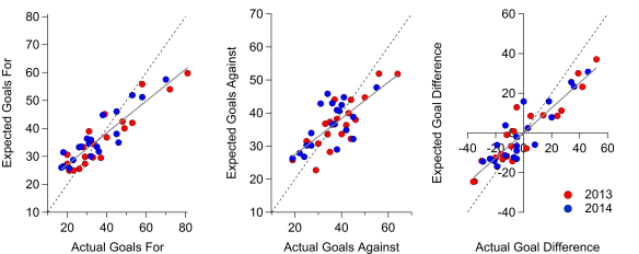
I can use the above information to construct a confidence interval for the expected goal totals for each team, which is what I have done below. Each point represents a team in each season and I’ve compared their expected goals vs their actual goals. The error bars show the range for the 90% confidence intervals.

Most teams line up with the one-to-one line within their respective confidence intervals when comparing with goals for and against. As I noted in the previous post, the overall tendency is for actual goals to exceed expected goals at the team level.

Expected goals vs actual goals for teams in the 2013/14 and 2014/15 Premier League. Dotted line is the 1:1 line, the solid line is the line of best fit and the error bars denote the 90% confidence intervals based on the xG curve above.

Expected goals vs actual goals for teams in the 2013/14 and 2014/15 Premier League. Dotted line is the 1:1 line, the solid line is the line of best fit and the error bars denote the 90% confidence intervals based on the xG curve above.

As an example of what the confidence intervals represent, in the 2013/14 season, Manchester City’s expected goal total was 59.8, with a confidence interval ranging from 52.2 to 67.7 expected goals. In reality, they scored 81 non-penalty goals with their feet, which falls outside of their confidence interval here. On the plot below, Manchester City are the red marker on the far right of the expected goals for vs actual goals for plot.

Embracing uncertainty

Another method of testing the model is to look at the model residuals, which are calculated by subtracting the outcome of a shot (either zero or one) from its expected goal value. If you were an omnipotent being who knew every aspect relating to the taking of a shot, you could theoretically predict the outcome of a shot (goal or no goal) perfectly (plus some allowance for random variation). The residuals of such a model would always be zero as the outcome minus the expectation of a goal would equal zero in all cases. In the real world though, we can’t know everything so this isn’t the case. However, we might expect that over a sufficiently large sample, the residual will be close to zero.

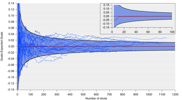
In the figure below, I’ve again bootstrapped the data and looked at the model residuals as the number of shots increases. I’ve done this 10,000 times for each number of shots i.e. I extract a random sample from the data and then calculate the residual for that number of shots. The red line is the median residual (goals minus expected goals), while the blue shaded region corresponds to the standard error range (calculated as the 90% confidence interval). The residual is normalised to a per shot basis, so the overall uncertainty value is equal to this value multiplied by the number of shots taken.

BootStrap_xGdiff_col

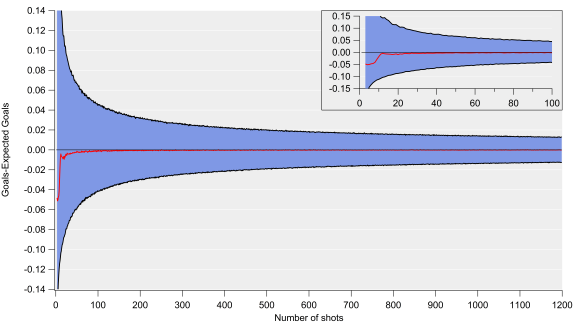
Goals-Expected Goals versus number of shots calculated via bootstrapping. Inset focusses on the first 100 shots. The red line is the median, while the blue shaded region denotes the 90% confidence interval (standard error).

The inset shows how this evolves up to 100 shots and we see that over about 10 shots, the residual approaches zero but the standard errors are very large at this point. Consequently, our best estimate of expected goals is likely highly uncertain over such a small sample. For example, if we expected to score two goals from 20 shots, the standard error range would span 0.35 to 4.2 goals. To add a further complication, the residuals aren’t normally distributed at that point, which makes interpretations even more challenging.

Clearly there is both a significant amount of variation over such small samples, which could be a consequence of both random variation and factors not included in the model. This is an important point when assessing xG estimates for single matches; while the central estimate will likely have a very small residual, the uncertainty range is huge.

As the sample size increases, the uncertainty decreases. After 100 shots, which would equate to a high shot volume for a forward, the uncertainty in goal expectation would amount to approximately ±4 goals. After 400 shots, which is close to the average number of shots a team would take over a single season, the uncertainty would equate to approximately ±9 goals. For a 10% conversion rate, our expected goal value after 100 shots would be 10±4, while after 400 shots, our estimate would be 40±9 (note the percentage uncertainty decreases as the number of shots increases).

BootStrap_xGdiff_col_wTeams

Same as above but with individual teams overlaid.

Above is the same plot but with the residuals shown for each team over the past two seasons (or one season if they only played for a single season). The majority of teams fall within the uncertainty envelope but there are some notable deviations. At the bottom of the plot are Burnley and Norwich, who significantly under-performed their expected goal estimate (they were also both relegated). On the flip side, Manchester City have seemingly consistently outperformed the expected goal estimate. Part of this is a result of the simplicity of the model; if I include additional factors such as how the chance is created, the residuals are smaller.

How well does an xG model predict goals?

Broadly speaking, the central estimates of expected goals appear to be reasonably good; the residuals tend to zero quickly and even though there is some bias, the correlations and errors are encouraging. When the uncertainties in the model are propagated through to the team level, the confidence intervals are on average around ±15% for expected goals for and against.

When we examine the model errors in more detail, they tend to be larger (around ±25% at the team level over a single season). The upshot of all this is that there appears to be a large degree of uncertainty in expected goal values when considering sample sizes relevant at the team and player level. While the simplicity of the model used here may mean that the uncertainty values shown represent a worst-case scenario, it is still something that should be considered when analysts make statements and projections. Having said this, based on some initial tests, adding extra complexity doesn’t appear to reduce the residuals to any great degree.

Uncertainty estimates and confidence intervals aren’t sexy and having spent the last 1500ish words writing about them, I’m well aware they aren’t that accessible either. However, I do think they are useful and important in the real world.

Quantifying these uncertainties can help to provide more honest assessments and recommendations. For example, I would say it is more useful to say that my projections estimate that player X will score 0.6-1.4 goals per 90 minutes next season along with some central value, rather than going with a single value of 1 goal per 90 minutes. Furthermore, it is better to state such caveats in advance – if you just provided the central estimate and the player posted say 0.65 goals per 90 and you then bring up your model’s uncertainty range, you will just sound like you’re making excuses.

This also has implications regarding over and under performance by players and teams relative to expected goals. I frequently see statements about regression to the mean without considering model errors. As George Box wisely noted:

Statisticians, like artists, have the bad habit of falling in love with their models.

This isn’t to say that expected goal models aren’t useful, just that if you want to wade into the world of probability and modelling, you should also illustrate the limitations and uncertainties associated with the analysis.

Perhaps those using expected goal models are well aware of these issues but I don’t see much discussion of it in public. Analytics is increasingly finding a wider public audience, along with being used within clubs. That will often mean that those consuming the results will not be aware of these uncertainties unless you explain them. Speaking as a researcher who is interested in the communication of science, I can give many examples of where not discussing uncertainty upfront can backfire in the long run.

Isn’t uncertainty fun!

——————————————————————————————————————–

Thanks to several people who were kind enough to read an initial draft of this article and the proceeding method piece.

Advertisement

Great Expectations

One of the most popular metrics in football analytics is the concept of ‘expected goals’ or xG for short. There are various flavours of expected goal models but the fundamental objective is to assess the quality of chances created or conceded by a team. The models are also routinely applied to assessing players using various techniques.

Michael Caley wrote a nice explanation of the what and the why of expected goals last month. Alternatively, you could check out this video by Daniel Altman for a summary of some of the potential applications of the metric.

I’ve been building my own expected goals model recently and I’ve been testing out a fundamental question regarding the performance of the model, namely:

How well does it predict goals?

Do expected goal models actually do what they say on the tin? This is a really fundamental and dumb question that hasn’t ever been particularly clear to me in relation to the public expected goal models that are available.

This is a key aspect, particularly if we want to make statements about prior over or under-performance and any anticipated changes in the future. Further to this, I’m going to talk about uncertainty and how that influences the statements that we can make regarding expected goals.

In this post, I’m going to describe the model and make some comparisons with a ‘naive’ baseline. In a second post, I’m going to look at uncertainties relating to expected goal models and how they may impact our interpretations of them.

The model

Before I go further, I should note that the initial development closely resembles the work done by Michael Caley and Martin Eastwood, who detailed their own expected goal methods here and here respectively.

I built the model using data from the Premier League from 2013/14 and 2014/15. For the analysis below, I’m just going to focus on non-penalty shots with the foot, so it includes both open-play and set piece shot situations. Mixing these will introduce some bias but we have to start somewhere. The data amounts to over 16,000 shots.

I’m only including distance from the centre of the goal in the first instance, which I calculated in a similar manner to Michael Caley in the link above as the distance from the goal line divided by the relative angle. I didn’t raise the relative angle to any power though.

I then calculate the probability of a goal being scored with the adjusted distance of each shot as the input; shots are deemed either successful (goal) or unsuccessful (no goal). Similarly to Martin Eastwood, I found that an exponential decay formula represented the data well. However, I found that there was a tendency towards under-predicting goals on average, so I included an offset in the regression. The equation I used is below:

xG = exp(-Distance/α) + β

Based on the dataset, the fit coefficients were 6.65 for α and 0.017 for β. Below is what this looks like graphically when I colour each shot by the probability of a goal being scored; shots from close to the goal line in central positions are far more likely to be scored than long distance shots or shots from narrow angles, which isn’t a new finding.

xGmap

Expected goals based on shot location using data from the 2013/14 and 2014/15 Premier League seasons. Shots with the foot only.

So, now we have a pretty map and yet another expected goal model to add to the roughly 1,000,001 other models in existence.

Baseline

In the figure below, I’ve compared the expected goal totals with the actual goals. Most teams are close to the one-to-one line when comparing with goals for and against, although the overall tendency is for actual goals to exceed expected goals at the team level. When looking at goal difference, there is some cancellation for teams, with the correlation being tighter and the line of best fit passing through zero.

Text.

Expected goals vs actual goals for teams in the 2013/14 and 2014/15 Premier League. Dotted line is the 1:1 line, the solid line is the line of best fit. Click on the graph for an enlarged version.

Inspecting the plot more closely, we can see some bias in the expected goal number at the extreme ends; high-scoring teams tend to out-perform their expected goal total, while the reverse is true for low scoring teams. The same is also true for goals against, to some extent, although the general relationship is less strong than for goals for. Michael Caley noted a similar phenomenon here in relation to his xG model. Overall, it looks like just using location does a reasonable job.

Text.

The table above includes R2 and mean absolute error (MAE) values for each metric and compares them to a ‘naïve’ baseline where just the average conversion rate is used to calculate the xG values i.e. the location of the shot is ignored. The Rvalue assesses the strength of the relationship between expected goals and goals, with values closer to one indicating a stronger link. Mean absolute error takes an average of the difference between the goals and expected goals; the lower the value the better. In all cases, including location improves the comparison. ‘Naïve’ xG difference is effectively Total Shot Difference as it assumes that all shots are equal.

What is interesting is that the correlations are stronger in both cases for goals for than goals against. This could be a fluke of the sample I’m using but the differences are quite large. There is more stratification in goals for than goals against, which likely helps improve the correlations. James Grayson noted here that there is more ‘luck’ or random variation in goals against than goals for.

How well does an xG model predict goals?

Broadly speaking, the central estimates of expected goals appear to be reasonably good. Even though there is some bias, the correlations and errors are encouraging. Adding location into an xG model clearly improves our ability to predict goals compared to a naïve baseline. This obviously isn’t a surprise but it is useful to quantify the improvements.

The model can certainly be improved though and I also want to quantify the uncertainties within the model, which will be the topic of my next post.

Luis Suárez: Home & away

Everyone’s favourite riddle wrapped in an enigma was a topic of Twitter conversation between various analysts yesterday. The matter at hand was Luis Suárez’s improved goal conversion this season compared to his previous endeavours. Suárez has previously been labelled as inefficient by members of the analytics community (not the worst thing he has been called mind), so explaining his upturn is an important puzzle.

In the 2012/13 season, Suárez scored 23 goals from 187 shots, giving him a 12.3% conversion rate. So far this season he has scored 25 goals from 132 shots, which works out at 18.9%.

What has driven this increased conversion?

Red Alert

Below I’ve broken down Suárez’s goal conversion exploits into matches played home and away over the past two seasons. In terms of sample sizes, in 2012/13 he took 98 shots at home and 89 shots away, while he has taken 69 and 63 respectively this season.

Season Home Away Overall
2012/13 11.2% 13.5% 12.3%
2013/14 23.2% 14.3% 18.9%

The obvious conclusion is that Suárez’s improved goal scoring rate has largely been driven by an increased conversion percentage at home. His improvement away is minor, coming in at 0.8% but his home improvement is a huge 12%.

What could be driving this upturn?

Total Annihilation

Liverpool’s home goal scoring record this season has seen them average 3 goals per game compared to 1.7 last season. Liverpool have handed out several thrashings at home this season, scoring 3 or more goals in nine of their fourteen matches. Their away goal scoring has improved from 2 goals per game to 2.27 per game for comparison.

Liverpool have been annihilating their opponents at home this season and I suspect Suárez is reaping some of the benefit of this with his improved goal scoring rate. Liverpool have typically gone ahead early in their matches at home this season but aside from their initial Suárez-less matches, that hasn’t generally seen them ease off in terms of their attacking play (they lead the league in shots per game at home with 20.7).

My working theory is that Suárez has benefited from such situations by taking his shots under less pressure and/or better locations when Liverpool have been leading at home. I would love to hear from those who collect more detailed shot data on this.

Drilling down into some more shooting metrics at home adds some support to this. Suárez has seen a greater percentage of his shots hit the target at home this season compared with last (46.4% vs 35.7%). He has also seen a smaller percentage being blocked this season (13% vs 24.5%). Half of Suárez’s shots on target at home this season have resulted in a goal compared to 31.4% last season. Away from home, the comparison between this season and last is much closer.

These numbers are consistent with Suárez taking his shots at home this season in better circumstances. I should stress that there is a degree of circularity here as Suárez’s goal scoring is not independent of Liverpool’s. Further analysis is required.

Starcraft

The above is an attempt to explain Suárez’s improved goal scoring form. I doubt it is the whole story but it hopefully provides some clues ahead of more detailed analysis. Suárez may well have also benefited from a hot-streak this season and the big question will be whether he can sustain his goal scoring form over the remainder of this season and into next.

As I’ve shown previously, there is a large amount of variability in player shot conversion from season to season. Some of this will be due to ‘luck’ or randomness but some of this could be due to specific circumstances such as those potentially aiding Suárez this season. Explaining the various factors involved in goal scoring is a tricky puzzle indeed.

——————————————————————————————————————–

All data in this post are from Squawka and WhoScored.

Scoring ability: the good, the bad and the Messi

Identifying scoring talent is one of the main areas of investigation in analytics circles, with the information provided potentially helping to inform decisions that can cost many, many millions. Players who can consistently put the ball in the net cost a premium; can we separate these players from the their peers?

I’m using data from the 2008/09 to 2012/13 seasons across the top divisions in England, Spain, Germany and Italy from ESPN. An example of the data provided is available here for Liverpool in 2012/13. This gives me total shots (including blocked shots) and goals for over 8000 individual player seasons. I’ve also taken out penalties from the shot and goal totals using data from TransferMarkt. This should give us a good baseline for what looks good, bad and extraordinary in terms of scoring talent. Clearly this ignores the now substantial work being done in relation to shot location and different types of shot but the upside here is that the sample size (number of shots) is larger.

Below is a graph of shot conversion (defined as goals divided by total shots) against total shots. All of the metrics I’ll use will have penalties removed from the sample. The average conversion rate across the whole sample is 9.2%. Using this average, we can calculate the bounds of what average looks like in terms of shot conversion; we would expect some level of random variation around the average and for this variation to be larger for players who’ve taken fewer shots.

Shot conversion versus total shots for individual players in the top leagues in England, Italy, Spain and Germany from 2008/09-2012/13. Points are shown in grey with certain players highlighted, with the colours corresponding to the season. The solid black line is the average conversion rate of 9.2%, with the dotted lines above and below this line corresponding to two standard errors above the average. The dashed line corresponds to five standard errors. Click on the image for a larger view.

On the plot I’ve also added some lines to illustrate this. The solid black line is the average shot conversion rate, while the two dotted lines either side of it represent upper and lower confidence limits calculated as being two standard errors from the mean. These are known as funnel plots and as far as I’m aware, they were introduced to football analysis by James Grayson in his work on penalties. Paul Riley has also used them when looking at shot conversion from different areas of the pitch. There is a third dotted line but I’ll talk about that later.

So what does this tell us? Well we would expect approximately 95% of the points to fall within this envelope around the average conversion rate; the actual number of points is 97%. From a statistical point of view, we can’t identify whether these players are anything other than average at shot conversion. Some players fall below the lower bound, which suggests that they are below average at converting their shots into goals. On the other hand, those players falling above the upper bound, are potentially above average.

The Bad

I’m not sure if this is surprising or not, but it is actually quite hard to identify players who fall below the lower bound and qualify as “bad”. A player needs to take about 40 shots without scoring to fall beneath the lower bound, so I suspect “bad” shooters don’t get the opportunity to approach statistical significance. Some do though.

Only 62 player seasons fall below the lower bound, with Alessandro Diamanti, Antonio Candreva, Gökhan Inler and (drum-roll) Stewart Downing having the dubious record of appearing twice. Downing actually holds the record in my data for the most shots (80) without scoring in 2008/09, with his 2011/12 season coming in second with 71 shots without scoring.

The Good

Over a single season of shots, it is somewhat easier to identify “good” players in the sample, with 219 players lying above the two standard error curve. Some of these players are highlighted in the graph above and rather than list all of them, I’ll focus on players that have managed to consistently finish their shooting opportunities at an above average rate.

Only two players appear in each of the five seasons of this sample; Gonzalo Higuaín and Lionel Messi. Higuaín has scored an impressive 94 goals with a shot conversion rate of 25.4% over that sample. I’ll leave Messi’s numbers until a little later. Four players appear on four separate occasions; Álvaro Negredo, Stefan Kießling, Alberto Gilardino and Giampaolo Pazzini. Negredo is interesting here as while his 15.1% conversion rate over multiple seasons isn’t as exceptional as some other players, he has done this over a sustained period while taking a decent volume of shots each season (note his current conversion rate at Manchester City is 16.1%).

Eighteen players have appeared on this list three times; notable names include van Persie, Di Natale, Cavani, Agüero, Gómez, Soldado, Benzema, Raúl, Fletcher, Hernández and Agbonlahor (wasn’t expecting that last one). I would say that most of the players mentioned here are more penalty box strikers, which suggests they take more of their shots from closer to the goal, where conversion rates are higher. It would be interesting to cross-check these with analysts who are tracking player shot locations.

The Messi

To some extent, looking at players that lie two standard errors above or below the average shot conversion rate is somewhat arbitrary. The number of standard errors you use to judge a particular property typically depends on your application and how “sure” you want to be that the signal you are observing is “real” rather than due to “chance”. For instance, when scientists at CERN were attempting to establish the existence of the Higgs boson, they used a very stringent requirement that the observed signal is five standard errors above the typical baseline of their instruments; they want to be really sure that they’ve established the existence of a new particle. The tolerance here is that there be much less than a one in a million chance that any observed signal be the result of a statistical fluctuation.

As far as shot conversion is concerned, over the two seasons prior to this, Lional Messi is the Higgs boson of football. While other players have had shot conversion rates above this five-standard error level, Messi has done this while taking huge shot volumes. This sets him apart from his peers. Over the five seasons prior to this, Messi took 764 shots, from which an average player would be expected to score between 54 and 86 goals based on a player falling within two standard errors of the average; Messi has scored 162! Turns out Messi is good at the football…who knew?

Is shooting accuracy maintained from season to season?

This is a short follow-up to this post using the same dataset. Instead of shot conversion, we’re now looking at shooting accuracy which is defined as the number of shots on target divided by the total number of shots. The short story here is that shooting accuracy regresses more strongly to the mean than shot conversion at the larger shot samples (more than 70 shots) and is very similar below this.

Comparison between shooting accuracy for players in year zero and the following season (year one). Click on the image or here for a larger interactive version.

Comparison between shooting accuracy for players in year zero and the following season (year one). Click on the image or here for a larger interactive version.

Minimum Shots Players year-to-year r^2 ‘luck’ ‘skill’
1 2301 0.045 79% 21%
10 1865 0.118 66% 34%
20 1428 0.159 60% 40%
30 951 0.214 54% 46%
40 632 0.225 53% 47%
50 456 0.219 53% 47%
60 311 0.190 56% 44%
70 180 0.245 51% 49%
80 117 0.305 45% 55%
90 75 0.341 42% 58%
100 43 0.359 40% 60%

Comparison of the level of ‘skill’ and ‘luck’ attributed to shooting accuracy (measured by shots on target divided by all shots) from one season to the next. The data is filtered by the total number of shots a player takes in consecutive seasons.

Essentially, there is quite a bit of luck involved with getting shots on target and for large-volume shooters, there is more luck involved in getting accurate shots in than in scoring them.

Is scoring ability maintained from season to season? (slight return)

In my previous post (many moons ago), I looked at whether a players’ shot conversion in one season was a good guide to their shot conversion in the next. While there were some interesting features in this, I was wary of being too definitive given the relatively small sample size that was used. Data analysis is a journey with no end, so this is the next step. I collated the last 5 seasons of data across the top divisions in England, Spain, Germany and Italy (I drew the line at collecting France) from ESPN. An example of the data provided is available here for Liverpool in 2012/13. The last 5 seasons on ESPN are Opta provided data and matched up perfectly when I compared with English Premier League data from EPL-Index.

Before digging into the results, a few notes on the data. The data is all shots and all goals i.e. penalties are not removed. Ideally, you would strip out penalty shots and goals but that would require player-level data that I don’t have and I’ve already done enough copy and pasting. I doubt including penalties will change the story too much but it would alter the absolute numbers. Shot conversion here is defined as goals divided by total shots, where total shots includes blocked shots. I then compared shot conversion for individual players in year zero with their shot conversion the following year (year one). The initial filter that I applied here was that the player had to have scored at least one goal in both years (so as to exclude players having 0% shot conversion).

Comparison between shot conversion rates for players in year zero and the following season (year one). Click on the image or here for a larger interactive version.

Starting out with the full dataset, we have 2301 data points where a player scored a goal in two consecutive seasons. The R^2 here (a measure of the strength of the relationship) is very low, with a value of 0.061 (where zero would mean no relationship and one would be perfect). Based on the method outlined here by James Grayson, this suggests that shot conversion regresses 75% towards the mean from one season to the next. The implication of this number is that shot conversion is 25% ‘skill’ and 75% is due to random variation, which is often described as ‘luck’.

As I noted in my previous post on this subject, the attribution to skill and luck is dependent on the number of shots taken. As the number of shots increases, we smooth out some of the randomness and skill begins to emerge. A visualisation of the relationship between shot conversion and total shots is available here. Below is a summary table showing how this evolves in 10 shot increments. After around 30 shots, skill and luck are basically equal and this is maintained up to 60 shots. Above 80 shots, we seem to plateau at a 70/30% split between ‘skill’ and ‘luck’ respectively.

Minimum Shots Players year-to-year r^2 ‘luck’ ‘skill’
1 2301 0.061 75% 25%
10 1865 0.128 64% 36%
20 1428 0.174 58% 42%
30 951 0.234 52% 48%
40 632 0.261 49% 51%
50 456 0.262 49% 51%
60 311 0.261 49% 51%
70 180 0.375 39% 61%
80 117 0.489 30% 70%
90 75 0.472 31% 69%
100 43 0.465 32% 68%

Comparison of the level of ‘skill’ and ‘luck’ attributed to scoring ability (measured by shot conversion) from one season to the next. The data is filtered by the total number of shots a player takes in consecutive seasons.

The results here are different to my previous post, where the equivalence of luck and skill was hit around 70 shots whereas it lies from 30-60 shots here. I suspect this is driven by the smaller sample size in the previous analysis. The song remains the same though; judging a player on around half a season of shots will be about as good as a coin toss. Really you want to assess a heavy shooter over at least a season with the proviso that there is still plenty of room for random variation in their shot conversion.

What is shot conversion anyway?

The past summer in the football analytics community saw a wonderful catalytic cycle of hypothesis, analysis and discussion. It’s been great to see the community feeding off each other; I would have liked to join in more but the academic conference season and the first UK heatwave in 7 years put paid to that. Much of the focus has been on shots and their outcomes. Increasingly the data is becoming more granular; soon we’ll know how many shots per game are taken within 10 yards of the corner flag at a tied game state by players with brown hair and blue eyes while their manager juggles on the sideline (corrected for strength of opposition of course). This increasing granularity is a fascinating and exciting development. While it was already clear that all shots aren’t created equal from purely watching the football, the past summer has quantified this very clearly. To me, this demonstrates that the traditional view of ‘shot conversion’ as a measure of finishing ability is erroneous.

As an illustrative example, consider two players who both take 66 shots in a season. Player A scores 11 goals, so has a shot conversion of 17%. Player B scores 2 goals, so has a shot conversion of 3%. The traditional view of shot conversion would suggest that Player A is a better finisher than Player B. However, if Player A took all of his shots from a central area within the 18-yard box, he would be bang in line with the Premier League average over the past 3 seasons. If Player B took all of his shots from outside the area, he would also be consistent with the average Premier League player. Both players are average when controlling for shot location. Clearly this is an extreme example but then again it is meant to be an illustration. To me at least, shot conversion seems more indicative of shooting efficiency i.e. taking shots from good positions under less defensive pressure will lead to an increased shot conversion percentage. Worth bearing in mind the next time someone mentions ‘best’ or ‘worst’ in combination with shot conversion.

The remaining question for me is how sustainable the more granular data is from season-to-season, especially given the smaller sample sizes.

Is scoring ability maintained from season to season?

With the football season now over across the major European leagues, analysis and discussion turns to reflection of the who, what and why of the past year. With the transfer window soon to do whatever the opposite of slam shut is, thoughts also turn to how such reflections might inform potential transfer acquisitions. As outlined by Gabriele Marcotti today in the Wall Street Journal, strikers are still the centre of attention when it comes to transfers:

The game’s obsession with centerforwards is not new. After all, it’s the glamour role. Little kids generally dream of being the guy banging in the goals, not the one keeping them out.

On the football analytics front, there has been a lot of discussion surrounding the relative merits of various forward players, with an increasing focus on their goal scoring efficiency (or shot conversion rate) and where players are shooting from. There has been a lot of great work produced but a very simple question has been nagging away at me:

Does being ‘good’ one year suggest that you’ll be ‘good’ next year?

We can all point to examples of forwards shining brightly for a short period during which they plunder a large number of goals, only to then fade away as regression to their (much lower) mean skill level ensues. With this in mind, let’s take a look at some data.

Scoring proficiency

I’ve put together data on players over the past two seasons who have scored at least 10 goals during a single season in the top division in either England, Spain, Germany or Italy from WhoScored. Choosing 10 goals is basically arbitrary but I wanted a reasonable number of goals so that calculated conversion rates didn’t oscillate too wildly and 10 seems like a good target for your budding goalscorer. So for example, Gareth Bale is included as he scored 21 in 2012/13 and 9 goals in 2011/12 but Nikica Jelavić isn’t as he didn’t pass 10 league goals in either season. Collecting the data is painful so a line had to be drawn somewhere. I could have based it on shots per game but that is prone to the wild shooting of the likes of Adel Taarabt and you end up with big outliers. If a player was transferred to or from a league within the WhoScored database (so including France), I retained the player for analysis but if they left the ‘Big 5’ then they were booted out.

In the end I ended up with 115 players who had scored at least 10 league goals in one of the past two seasons. Only 43 players managed to score 10 league goals in both 2011/12 and 2012/13, with only 6 players not named Lionel Messi or Cristiano Ronaldo able to score 20 or more in both seasons. Below is how they match up when comparing their shot conversion, where their goals are divided by their total shots, across both seasons. The conversion rates are based on all goals and all shots, ideally you would take out penalties but that takes time to collate and I doubt it will make much difference to the conclusions.

Comparison between shot conversion rates for players in 2011/12 and 2012/13. Click on the image or here for a larger interactive version.

If we look at the whole dataset, we get a very weak relationship between shot conversion in 2013/12 relative to shot conversion in 2011/12. The R^2 here is 0.11, which suggests that shot conversion by an individual player shows 67% regression to the mean from one season to the next. The upshot of this is that shot conversion above or below the mean is around two-thirds due to luck and one-third due to skill. Without filtering the data any further, this would suggest that predicting how a player will convert their chances next season based on the last will be very difficult.

A potential issue here is the sample size for the number of shots taken by an individual in a season. Dimitar Berbatov’s conversion rate of 44% in 2011/12 is for only 16 shots; he’s good but not that good. If we filter for the number of shots, we can take out some of the outliers and hopefully retain a representative sample. Up to 50 shots, we’re still seeing a 65% regression to the mean and we’ve reduced our sample to 72 players. It is only when we get up to 70 shots and down to 44 players that we see a close to even split between ‘luck’ and ‘skill’ (54% regression to the mean). The problem here is that we’re in danger of ‘over-fitting’ as we rapidly reduce our sample size. If you are happy with a sample of 18 players, then you need to see around 90 shots per season to able to attribute 80% of shot conversion to ‘skill’.

Born again

So where does that leave us? Perhaps unsurprisingly, the results here for players are similar to what James Grayson found at the team level, with a 61% regression to the mean from season to season. Mark Taylor found that around 45 shots was where skill overtook luck for assessing goal scoring, so a little lower than what I found above although I suspect this is due to Mark’s work being based on a larger sample over 3 season in the Premier League.

The above also points to the ongoing importance of sample size when judging players, although I’d want to do some more work on this before being too definitive. Judgements on around half a season of shots appears rather unwise and is about as good as flipping a coin. Really you want around a season for a fuller judgement and even then you might be a little wary of spending too much cash. For something approaching a guarantee, you want some heavy shooting across two seasons, which allied with a good conversion rate can bring you over 20 league goals in a season. I guess that is why the likes of Van Persie, Falcao, Lewandowski, Cavani and Ibrahimovic go for such hefty transfer fees.

Is playing style important?

I’ve previously looked at whether different playing styles can be assessed using seasonal data for the 2011/12 season. The piece concentrated on whether it was possible to separate different playing styles using a method called Principal Component Analysis (PCA). At a broad level, it was possible to separate teams between those that were proactive and reactive with the ball (Principal Component 1) and those that attempted to regain the ball more quickly when out of possession (Principal Component 2). What I didn’t touch upon was whether such features were potentially more successful than others…

Below is the relationship between points won during the 2011/12 season and the proactive/reactive principal component. The relationship between these variables suggests that more proactive teams, that tend to control the game in terms of possession and shots, are more successful. However, the converse could also be true to an extent in that successful teams might have more of the ball and thus have more shots and concede fewer. Either way, the relationship here is relatively strong, with an R2 value of 0.61.

Blah.

Relationship between number of points won in the 2011/12 season with principal component 1, which relates to the proactive or reactive nature of a team. More proactive teams are to the right of the horizontal axis, while more reactive teams are to the left of the horizontal axis. The data is based on the teams in the top division in Germany, England, Spain, France and Italy from WhoScored. The black line is the linear trend between the two variables. A larger interactive version of the plot is available either by clicking on the graph or clicking here.

Looking at the second principal component, there is basically no relationship at all with points won last season, with an R2 value of a whopping 0.0012. The trend line on the graph is about as flat as a pint of lager in a chain sports bar. There is a hint of a trend when looking at the English and French leagues individually but the sample sizes are small here, so I wouldn’t get too excited yet.

Playing style is important then?

It’s always tempting when looking at scatter plots with nice trend lines and reasonable R2 values to reach very steadfast conclusions without considering the data in more detail. This is likely an issue here as one of the major drivers of the ‘proactive/reactive’ principal component is the number of shots attempted and conceded by a team, which is often summarised as a differential or ratio. James Grayson has shown many times how Total Shots Ratio (TSR, the ratio of total shots for/(total shots for+total shots against)) is related to the skill of a football team and it’s ability to turn that control of a game into success over a season. That certainly appears to play a roll here, as this graph demonstrates, as the relationship between points and TSR yields an R2 value of 0.59. For comparison, the relationship between points and short passes per game yields an R2 value of 0.52. As one would expect based on the PCA results and this previous analysis, TSR and short passes per game are correlated also (R2 = 0.58).

Circular argument

As ever, it is difficult to pin down cause and effect when assessing data. This is particularly true in football when using seasonal averaged statistics as score effects likely play a significant role here in determining the final totals and relationships. Furthermore, the input data for the PCA is quite limited and would be improved with more context. However, the analysis does hint at more proactive styles of play being more successful; it is a challenge to ascribe how much of this is cause and how much is effect.

Danny Blanchflower summed up his footballing philosophy with this quote:

The great fallacy is that the game is first and last about winning. It is nothing of the kind. The game is about glory, it is about doing things in style and with a flourish, about going out and beating the other lot, not waiting for them to die of boredom.

The question is, is the glory defined by the style or does the style define the glory?

Luis Suárez: Stuck in the middle?

Luis Suárez, the latest member of Liverpool’s one-man team, has been playing rather well this season. At the time of writing, he is 2nd in the top scorers list with 15 goals, while also boasting the most chances created from open play in the league. Even more impressively he manages to accomplish this while nefariously drowning kittens in his spare time*.

This increased rate of scoring compared with last season has been much needed due to Liverpool’s lack of attacking options. The question is, what has changed?

Just can’t score enough?

Firstly, Suárez is averaging a goal every 8.4 shots this season compared to 11.6 last season. Secondly, he is shooting more often this season as he shoots every 15 minutes on average compared with a shot every 20 minutes last season. The combination of these two features would naturally lead to an enhanced scoring rate. So far, so good but can we delve a little deeper into Suárez’s shooting data?

Below is a summary of Suárez’s shooting across the last two seasons in the league based on data collected from Opta’s chalkboard services. The data is aggregated positionally to examine how regularly Suárez shoots from a particular location and also how efficient his goalscoring is from these areas. This provides us with indicators of the quality of a shot i.e. the distance from the goal-line coupled with the angle from which the shot is taken. Other factors will impact the quality of the shooting opportunity such as the position of the goalkeeper, whether the shot is attempted with the foot or the head and the number of players between the shooter and the goal. This last point is probably especially important for someone like Suárez who tends to see a lot of his shots blocked.

Comparison between Luis Suárez’s shooting and goalscoring from the 2011/12 and 2012/13 seasons. The circles designate areas from which Suárez took a shot from and are sized by the number of shots taken from that area. The areas correspond to horizontal bands from 0-10, 10-20 and more than 20 yards from the goal-line. The grey dotted lines show where the 10 and 20 yard lines are situated. The vertical bands are ordered along the lines of the touchline, edge of the 18 yard box and the 6 yard box. The numbers within each marker correspond to the average number of shots attempted per goal scored in that area. Markers without a number mean that no goals were scored from that area.

The first thing to note about the goals Suárez scores is that across both seasons, the vast majority of his goals come from relatively central areas within the penalty area or just on the edge of it. Furthermore, we can see that Suárez appears to shoot a lot from locations where he doesn’t generally score from. His overall number of shots is similar across the two seasons, although there are still 16 matches still to play this season. There has been some change in the areas from which he has been shooting this season, with close to twice as many shots being taken from the central zone that is more than 20 yards from the goal-line. This has been compensated with fewer attempts from the less than 10 yard zone.

The main difference between the two seasons is that he is now scoring goals more within the 10-20 yards central area and at a reasonable rate. Suárez is now far more efficient in this zone in terms of goalscoring, with 1 goal from 34 shots last season compared with 5 goals from 29 shots this season. It is the goals scored from within this zone that have led to his increased goalscoring rate.

Slipping and sliding

So we can see that compared with himself, Suárez has improved this season. The question is how does he compare with his peers? I don’t have a large enough dataset to do a like-for-like comparison but we can contrast his numbers with data collected by the Different Game blog. The zones are slightly different here but for the central zone within the penalty area, Suárez averaged 7.5 shots per goal last season and 4.5 this season. So compared to the 6 shots per goal average over last season and this, he is better than his peers this season but underperformed last season. There are caveats here in that my figures include penalties, although after his penalty “attempts” last season, Suárez hasn’t been taking penalties this season (not that Liverpool have had many to take and he only took one penalty in the league last season). Furthermore, this is for all players taking shots and potentially you might prefer to compare to other strikers.

In general, we can see that Suárez has been more efficient this season in terms of his goalscoring and that his conversion compares favourably with his peers. The reasons for this are less clear and could be due to a multitude of factors including luck, his role within the team this season, Liverpool’s overall tactics and even less tangible factors such as “off-field distractions”. One thing that is clear from this analysis is that if you want Luis Suárez to score goals, he needs to be taking his shots from central areas. Brendan Rodgers has hinted at playing him as a wide-forward now that Daniel Sturridge has arrived; preserving Suárez’s current goalscoring record would be a challenge if he ends up taking more shots from more difficult angles, which may occur due to his natural position being out-wide. Over the last season and a half, Suárez has taken 103 shots from the wide positions for a return of 5 goals.

Based on this analysis and watching him play a lot, I would say that in certain circumstances, Suárez is a good finisher but that he is wasteful in terms of his decision making. Since the beginning of 2011/12, just over 40% of his shots were taken from areas out-wide where he rarely scores from, coupled with 36% of all of his shots being blocked (although this has improved this season). While the “scorer of great goals, rather than a great goal scorer” line has been an attractive label for Suárez during his Liverpool career, the analysis presented here indicates that he is more nuanced than that. Mind you, “a reasonably efficient goalscorer provided that he is in a central shooting position within approximately 20 yards of goal who is capable of scoring the odd goal that takes your breath away” is a bit more of a mouthful.

——————————————————————————————————————–

Data sources: EPL-Index, Squawka and StatsZone.

——————————————————————————————————————–

*This is not true.

A cross to bear: Liverpool’s crossing addiction in 2011/12

In some recent interviews, Simon Kuper has suggested that Liverpool established a data-driven style of play focussed around crossing last season. He theorised that Liverpool attempted to cater to Andy Carroll’s heading strengths by buying players with good crossing statistics, such as Stewart Downing and Jordan Henderson. Kuper then goes on to state that such an approach is flawed due to crossing being an inefficient means of scoring goals.

Earlier in the season, the Guardian’s Secret Footballer also suggested that statistical principles guided Damien Comolli towards a crossing focussed approach in the transfer market. Andrew Beasley conducted an excellent analysis for The Tomkins Times on whether the data indicated that such an approach (along with some others) was actually working.

So the question is: Did Liverpool really pursue a strategy based around crossing last season and to what extent was it successful (you can probably guess the answer to the second part)?

Noughts & Crosses

Firstly, Opta define a cross as:

A pass from a wide position into a specific area in front of the goal.

The basic numbers show that Liverpool attempted more crosses (1102) than any other team in the Premier League last season. Manchester United (1018) and Wolves (999) ranked second and third respectively. At the other end of the scale, Blackburn (610), Fulham (649) and Swansea (721) attempted the fewest. The average per team was 837.2 crosses attempted, which equates to just over 22 crosses per game.

While the raw numbers provide a guide, it is possible that the figures could be skewed by how much of the ball a particular team has on average. For example, Wolves had much less of the ball than Manchester United last season but attempted a similar number of crosses. This suggests that Wolves were keener to attempt crosses than Manchester United. Furthermore, set-plays should be isolated from the total crosses, as teams may have different approaches in open-play vs set-play. In order to account for this, I’ve calculated the ratio of attacking half passes to total open-play crosses in the graph below. This gives an indication of how keen a team is to attempt a cross during open-play. I limited the passing to the attacking half only as this is where most (if not all) crosses will originate from and it avoids the data being skewed by teams that play a lot of passes in their own half.

Similarly to this tweet by OptaJoe, I calculated the average number of open-play crosses that each team in the Premier League required to score a goal from an open-play cross last season. This is shown in the graph below versus the number of attacking half passes per open-play cross.

Relationship between the number of crosses in open-play required to score a goal from a cross in open-play and the number of passes in the attacking half by a team prior to an open-play cross for English Premier League teams in 2011/12. Note that the cross:goal ratio scale is logarithmic and that it is reversed as a larger number is worse. The horizontal dashed black line indicates the average number of open-play crosses required to score a goal from a cross in open-play across the league, while the vertical dashed black line indicates the average number of passes in the attacking half by a team prior to an open-play cross. The teams are coloured by the percentage amount of goals they scored from open-play crosses, relative to their total number of goals in open-play. Data is provided by Opta, WhoScored and EPL-Index.

The analysis indicates that Liverpool did indeed pursue a crossing strategy last season relative to their peers in the Premier League, as they attempted 14 passes in the attacking half prior to attempting a cross. Only Wolves, Stoke and Sunderland played fewer attacking half passes prior to attempting a cross last season. At the other end of the scale, Manchester City and Fulham were relatively sheepish when it came to crossing, attempting just over 21 passes in their opponent’s half prior to attempting a cross. Arsenal, Swansea and Spurs also stood out here, lying more than 1 standard deviation above the league average.

The major issue for Liverpool based on the above analysis was that their conversion from crosses was simply atrocious. They required a staggering 421 open-play crosses to score a single goal in open-play on average last season. This was the worst rate in the whole league, with Wigan the closest on 294. Contrast this with the likes of Manchester United (44.5), Norwich (45.1) and Arsenal (48.4) who were the only clubs to post a value below 50. Furthermore, only 8.3% of Liverpool’s goals in open-play came from an open-play cross. Norwich scored 53.3% of their goals in open-play from open-play crosses

Liverpool seemingly embarked upon a style of play that provided them with a extremely poor return in terms of goals (only 2 goals from an open-play cross all season).

Is crossing the ball an inefficient means of scoring?

The above analysis seemingly demonstrates that Liverpool did indeed pursue a style of play centred around crossing. Liverpool’s apparent quest to show that crossing is an extremely inefficient means of scoring last season (I’m personally still trying to forget those 46 crosses against West Brom at Anfield) potentially clouds the more general question of whether crossing is a tactic worth basing your team around. It could be that crossing can be an efficient way to score but Liverpool were just simply not very good at it.

According to WhoScored, 659 goals were scored in total from open-play, while 241 goals came from set pieces (excluding penalties). The data from Opta show that 166 and 128 goals were scored from open and set-plays respectively. Thus 25% and 53% of all goals in these categories came from crosses. The average number of crosses per goal scored last season was 79 in open-play and 28.3 from a set-piece. Crossing accuracy is also higher for set-pieces (33.9%) compared with open-play (20.5%). This demonstrates that crossing is more effective from set-pieces than in open play.

Crossing the divide

The above analysis demonstrates that Liverpool pursued a playing style overly focussed upon crossing, which yielded very meagre returns. Whether the poor return was a symptom or a contributing factor to their generally poor shot conversion isn’t clear at present and requires further analysis.

The more general question regarding whether crossing is an efficient means of scoring is difficult to assess without more analysis. This study shows that crossing at set-pieces is more efficient than in open-play but to fully answer this question requires comparison with other modes of scoring. The above analysis suggests that structuring your team around crossing in open-play is a very low yield method of scoring, which also results in the loss of possession close to 80% of the time.

Liverpool’s addiction to crossing appears to be a recent trend. In the 3 seasons prior to 2011/12, they averaged 16.4, 15.4 and 15.5 attacking half passes prior to an attempted cross. Swansea under Brendan Rodgers averaged 18.9 last season, which potentially suggests that next season Liverpool will try to kick the crossing habit.