Regular visitors will know that I’ve been working on some metrics in relation to possession and territory based on the difficulty of completing passes into various areas of the pitch. To recap, passes into dangerous areas are harder to complete, which isn’t particularly revelatory but by building some metrics around this we can assess how well teams move the ball into dangerous areas as well as how well they prevent their opponents from doing so. These metrics can also be broken down to the player level to see which players complete the most ‘dangerous’ passes.
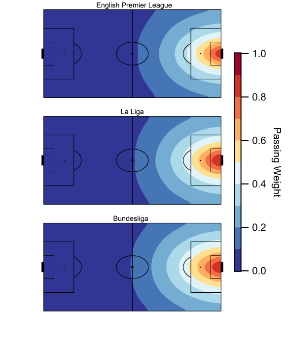
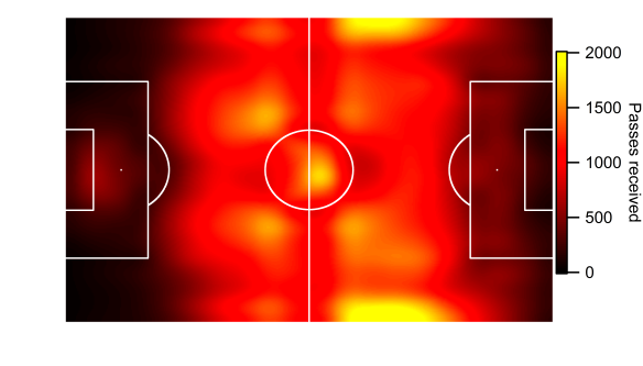
Below is the current iteration of the pass danger rating model based on data from the 2014/15 Premier League season; working the ball into positions closer to the goal is rewarded with a larger rating, while passes made within a teams own half carry very little weight.
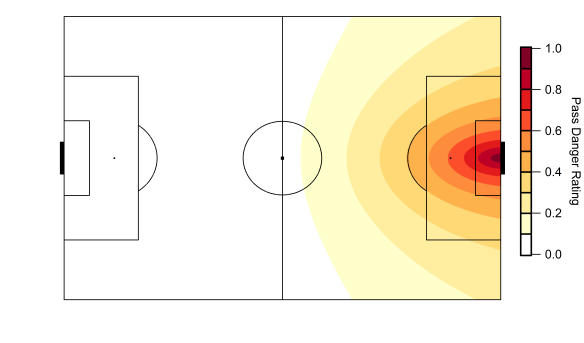
Map of the pass weighting model based on data from the English Premier League. Data via Opta.
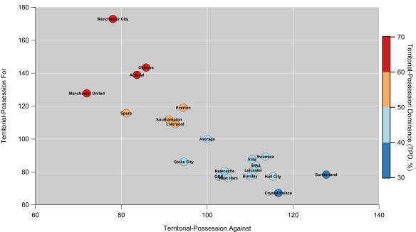
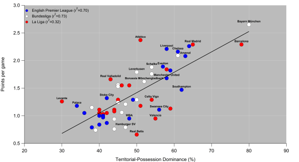
One particular issue with the Territorial-Possession Dominance (TPD) metric that I devised was that as well as having a crap name, the relationship with points and goal difference could have been better. The metric tended to over-rate teams who make a lot of passes in reasonably dangerous areas around the edge of the box but infrequently complete passes into the central zone of the penalty area. On the other side of the coin, it tended to under-rate more direct teams who don’t attack with sustained possession.
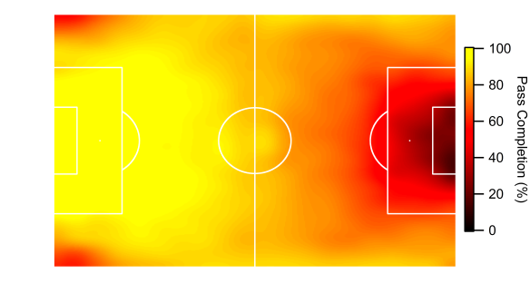
In order to account for this, I’ve calculated the danger rating by looking at attacks on a ‘possession’ basis i.e. by tracking individual chains of possession in open-play and looking at where they end. The end of the chain could be due to a number of reasons including shots, unsuccessful passes or a tackle by an opponent. Each possession is then assigned a danger rating based on the model in the figure above. Possessions which end deep into opponent territory will score more highly, while those that break down close to a team’s own goal are given little weight.
Conceptually, the model is similar to Daniel Altman’s non-shot based model (I think), although he views things through expected goals, whereas I started out looking at passing. You can find some of the details regarding the model here, plus a video of his presentation at the Opta Pro Analytics Forum is available here, which is well worth watching.
Danger Zone
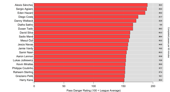
The ratings for last season’s Premier League teams are shown below, with positive values meaning a team had more dangerous possessions than their opponents over the course of the season and vice versa for the negative values. Overall, the correlation between the metric and goal difference and points is pretty good (r-squared values of 0.76 and 0.77 respectively). This is considering open-play only, so it ignores set pieces and penalties, plus I omitted possessions made up of just one shot. The correlation with open-play goal difference is a little larger, so it appears to be an encouraging indicator of team strength.

Open-Play Possession Danger Rating for the 2014/15 English Premier League season. Zero corresponds to a rating of 50%. Data via Opta.
The rating only takes into account the location of where the possession ends so there is plenty of scope for improvement e.g. throughball passes could carry more weight, counter-attacks could receive an increased danger rating, while moves featuring a cross might be down-weighted. Regardless of such improvements, these initial results are encouraging and are at a similar descriptive level to traditional shot ratios and expected goal models.
Arsenal are narrowly ahead of Manchester City here, as they make up a clear top-two which is strongly driven by their attacking play. Intriguingly, Manchester City’s rating was much greater (+7%) for possessions ending with a shot, while Arsenal’s was almost unchanged (-1%). Similarly to City, Chelsea’s rating for possessions ending with a shot was also greater (+4%) than their rating for all possessions. I don’t know yet if this is a repeatable trait but it suggests Chelsea and City were more efficient at generating quality shots and limiting their opponents.
Manchester United sit narrowly ahead of Liverpool and Southampton and round out the top four, which was mainly driven by their league-leading defensive performance; few teams were able to get the ball into dangerous positions near their goal. Manchester United’s ability to keep their opponents at arms length has been a consistent trend from the territory-based numbers I’ve looked at.
Analytics anti-heroes Sunderland and a West Brom team managed by Tony Pulis for a large chunk of last season reside at the bottom of the table. Sunderland comfortably allowed the most dangerous possessions in the league last season.
Possessed
So, we’re left with yet another team strength metric to add to the analytics pile. The question is what does this add to our knowledge and how might we use it?
Analytics has generally based metrics around shots, which is sometimes not reflective of how we often experience the game from a chance creation point of view. The concept of creating a non-shot based chance isn’t a new one – the well worn cliché about a striker ‘fluffing a chance’ tells us that much but what analytics is striving to do is quantify these opportunities and hopefully do something useful with them. Basing the metric on all open-play possessions rather than just focusing on shots potentially opens up some interesting avenues for future research in terms of examining how teams attack and defend. Furthermore, using all possessions rather than those just ending with a shot increases our sample size and opens up the potential for new ways of assessing player contributions.
Looking at player contributions to these possessions will be the subject of my next post.