Models that attempt to measure passing ability have been around for several years, with Devin Pleuler’s 2012 study being the first that I recall seeing publicly. More models have sprung up in the past year, including efforts by Paul Riley, Neil Charles and StatsBomb Services. These models aim to calculate the probability of a pass being completed using various inputs about the start and end location of the pass, the length of the pass, the angle of it, as well as whether it is played with the head or foot.
Most applications have analysed the outputs from such models from a player passing skill perspective but they can also be applied at the team level to glean insights. Passing is the primary means of constructing attacks, so perhaps examining how a defense disrupts passing could prove enlightening?
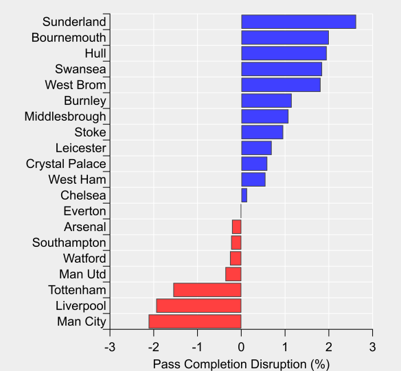
In the figure below, I’ve used a pass probability model (see end of post for details and code) to estimate the difficulty in completing a pass and then compared this to the actual passing outcomes at a team-level. This provides a global measure of how much a team disrupts their opponents passing. We see the Premier League’s main pressing teams with the greatest disruption, through to the barely corporeal form represented by Sunderland.
Pass completion disruption for the 2016/17 English Premier League season. Disruption is defined as actual pass completion percentage minus expected pass completion percentage. Negative values means opponent’s complete fewer passes than expected. Data via Opta.
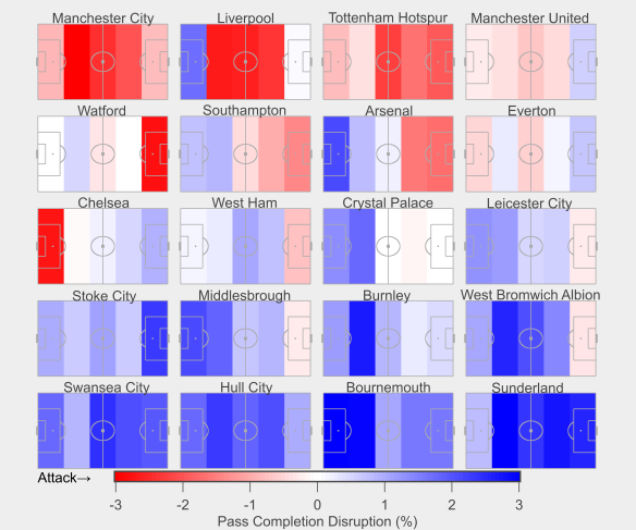
The next step is to break this down by pitch location, which is shown in the figure below where the pitch has been broken into five bands with pass completion disruption calculated for each. The teams are ordered from most-to-least disruptive.
Zonal pass completion disruption for 2016/17 English Premier League season. Teams are attacking from left-to-right, so defensive zones are to the left of each plot. Data via Opta.
We see Manchester City and Spurs disrupt their opponents passing across the entire pitch, with Spurs’ disruption skewed somewhat higher. Liverpool dominate in the midfield zones but offer little disruption in their deepest-defensive zone, suggesting that once a team breaks through the press, they have time and/or space close to goal; a familiar refrain when discussing Liverpool’s defense.
Chelsea offer an interesting contrast with the high-pressing teams, with their disruption gradually increasing as their opponents inch closer to their goal. What stands out is their defensive zone sees the greatest disruption (-2.8%), which illustrates that they are highly disruptive where it most counts.
The antithesis of Chelsea is Bournemouth who put together an average amount of disruption higher up the pitch but are extremely accommodating in their defensive zones (+4.5% in their deepest-defensive zone). Sunderland place their opponents under limited pressure in all zones aside from their deepest-defensive zone where they are fairly average in terms of disruption.
The above offers a glimpse of the defensive processes and outcomes at the team level, which can be used to improve performance or identify weaknesses to exploit. Folding such approaches into pre-game routines could quickly and easily supplement video scouting.
Appendix: Pass probability model
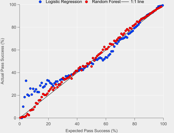
For this post, I built two different passing models; the first used Logistic Regression and the second used Random Forests. The code for each model is available here and here.
Below is a comparison between the two, which compares expected success rates with actual success rates on out-of-sample test data.
Actual versus expected pass success for two different models. Data via Opta.
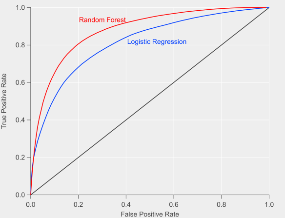
The Random Forest method performs better than the Logistic Regression model, particularly for low probability passes. This result is confirmed when examining the Receiver Operating Characteristics (ROC) curves in the figure below. The Area Under the Curve (AUC) for the Random Forest model is 87%, while the Logistic Regression AUC is 81%.
Receiver Operating Characteristics (ROC) curves for the two different passing models. Data via Opta.
Given the better performance of the Random Forest model, I used this in the analysis in the main article.
Who will win the Premier League title this season? While Leicester City and Tottenham Hotspur have their merits, the bookmakers and public analytics models point to a two-horse race between Manchester City and Arsenal.
From an analytics perspective, this is where things get interesting, as depending on your metric of choice, the picture painted of each team is quite different.
As discussed on the recent StatsBomb podcast, Manchester City are heavily favoured by ‘traditional’ shot metrics, as well as by combined team ratings composed of multiple shooting statistics (a method pioneered by James Grayson). Of particular concern for Arsenal are their poor shot-on-target numbers.
However, if we look at expected goals based on all shots taken and conceded, then Arsenal lead the way: Michael Caley has them with an expected goal difference per game of 0.98, while City lie second on 0.83. My own figures in open-play have Arsenal ahead but by a narrower margin (0.69 vs 0.65); Arsenal have a significant edge in terms of ‘big chances’, which I don’t include in my model, whereas Michael does include them. Turning to my non-shots based expected goal model, Arsenal’s edge is extended (0.66 vs 0.53). Finally, Paul Riley’s expected goal model favours City over Arsenal (0.88 vs 0.69), although Spurs are actually rated higher than both. Paul’s model considers shots on target only, which largely explains the contrast with other expected goal models.
Overall, City are rated quite strongly across the board, while Arsenal’s level is more mixed. The above isn’t an exhaustive list of models and metrics but the differences between how they rate the two main title contenders is apparent. All of these metrics have demonstrated utility at making in-season predictions but clearly assumptions about the relative strength of these two teams differs between them.
The question is why? If we look at the two extremes in terms of these methods, you would have total shots difference (or ratio, TSR) at one end and non-shots expected goals at the other i.e. one values all shots equally, while the other doesn’t ‘care’ whether a shot is taken or not.
There likely exists a range of happy mediums in terms of emphasising the taking of shots versus maximising the likelihood of scoring from a given attack. Such a trade-off likely depends on individual players in a team, tactical setup and a whole other host of factors including the current score line and incentives during a match.
However, a team could be accused of shooting too readily, which might mean spurning a better scoring opportunity in favour of a shot from long-range. Perhaps data can pick out those ‘trigger-happy’ teams versus those who adopt a more patient approach.
My non-shots based expected goal model evaluates the likelihood of a goal being scored from an individual chain of possession. If I switch goals for shots in the maths, then I can calculate the probability that a possession will end with a shot. We’ll refer to this as ‘expected shots’.
I’ve done this for the 2012/13 to 2014/15 Premier League seasons. Below is the data for the actual versus expected number of shots per game that each team attempted.
Actual shots per game compared with expected shots per game. Black line is the 1:1 line. Data via Opta.
We can see that the model does a reasonable job of capturing shot expectation (r-squared is at 0.77, while the mean absolute error is 0.91 shots per game). There is some bias in the relationship though, with lower shot volume teams being estimated more accurately, while higher shot volume sides typically shoot less than expected (the slope of the linear regression line is 0.79).
If we take the model at face value and assume that it is telling a reasonable approximation of the truth, then one interpretation would be that teams with higher expected shot volumes are more patient in their approach. Historically these have been teams that tend to dominate territory and possession such as Manchester City, Arsenal and Chelsea; are these teams maintaining possession in the final third in order to take a higher value shot? It could also be due to defenses denying these teams shooting opportunities but looking at the figures for expected and actual shots conceded, the data doesn’t support that notion.
What is also clear from the graph is that it appears to match our expectations in terms of a team being ‘trigger-happy’ – by far the largest outlier in terms of actual shots minus expected shots is Tottenham Hotspurs’ full season under André Villas-Boas, a team that was well known for taking a lot of shots from long-range. We also see a decline as we move into the 2013/14 season when AVB was fired after 16 matches (42% of the full season) and then the 2014/15 season under Pochettino. Observations such as these that pass the ‘sniff-test’ can give us a little more confidence in the metric/method.
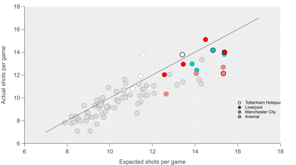
If we move back to the season at hand, then we see some interesting trends emerge. Below I’ve added the data points for this current season and highlighted Arsenal, Manchester City, Liverpool and Tottenham (the solid black outlines are for this season). Throughout the dataset, we see that Arsenal have been consistently below expectations in terms of the number of shots they attempt and that this is particularly true this season. City have also fallen below expectations but to a smaller extent than Arsenal and are almost in line with expectations this year. Liverpool and Tottenham have taken a similar number of shots but with quite different levels of expectation.
Actual shots per game compared with expected shots per game. Black line is the 1:1 line. Markers with solid black outline are for the current season. Data via Opta.
None of the above indicates that there is a better way of attempting to score but I think it does illustrate that team style and tactics are important factors in how we build and assess metrics. Arsenal’s ‘pass it in the net’ approach has been known (and often derided) ever since they last won the league and it is quite possible that models that are more focused on quality in possession will over-rate their chances in the same way that focusing on just shots would over-rate AVB’s Spurs. Manchester City have run the best attack in the league over the past few seasons by combining the intricate passing skills of their attackers with the odd thunder-bastard from Yaya Touré.
The question remains though: who will win the Premier League title this season? Will Manchester City prevail due to their mixed-approach or will Arsenal prove that patience really is a virtue? The boring answer is that time will tell. The obvious answer is Leicester City.
The dynamics of a football match are often dictated by the scoreline and teams will often try to influence this via their approach; a fast start in search of an early goal, keeping it tight with an eye on counter-attacking or digging a moat around the penalty area.
With this in mind, I’m going to examine the repeatability of the amount of time a team spends winning, losing and drawing from year to year. I’m basically copying the approach of James Grayson here who has looked at the repeatability of several statistical metrics. This is meant to be a broad first look; there are lots of potential avenues for further study here.
I’ve collected data from football-lineups.com (tip of the hat to Andrew Beasley for alerting me to the data via his blog) for the past 15 English Premier League seasons and then compared each teams performance from one season (year zero) to the next (year one). Promoted or relegated teams are excluded as they don’t spend two consecutive seasons in the top flight.
Losers
Below is a plot showing how the time spent losing varies in consecutive seasons. Broadly speaking, there is a reasonable correlation from one season to the next but with a degree of variation also (R^2=0.41). The data suggests that 64% of time spent winning is repeatable, leaving 36% in terms of variation from one season to the next. This variation could result due to many factors such as pure randomness/luck, systemic or tactical influences, injury, managerial and/or player changes etc.
Relationship between time spent losing per game from one season to the next.
As might be expected, title winning teams and relegated sides tend towards the extreme ends in terms of time spent losing. Generally, teams at these extreme ends in terms of success over and under perform respectively compared to the previous season.
Winners
Below is the equivalent plot for time spent winning. Again there is a reasonable correlation from one season to the next, with the relationship for time spent winning (R^2=0.47) being stronger than for time spent losing. The data suggests that 67% of time spent winning is repeatable, leaving 33% in terms of variation from one season to the next.
Relationship between time spent winning per game from one season to the next.
As might be expected, title winning teams spend a lot of time winning. The opposite is true for relegated teams. Title winners generally improve their time spent winning compared to the previous season. Interestingly, they often then see a drop off in the following season.
Manchester City and Liverpool really stick out here in terms of their improvement relative to 2012/13. Liverpool spent 19 minutes more per game in a winning position in 2013/14 than they did the previous season; I have this as the second biggest improvement in the past 15 seasons. They were narrowly pipped into second place (sounds familiar) by Manchester City this season, who improved by close to 22 minutes. They spent 51 and 48 minutes in a winning position per game respectively. They occupy the top two slots for time spent winning in the past 15 seasons.
According to football-lineups.com, Manchester City and Liverpool scored their first goals of the match in the 26th and 27th minutes respectively. Chelsea were the next closest in the 38th minute. They were also in the top four for how late they conceded their first goal on average, with Liverpool conceding in the 55th minute and City in the 57th. Add in their ability to rack up the goals when leading and you have a recipe for spending a lot of time winning.
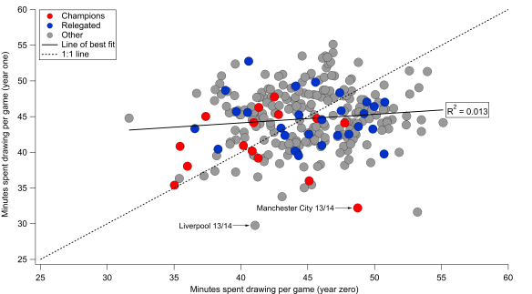
Illustrators
The final plot below is for time spent drawing. Football-lineups doesn’t report the figures for drawing directly so I just estimated it by subtracting the winning and losing figures from 90. There will be some error here as this doesn’t account for injury time but I doubt it would hugely alter the general picture. The relationship here from season to season is almost non-existent (R^2=0.013), which implies that time spent drawing regresses to the mean by 89% from season to season.
Relationship between time spent drawing per game from one season to the next.
Teams seemingly have limited control on the amount of time they spend drawing. I suspect this is a combination of team quality and incentives. Good teams have a reasonable control on the amount of time they spend winning and losing (as seen above) and it is in their interests to push for a win. Bad teams will face a (literally) losing battle against better teams in general, leading to them spending a lot of time losing (and not winning). It should be noted that teams do spend a large proportion of their time drawing though (obviously this is the default setting for a football match given the scoreline starts at 0-0), so it is an important period.
We can also see the shift in Liverpool and Manchester City’s numbers; they replaced fairly average numbers for time spent drawing in 2012/13 with much lower numbers in 2013/14. Liverpool’s time spent drawing figure of 29.8 minutes this season was the lowest value in the past 15 seasons according to this data!
Baked
There we have it then. In broad terms, time spent winning and losing exhibit a reasonable degree of repeatability but with significant variation superimposed. In particular, it seems that title winners require a boost in their time spent winning and a drop in their time spent losing to claim their prize. Perhaps unsurprisingly, things have to go right for you to win the title.
As far as this season goes, Manchester City and Liverpool both improved their time spent winning dramatically. If history is anything to go by, both will likely regress next season and not have the scoreboard so heavily stacked in their favour. It will be interesting to see how they adapt to such potential challenges next year.
Manchester City drew 2-2 with Liverpool at the Etihad. Below is the passing network analysis for Manchester City and Liverpool. More information on how these are put together is available here in my previous posts on this subject.
The positions of the players are loosely based on the formations played by the two teams, although some creative license is employed for clarity. It is important to note that these are fixed positions, which will not always be representative of where a player passed/received the ball. Only the starting eleven is shown on the pitch, as the substitutes weren’t hugely interesting from a passing perspective in this instance.
Passing network for Manchester City and Liverpool from the match at the Etihad on the 3rd February 2013. Only completed passes are shown. Darker and thicker arrows indicate more passes between each player. The player markers are sized according to their passing influence, the larger the marker, the greater their influence. The size and colour of the markers is relative to the players on their own team i.e. they are on different scales for each team. Only the starting eleven is shown. Players with an * next to their name were substituted. Click on the image for a larger view.
In the reverse fixture, Yaya Touré and De Jong were very influential for City but Touré was away at the African Cup of Nations, while De Jong joined Milan shortly after that fixture. Their replacements in this game, Barry and Garcia, were less influential, although Barry had the strongest passing influence for City in this match, with Milner second. The central midfield two, Lucas and Gerrard, were very influential for Liverpool and strongly dictated the passing patterns of the team. They both linked well with the fullbacks and wider players, while Lucas also had strong links with Suárez and Sturridge. Certainly in this area of the pitch, Liverpool had the upper hand over City and this provided a solid base for Liverpool in the match.
No Silva lining
Something that Liverpool did particularly well was limit the involvement of David Silva, who posted his worst pass completion rate (73% via EPL-Index) this season. Usually, Silva completes a pass every 96 seconds this season, whereas against Liverpool it was every 162 seconds. While Mancini’s tactical change did bring Silva more into the game briefly, overall it had a negligible impact upon Silva’s influence when comparing the networks before and after the substitution. However, one of the few occasions where Silva was able to find some time and space, he combined well with James Milner to help create City’s first goal. Goes to show it is difficult to keep good players quiet for a whole match.
Moving forward
Similarly to the Arsenal game, Liverpool showed less of an emphasis upon recycling the ball in deeper areas. Instead, they favoured moving the ball forward more directly, with Enrique often being an outlet for this via Reina and Agger. Liverpool’s fullbacks combined well with their respective wide-players, while also being strong options for Lucas and Gerrard. Strurridge was generally excellent in this match and was more influential in terms of passing than in his previous games against Norwich and Arsenal, combining well with Suárez, Lucas and Gerrard.
At least based on the past few games, Liverpool have shown the ability to alter their passing approach with a heavily possession orientated game against Norwich, followed up by more direct counter-attacking performances against Arsenal and Manchester City. The game against City was particularly impressive as this was mixed in with some good control in midfield via Lucas and Gerrard, which was absent against Arsenal. How this progresses during Liverpool’s next run of fixtures will be something to look out for.
The perceived playing style of a football team is a much debated topic with conversations often revolving around whether a particular style is “good/bad” or “entertaining/boring”. Such perceptions are usually based upon subjective criteria and personal opinions. The question is whether the playing style of a team can be assessed using data to categorise and compare different teams.
WhoScored report several variables (e.g. data on passing, shooting, tackling) for the teams in the top league in England, Spain, Italy, Germany and France. I’ve collated these variables for last season (2011/12) in order to examine whether they can be used to assess the playing style of these sides. In total there are 15 variables, which are somewhat limited in scope but should serve as a starting point for such an analysis. Goals scored or conceded are not included as the interest here is how teams actually play, rather than how it necessarily translates into goals. The first step is to combine the data in some form in order to simplify their interpretation.
Principal Component Analysis
One method for exploring datasets with multiple variables is Principal Component Analysis (PCA), which is a mathematical technique that attempts to find the most common patterns within a dataset. Such patterns are known as ‘principal components’, which describe a certain amount of the variability in the overall dataset. These principal components are numbered according to the amount of variance in the dataset that they account for. Generally this means that only the first few principal components are examined as they account for the greatest percentage variance in the dataset. Furthermore, the object is to simplify the dataset so examining a large number of principal components would somewhat negate the point of the analysis.
The video below gives a good explanation of how PCA might be applied to an everyday object.
Below is a graph showing the first and second principal components plotted against each other. Each data point represents a single team from each of the top leagues in England, Spain, Italy, Germany and Italy. The question though is what do each of these principal components represent and what can they tell us about the football teams included in the analysis?
Principal component analysis of all teams in the top division in England, Spain, Italy, Germany and France. Input variables are taken from WhoScored.com for the 2011/12 season.
The first principal component accounts for 37% of the variance in the dataset, which means that just over a third of the spread in the data is described by this component. This component is represented predominantly by data relating to shooting and passing, which can be seen in the graph below. Passing accuracy and the average number of short passes attempted per game are both strongly negatively-correlated (r=-0.93 for both) with this principal component, which suggests that teams positioned closer to the bottom of the graph retain possession more and attempt more short passes; unsurprisingly Barcelona are at the extreme end here. Total shots per game and total shots on target per game are also strongly negatively-correlated (r=-0.88 for both) with the first principal component. Attempted through-balls per game are also negatively correlated (r=-0.62). In contrast, total shots conceded per game and total aerial duels won per game are positively-correlated (r=0.65 & 0.59 respectively). So in summary, teams towards the top of the graph typically concede more shots and win more aerial duels, while as you move down the graph, teams attempt more short passes with greater accuracy and have more attempts at goal.
The first principal component is reminiscent of a relationship that I’ve written about previously, where the ratio of shots attempted:conceded was well correlated with the number of short passes per game. This could be interpreted as a measure of how “proactive” a team is with the ball in terms of passing and how this transfers to a large number of shots on goal, while also conceding fewer shots. Such teams tend to have a greater passing accuracy also. These teams tend to control the game in terms of possession and shots.
The second principal component accounts for a further 18% of the variance in the dataset [by convention the principal components are numbered according to the amount of variance described]. This component is positively correlated with tackles (0.77), interceptions (0.52), fouls won (0.68), fouls conceded (0.74), attempted dribbles (0.59) and offsides won (0.63). In essence, teams further to the right of the graph attempt more tackles, interceptions and dribbles which unsurprisingly leads to more fouls taking place during their matches.
The second principal component appears to relate to changes in possession or possession duels, although the data only relates to attempted tackles, so there isn’t any information on how successful these are and whether possession is retained. Without more detail, it’s difficult to sum up what this component represents but we can describe the characteristics of teams and leagues in relation to this component.
Correlation score graph for the principal component analysis. PS stands for Pass Success.
The first and second components together account for 55% of the variance in the dataset. Adding more and more components to the solution would drive this figure upwards but in ever diminishing amounts e.g. the third component accounts for 8% and the fourth accounts for 7%. For simplicity and due to the further components adding little further interpretative value, the analysis is limited to just the first two components.
Assessing team playing styles
So what do these principal components mean and how can we use them to interpret team styles of play? Putting all of the above together, we can see that there are significant differences between teams within single leagues and when comparing all five as a whole.
Within the English league, there is a distinct separation between more proactive sides (Liverpool, Spurs, Chelsea, Manchester United, Arsenal and Manchester City) and the rest of the league. Swansea are somewhat atypical, falling between the more reactive English teams and the proactive 6 mentioned previously. Stoke could be classed as the most “reactive” side in the league based on this measure.
There isn’t a particularly large range in the second principal component for the English sides, probably due the multiple correlations embedded within this component. One interesting aspect is how all of the English teams are clustered to the left of the second principal component, which suggests that English teams attempt fewer tackles, make fewer interceptions and win/concede fewer fouls compared with the rest of Europe. Inspection of the raw data supports this. This contrasts with the clichéd blood and thunder approach associated with football in England, whereby crunching tackles fly in and new foreign players struggle to adapt to the intense tackling approach. No doubt there is more subtlety inherent in this area and the current analysis doesn’t include anything about the types of tackles/interceptions/fouls, where on the pitch they occur or who perpetrates them but this is an interesting feature pointed out by the analysis worthy of further exploration in the future.
The substantial gulf in quality between the top two sides in La Liga from the rest is well documented but this analysis shows how much they differed in style with the rest of the league last season. Real Madrid and Barcelona have more of the ball, take more shots and concede far fewer shots compared with their Spanish peers. However, in terms of style, La Liga is split into three groups: Barcelona, Real Madrid and the rest. PCA is very good at evaluating differences in a dataset and with this in mind we could describe Barcelona as the most “different” football team in these five leagues. Based on the first principal component, Barcelona are the most proactive team in terms of possession and this translates to their ratio of shots attempted:conceded; no team conceded fewer shots than Barcelona last season. This is combined with their pressing style without the ball, as they attempt more tackles and interceptions relative to many of their peers across Europe.
Teams from the Bundesliga are predominantly grouped to the right-hand-side of the second principal component, which suggests that teams in Germany are keen to regain possession relative to the other leagues analysed. The Spanish, Italian and French tend to fall between the two extremes of the German and English teams in terms of this component.
All models are wrong, but some are useful
The interpretation of the dataset is the major challenge here; Principal Component Analysis is purely a mathematical construct that doesn’t know anything about football! While the initial results presented here show potential, the analysis could be significantly improved with more granular data. For example, the second principal component could be improved by including information on where the tackles and interceptions are being attempted. Do teams in England sit back more compared with German teams? Does this explain the lower number of tackles/interceptions in England relative to other leagues? Furthermore, the passing and shooting variables could be improved with more context; where are the passes and shots being attempted?
The results are encouraging here in a broad sense – Barcelona do play a different style compared with Stoke and they are not at all like Swansea! There are many interesting features within the analysis, which are worthy of further investigation. This analysis has concentrated on the contrasts between different teams, rather than whether one style is more successful or “better” than another (the subject of a future post?). With that in mind, I’ll finish with this quote from Andrés Iniesta from his interview with Sid Lowe for the Guardian from the weekend.
…the football that Spain and Barcelona play is not the only kind of football there is. Counter-attacking football, for example, has just as much merit. The way Barcelona play and the way Spain play isn’t the only way. Different styles make this such a wonderful sport.
In my previous post, I looked at how Liverpool seemingly focussed upon crossing last season and how it was on the whole unsuccessful, at least in open-play. One thing that I noted was that crossing from set-pieces appeared to be more successful in terms of goals scored than crosses in open-play.
The average number of crosses per goal scored last season was 79 in open-play and 28.3 from a set-piece. Crossing accuracy is also higher for set-pieces (33.9%) compared with open-play (20.5%). This demonstrates that crossing is more effective from set-pieces than in open play.
So the question is: Which teams were particularly efficient at scoring from set-play crosses and how did this contrast with their open-play performance?
Crossing efficiency
As with the crosses from open-play analysis, there are several under and over-performers in terms of crosses from set-pieces. Furthermore, some teams score a large proportion of their goals from crosses.
Relationship between the number of crosses in open-play required to score a goal from a cross in open-play and the number of crosses from a set-play required to score a goal from a cross at a set-play for English Premier League teams in 2011/12. Note that both scales are logarithmic and that they are reversed as a larger number is worse. The horizontal dashed black line indicates the average number of open-play crosses required to score a goal from a cross in open-play across the league, while the vertical dashed black line indicates the number of crosses from a set-play required to score a goal from a cross at a set-play. The teams are coloured by the percentage amount of goals they scored from all crosses, relative to their total number of goals. Data is provided by Opta and EPL-Index.
Stoke conformed to their stereotype here as they led the way marginally from Chelsea, as they required 15.4 crosses per goal at a set-piece compared to Chelsea’s 15.6. Chelsea scored 14 goals in total from set-pieces, while Stoke scored 10. Other notable performers were Blackburn (16.9), Norwich (17.6) and Everton (17.7). Norwich were probably the most efficient crossing team in the league last season, as they scored frequently compared to their peers from both open-play and set-pieces. In fact, 46% of their goals came from crosses last season, ahead of Stoke (39%), QPR (37%) and Chelsea (37%). Whether such numbers will be sustainable next season could be crucial for Norwich under Chris Hughton.
Aston Villa (180), Newcastle (138) and Swansea (85.5) were the clearest under-achievers, as they only scored 4 goals from a set-piece cross between them. In contrast to their severe under-performance in the open-play crossing analysis, Liverpool were about average as far as set-piece crosses were concerned. Indeed, Liverpool scored 9 goals from set-piece crosses last season, which was joint third with Blackburn, Everton and West Brom.
Getting to the byline
One of the aspects of crossing that I find curious is the poor success rate of crosses in terms of their accuracy. At first glance, the accuracy of crosses appears to be uniformly low; 23.4% for all crosses, with Arsenal posting the lowest (21.5%) and Norwich having the highest (27.3%). Accuracy is even worse in open-play, where it drops to 20.5% on average last season. Norwich are again the highest (24.8%), while Bolton had the lowest (17.2%). The overall crossing accuracy figures are skewed by the greater accuracy from set-piece crosses, which on average were accurate 33.9% of the time. Newcastle had the lowest accuracy with 23.9%, which was far lower than any other side (Liverpool were next lowest with 29.1%). Such a low accuracy goes some way to explaining their poor efficiency from set-piece crosses. The contrast to this is Aston Villa, who amazingly had the highest set-piece cross accuracy with 41.7% but could only score 1 goal from a set-piece cross all season.
This greater range and contrast in crossing accuracy when they are broken down potentially points towards a level of granularity in the crossing data, that is not separated by the coarse definition of crosses used here. Ideally, the crosses would be separated by the position from which the cross originated, along with defending and attacking players positioning. EPL-Index include “byline crosses” in their crossing database, which is a start as it shows that such crosses are far more accurate on average (47.8%). If we assume that successfully crossing to a team-mate is the first stage in potentially creating a chance to shoot and subsequently scoring, then it would appear that byline crosses are a far better option than other crosses in open-play; open-play crosses excluding these byline crosses have an accuracy of 19.7%.
Sadly I don’t have enough information available to assess whether byline crosses are a more efficient means of scoring from a cross plus the sample size is relatively small compared to total open-play crosses on a team-by-team basis. Some teams essentially never get to the byline and cross the ball; Stoke attempted only 2 byline crosses all season. Only Manchester City (50), Arsenal (47), Liverpool (34) and Manchester United (31) really attempted enough to draw even tentative conclusions. However, it would make sense if such crosses were a more effective means of scoring from a cross as they are often attempted closer to goal, which may result in an easier chance for the receiver.
In the mixer
Based on last season, set-piece crosses are a more efficient means of scoring than open-play crosses. There are likely a multitude of reasons for this, one of which is possibly the superior crossing accuracy from set-pieces compared to those in open-play. The greater parity in numbers between attackers and defenders could be another reason plus the more specialised headers of the ball, such as centre-backs, could be used to greater effect at set-pieces. One potential method of extracting more value from crosses is to attempt them closer to the byline, where the accuracy is far greater than other open-play crosses but at present I don’t have enough data to fully explore this idea.
Overall, scoring from a cross does not appear to be a particularly efficient and direct method of providing goals. However, it could be argued that a goal may indirectly result from a cross; the “in the mixer” approach, although this is likely to be particularly subject to the vagaries of luck and is more applicable to set-pieces. Based on last season, a team will on average score a goal from a cross in open-play every 79 crosses. Even the best performers in the league needed 45 crosses on average to score a single goal. The average number of open-play crosses per game attempted by a team last season was 17, which suggests that over the long-term, a team can expect to at best score a goal from an open-play cross every 2-3 games. Crossing, especially in open-play, appears to be a low-yield method of scoring.
If Liverpool had been merely average last season, the 841 open-play crosses they attempted would have yielded an extra 8 goals. If they had been exceptional, they could have expected another 16 goals. The question is whether this is a good enough return to motivate basing your playing style upon over the long-term?
In some recent interviews, Simon Kuper has suggested that Liverpool established a data-driven style of play focussed around crossing last season. He theorised that Liverpool attempted to cater to Andy Carroll’s heading strengths by buying players with good crossing statistics, such as Stewart Downing and Jordan Henderson. Kuper then goes on to state that such an approach is flawed due to crossing being an inefficient means of scoring goals.
Earlier in the season, the Guardian’s Secret Footballer also suggested that statistical principles guided Damien Comolli towards a crossing focussed approach in the transfer market. Andrew Beasley conducted an excellent analysis for The Tomkins Times on whether the data indicated that such an approach (along with some others) was actually working.
So the question is: Did Liverpool really pursue a strategy based around crossing last season and to what extent was it successful (you can probably guess the answer to the second part)?
Noughts & Crosses
Firstly, Opta define a cross as:
A pass from a wide position into a specific area in front of the goal.
The basic numbers show that Liverpool attempted more crosses (1102) than any other team in the Premier League last season. Manchester United (1018) and Wolves (999) ranked second and third respectively. At the other end of the scale, Blackburn (610), Fulham (649) and Swansea (721) attempted the fewest. The average per team was 837.2 crosses attempted, which equates to just over 22 crosses per game.
While the raw numbers provide a guide, it is possible that the figures could be skewed by how much of the ball a particular team has on average. For example, Wolves had much less of the ball than Manchester United last season but attempted a similar number of crosses. This suggests that Wolves were keener to attempt crosses than Manchester United. Furthermore, set-plays should be isolated from the total crosses, as teams may have different approaches in open-play vs set-play. In order to account for this, I’ve calculated the ratio of attacking half passes to total open-play crosses in the graph below. This gives an indication of how keen a team is to attempt a cross during open-play. I limited the passing to the attacking half only as this is where most (if not all) crosses will originate from and it avoids the data being skewed by teams that play a lot of passes in their own half.
Similarly to this tweet by OptaJoe, I calculated the average number of open-play crosses that each team in the Premier League required to score a goal from an open-play cross last season. This is shown in the graph below versus the number of attacking half passes per open-play cross.
Relationship between the number of crosses in open-play required to score a goal from a cross in open-play and the number of passes in the attacking half by a team prior to an open-play cross for English Premier League teams in 2011/12. Note that the cross:goal ratio scale is logarithmic and that it is reversed as a larger number is worse. The horizontal dashed black line indicates the average number of open-play crosses required to score a goal from a cross in open-play across the league, while the vertical dashed black line indicates the average number of passes in the attacking half by a team prior to an open-play cross. The teams are coloured by the percentage amount of goals they scored from open-play crosses, relative to their total number of goals in open-play. Data is provided by Opta, WhoScored and EPL-Index.
The analysis indicates that Liverpool did indeed pursue a crossing strategy last season relative to their peers in the Premier League, as they attempted 14 passes in the attacking half prior to attempting a cross. Only Wolves, Stoke and Sunderland played fewer attacking half passes prior to attempting a cross last season. At the other end of the scale, Manchester City and Fulham were relatively sheepish when it came to crossing, attempting just over 21 passes in their opponent’s half prior to attempting a cross. Arsenal, Swansea and Spurs also stood out here, lying more than 1 standard deviation above the league average.
The major issue for Liverpool based on the above analysis was that their conversion from crosses was simply atrocious. They required a staggering 421 open-play crosses to score a single goal in open-play on average last season. This was the worst rate in the whole league, with Wigan the closest on 294. Contrast this with the likes of Manchester United (44.5), Norwich (45.1) and Arsenal (48.4) who were the only clubs to post a value below 50. Furthermore, only 8.3% of Liverpool’s goals in open-play came from an open-play cross. Norwich scored 53.3% of their goals in open-play from open-play crosses
Liverpool seemingly embarked upon a style of play that provided them with a extremely poor return in terms of goals (only 2 goals from an open-play cross all season).
Is crossing the ball an inefficient means of scoring?
The above analysis seemingly demonstrates that Liverpool did indeed pursue a style of play centred around crossing. Liverpool’s apparent quest to show that crossing is an extremely inefficient means of scoring last season (I’m personally still trying to forget those 46 crosses against West Brom at Anfield) potentially clouds the more general question of whether crossing is a tactic worth basing your team around. It could be that crossing can be an efficient way to score but Liverpool were just simply not very good at it.
According to WhoScored, 659 goals were scored in total from open-play, while 241 goals came from set pieces (excluding penalties). The data from Opta show that 166 and 128 goals were scored from open and set-plays respectively. Thus 25% and 53% of all goals in these categories came from crosses. The average number of crosses per goal scored last season was 79 in open-play and 28.3 from a set-piece. Crossing accuracy is also higher for set-pieces (33.9%) compared with open-play (20.5%). This demonstrates that crossing is more effective from set-pieces than in open play.
Crossing the divide
The above analysis demonstrates that Liverpool pursued a playing style overly focussed upon crossing, which yielded very meagre returns. Whether the poor return was a symptom or a contributing factor to their generally poor shot conversion isn’t clear at present and requires further analysis.
The more general question regarding whether crossing is an efficient means of scoring is difficult to assess without more analysis. This study shows that crossing at set-pieces is more efficient than in open-play but to fully answer this question requires comparison with other modes of scoring. The above analysis suggests that structuring your team around crossing in open-play is a very low yield method of scoring, which also results in the loss of possession close to 80% of the time.
Liverpool’s addiction to crossing appears to be a recent trend. In the 3 seasons prior to 2011/12, they averaged 16.4, 15.4 and 15.5 attacking half passes prior to an attempted cross. Swansea under Brendan Rodgers averaged 18.9 last season, which potentially suggests that next season Liverpool will try to kick the crossing habit.